Remove Chart Gaps in Excel with these 3 Tips
HTML-код
- Опубликовано: 3 апр 2023
- Download the File: www.teachexcel.com/excel-tuto...
Full Excel VBA/Macro Course [On Sale!]: www.teachexcel.com/vba-course...
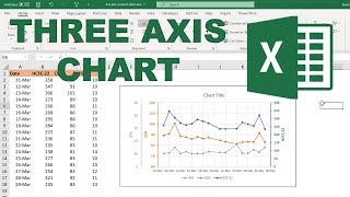
How to easily remove the gaps in your charts in Excel. This requires a simple setting change and a custom input into your source data and that’s it!
This allows you to show more fluid charts without breaks or zero values that disrupt the flow of the data visualization.
I hope you enjoyed this Excel tutorial!
Resources:
TeachExcel Online Courses: www.teachexcel.com/premium-co...
Excel Charts (Microsoft): support.microsoft.com/en-us/o...
#msexcel #tutorial #exceltips #freetutorial #exceltips #excel


That is a very nice feature. Thank you for sharing it with us !
Thanks man
Great tip. What if we start AXIS without “ Zero”.
Maybe this is a bad example. Connecting sales figures is misleading as they have no relationship. A bar chart would be a better representation but the tip is welcome.