not entirely correct when maximum of the population is an outliers, thus need to exclude the outliers to compute the new upper /lower whiskers, appreciate if you can show how to plot the box plot together with outliers.
I don’t think you can. Google sheets is not the best to use for this. Excel works much better. I have a video to do this in excel if you want to check it out. I just did the video in google sheets because there some out there that use it.
Not related to the topic of the video, I always thought that black people had the best accent but yours is very nice too :) where is that excel video? can not find it in the description


i watched this for a project and just.. kept watching. you have an absolutely lovely voice.
Thank you.
It actually WORKED! I did exactly what you did in the video and it worked! That's never happened before! Thank you so much!
You’re welcome.
Thank you Steve! This was a really good explanation!
You’re welcome. Glad it helped.
Thank you for uploading this video. Helped me to create a Box plot in Google Spreadsheet
You’re welcome. Glad it helped.
This is a clear useful video. Thank you! Is there a way to see the median in the box and whisker chart
on google sheets?
Thank you. I haven’t figured it out.
Thank you! Helped me a lot
You’re welcome. Glad it helped.
Can you add mean and median to the box and whisker chart on google sheet?
Im doing this for my statisitcs lol
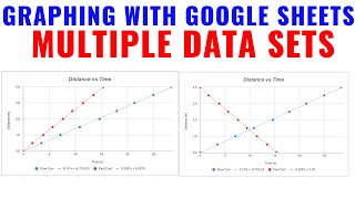
Hi how can you make multiple data sets on the same chart?
Yeah that is what I am wondering
not entirely correct when maximum of the population is an outliers, thus need to exclude the outliers to compute the new upper /lower whiskers, appreciate if you can show how to plot the box plot together with outliers.
How do you add a median in?
I don’t think you can. Google sheets is not the best to use for this. Excel works much better. I have a video to do this in excel if you want to check it out. I just did the video in google sheets because there some out there that use it.
Just pick a cell and type =MEDIAN instead of =QUARTILE or =MIN or whatever.
Not related to the topic of the video, I always thought that black people had the best accent but yours is very nice too :) where is that excel video? can not find it in the description
ruclips.net/video/J0CRpDqKCiI/видео.html
I never see outlier datapoints this way?
This is not box and whisker plot
lahe !