Your color choices are so beautiful! I just put together my core palette yesterday; I have only 18 wells so I chose a warm and cool of each primary color, then added some earth tones, a couple of colors for mixing, and a couple of convenience colors I find difficult to mix. Hopefully this will give me enough variety to mix anything I need. Thank you for sharing your lovely swatching card!❤
I too have several smaller palettes--Poems About You for landscapes, Roman Szmal, a palette of quarter pans of bright colors for coral reefs, and a palette of glitter paints for silly birds--my husband collects those. And several -palettes of blacks. I love blacks.
I love your palette!😍 I'm new to watercolor and to making art generally. First I've bought WN Cotman set, but I didn't like half of the colors. So I picked colors that I thought would be suitable for flowers, urban sketching or lansdcapes as I don't know what I'm capable to draw or paint yet😂 I left some WN, bought Roman Szmal, put them in a derwent pencil metal case and now I feel like a professional artist😁 What's in my palette: Buff titanium RS, Lemon Yellow WN, Cadmium Yellow WN, Cadmium Orange WN, Pyrrole Orange RS, Cadmium Red Deep WN, Cherry Quin. Red RS, Alizarin Crimson WS, Perylene Violet RS, Permanent Rose WN, Purple Lake WN, Dioxazine Purple WN, Przybysz's Grey RS, Indigo RS, Cobalt Coelin Blue RS, Ultramarine WN, Ocean Blue RS, Cobalt Tutquoise RS, Perylene Green RS, Aquarius Green RS, Hooker's Green RS, Olive Green Deep RS, Deep Green Gold RS, Quin. Gold RS, Gold Ochre RS, Burnt Siena WN, Hematite RS, Burnt Umber WN, Cyprus Raw Umber Brownish RS, Van Dych Brown RS.
Love your choices for your palette!! I must try Aquarius Green one of these days, have heard so many good things about it 😊Thank you so much for sharing! ❤
@@lilymoonart Thank you☺ Aquarius green is a beautiful shade, but I don't find it as unique as everybody says. Maybe because I don't have a unique paper. But I still love it and enjoy using for mixing
❤ such a pretty pallet. I was surprised that Caput Mortum was missing, I always feel like a little shopping after ive watched one of your inspiring videos. I would love to see a painting tutorial one day.🎉
I love Caput Mortuum, and it is in a little palette I have with my earthy colors, close at hand! 😁🌺Thank you so much for being here and for your lovely comment! 🎨🌺
Have you tried any of the Daniel Smith watercolor stick? They have about the same amount of pigment as the 15ml tubes , just without the liquid. They're not as expensive as well. I myself have six- sodalite genuine, hematite genuine, undersea green, lunar black, buff titanium and yellow ochre.
the camera you are using now is fine and show off the colors very well. I am into your swatch and did swatch the colors I have as well. So enjoy to watch your works. Thank you.
I NEED to create a core palette. What I use now is too big and there are for sure some colours I always use. Rutille Yellow is new to me and I LOVE it so much. Sending good wishes for your family member's surgery. And good luck with the camera :)
I love seing artists main palette. Im still in the process of figuring out mine. But my travel mixing colors are Permanent Rose, Phtalo Turquoise, Nickel Azo yellow, Burt Sienna, Caput M., Cobalt turquoise light, Payne's grey, Ultramarine blue and Rich green gold. And I want to add buff titanium.
This is probably one of the most beautiful and well considered palettes I have ever seen. Whilst I have quite a few of them, I've never used Roman Szmal for some reason. Lots of DS, W&N, Schminke, Qor, Holbein and a sprinkling of A Gallo. However, after seeing this, I've now got 4-5 new colours in 2 untried brands I want to try. I'm mainly a portrait artist so there would be a few additions and takeaways, but not many I must admit. It's beautiful, versatile and well, just beautiful! Thanks for a wonderfully calming video, you've made my morning. Cheers from Australia x
Lovely collection of base colors for your general palette! I thought you have some very unique choices too! I hope to watch you creating some paintings from your beautiful palette!
Thanks for posting the video! The third color which is labeled as Daniel Smith Hansa Yellow Medium appears to be a lot warmer than what I have and what’s on DS website. Was it from a different brand?
Such a fun palette 😊 I definitely can't go without a bright red, black, purples, blues and a buff titanium. It might sound like a weird palette but it fits my style as I prefer to paint portraits and anime kind of paintings 😅
That dragon blood watercolor looks like when I dilute my Diamine oxblood ink. I desire it greatly. Edit: Lunar red looks EXACTLY like oxblood!! I Desire That One Too
Such a beautiful palette🥰. Most of my paints are Daniel Smith and several are Winsor Newton, so I made a list of the colors in your palette and ordered the ones from Michael Harding, Roman Szmal, and Schmincke that I did not have in the brands I have not tried. I can hardly wait to get them! Would you be able to provide a tutorial mixing the colors in this palette? I will undoubtedly try that but I would love to see your suggestions. Thank you Lily for your beautiful tutorials, and I absolutely love the patron gifts you send each month. Many hugs for all the delightful things you are doing🤗
Hello Donna! I am so happy you enjoyed the video❤️ I'll make a note in my video ideas book about doing a mixing video with this palette, thank you so much for your lovely suggestion!😊❤️
I just discovered Michael Harding's Quin gold also. It's the color I order when I want to try a new brand... The only one I haven't liked was Roman Szmal's, but they do have a few colors that I like. Our core palettes are very similar. I think that your camera does a fine job! Good luck to your relative, wishing them a speedy recovery. 🌼
I just adore the way prepare your swatch books…so beautiful. Loved these paint swatches. Do you know where I could purchase the Dragon’s Blood by Zecchi please? I live in the USA
I wish I could find Zecchi watercolors! Their site does not show any watercolors, nor can I find them through other sources other than a over large set on ali-express. :(
Did you mean Schmincke Paynes Grey Bluish? I don't believe Schmincke has one called Paynes Grey Blue shade. It's the one that I keep permanently on my palette . Cannot be without it. Winser & Newton's regular Paynes Grey is almost as blue. Have you tried it yet? Thanks for all you share.
Renee yes, it is! I'm afraid I'm so used to saying 'blue shade' because of Winsor and Newton colors, the phrase just slips out 🙈 It is a wonderful color I agree! I don't remember WN's Payne's Grey, thank you for suggesting it - and thank you so much for being here! 🥰🎨
@@lilymoonart😂 I thought so too haha. I see a beautiful quad in your palette that I want to try in my next painting! Perylene Green, Sodalite Genuine, Potter's Pink and Lunar Red Rock 😍 I would have never thought to put those together if you didn't do these swatches, so thank you! Okay, now back to the video haha!
Oh man...okay...and add Vandyke Brown to that. So 6 colors total, not 4 hahaha. Perylene Green, Sodalite Genuine, Buff Titanium, Potter's Pink, Lunar Red Rock and Vandyke Brown!


Your color choices are so beautiful! I just put together my core palette yesterday; I have only 18 wells so I chose a warm and cool of each primary color, then added some earth tones, a couple of colors for mixing, and a couple of convenience colors I find difficult to mix. Hopefully this will give me enough variety to mix anything I need. Thank you for sharing your lovely swatching card!❤
I too have several smaller palettes--Poems About You for landscapes, Roman Szmal, a palette of quarter pans of bright colors for coral reefs, and a palette of glitter paints for silly birds--my husband collects those. And several -palettes of blacks. I love blacks.
I love your palette!😍 I'm new to watercolor and to making art generally. First I've bought WN Cotman set, but I didn't like half of the colors. So I picked colors that I thought would be suitable for flowers, urban sketching or lansdcapes as I don't know what I'm capable to draw or paint yet😂 I left some WN, bought Roman Szmal, put them in a derwent pencil metal case and now I feel like a professional artist😁 What's in my palette: Buff titanium RS, Lemon Yellow WN, Cadmium Yellow WN, Cadmium Orange WN, Pyrrole Orange RS, Cadmium Red Deep WN, Cherry Quin. Red RS, Alizarin Crimson WS, Perylene Violet RS, Permanent Rose WN, Purple Lake WN, Dioxazine Purple WN, Przybysz's Grey RS, Indigo RS, Cobalt Coelin Blue RS, Ultramarine WN, Ocean Blue RS, Cobalt Tutquoise RS, Perylene Green RS, Aquarius Green RS, Hooker's Green RS, Olive Green Deep RS, Deep Green Gold RS, Quin. Gold RS, Gold Ochre RS, Burnt Siena WN, Hematite RS, Burnt Umber WN, Cyprus Raw Umber Brownish RS, Van Dych Brown RS.
Love your choices for your palette!! I must try Aquarius Green one of these days, have heard so many good things about it 😊Thank you so much for sharing! ❤
@@lilymoonart Thank you☺ Aquarius green is a beautiful shade, but I don't find it as unique as everybody says. Maybe because I don't have a unique paper. But I still love it and enjoy using for mixing
❤ such a pretty pallet. I was surprised that Caput Mortum was missing, I always feel like a little shopping after ive watched one of your inspiring videos. I would love to see a painting tutorial one day.🎉
I love Caput Mortuum, and it is in a little palette I have with my earthy colors, close at hand! 😁🌺Thank you so much for being here and for your lovely comment! 🎨🌺
I am really starting to see the value in having several small curated palettes rather than one big overwhelming one.@@lilymoonart
Beautiful colours!
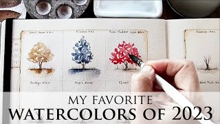
I love the swatch card and the branch it’s hanging from 😊.
Main Palette (Schmincke unless otherwise noted)
Titanium Yellow
Lemon Yellow
Pure Yellow
Quin Gold
Indian Yellow
Aussie Red Gold (DS)
Chromium Orange
Transparent Orange
Geranium Red
Deep Scarlet (DS)
Alizarin Crimson
Rose Dore (WN)
Magenta
Potter’s Pink
Perylene Maroon
Perylene Violet
Mineral Violet
Moonglow (DS)
Shadow Violet (RS)
Misty Morn (RS)
Dioxazine Violet
Ultramarine Violet
Ultramarine Finest
Cobalt Dark
Cobalt Light
Sodalite (DS)
Indigo (Case for Making)
Blue Apatite (DS)
Prussian Green
Cobalt Green Dark
Perylene Green
Jadeite (Daniel Smith)
Green (White Nights)
Undersea Green (DS)
Green Apatite (Daniel Smith)
Hooker’s Green (RS)
Transparent Ochre
Monte Amiata (DS)
Lunar Earth (DS)
Transparent Sienna
Golden Barok Red (Old Holland)
Piedmonite (DS)
Transparent Umber
Green Umber
Volcano Brown
Sepia
Payne’s Gray (MG)
Neutral Tint
Bloodstone (DS)
Lunar Black (DS)
Spares:
Cobalt Teal
Helio Turquoise
What a wonderful palette! So many gorgeous colors! Thank you for sharing it with us! 🥰❤️
That’s not a palette, that’s half the art store
Have you tried any of the Daniel Smith watercolor stick? They have about the same amount of pigment as the 15ml tubes , just without the liquid. They're not as expensive as well. I myself have six- sodalite genuine, hematite genuine, undersea green, lunar black, buff titanium and yellow ochre.
Kathrine, I haven't and I've always wondered about them! I should try them one day! Thank you so much for the suggestion!💖
Best wishes for a speedy recovery for your relative ❤😊
Thank you! 😊🥰
Great thanks Lily!
the camera you are using now is fine and show off the colors very well. I am into your swatch and did swatch the colors I have as well. So enjoy to watch your works. Thank you.
What palette did you use? I like that it fits more than the usual ones of that size
I NEED to create a core palette. What I use now is too big and there are for sure some colours I always use. Rutille Yellow is new to me and I LOVE it so much. Sending good wishes for your family member's surgery. And good luck with the camera :)
Thank you Monique! ❤
I've just added caput mortuum to my core palette. There is something wonderfully devious about the opacity of the red in mixes.
love the payne's grey
Such a lovely palette of colours! Love everyone...
I enjoyed this demo so much. I have most of these paints and i like learning about their use.
I love the Winsor and Newton Naples yellow. My favorite Naples yellow and I use all brands.
It's the perfect Naples Yellow for me! 😊
ooh that def is a lovely ultramarine blue 🥰 and i love that paynes grey
Such a beautiful palette!❤❤❤
I love seing artists main palette. Im still in the process of figuring out mine. But my travel mixing colors are Permanent Rose, Phtalo Turquoise, Nickel Azo yellow, Burt Sienna, Caput M., Cobalt turquoise light, Payne's grey, Ultramarine blue and Rich green gold. And I want to add buff titanium.
A lovely and versatile selection for a travel palette, thank you so much for sharing it with us! 🥰🎨
This is probably one of the most beautiful and well considered palettes I have ever seen. Whilst I have quite a few of them, I've never used Roman Szmal for some reason. Lots of DS, W&N, Schminke, Qor, Holbein and a sprinkling of A Gallo. However, after seeing this, I've now got 4-5 new colours in 2 untried brands I want to try. I'm mainly a portrait artist so there would be a few additions and takeaways, but not many I must admit. It's beautiful, versatile and well, just beautiful! Thanks for a wonderfully calming video, you've made my morning. Cheers from Australia x
Huge hello to Australia and a thank you so much for your wonderfully kind words!❤️🌸❤️
Lovely to chat Lily and catch a live. It was great fun, keep doing what you are doing you are great. Take care x
Thanks so much Francine! It was lovely to talk to you too! 🥰
Lovely collection of base colors for your general palette! I thought you have some very unique choices too! I hope to watch you creating some paintings from your beautiful palette!
Thanks for posting the video! The third color which is labeled as Daniel Smith Hansa Yellow Medium appears to be a lot warmer than what I have and what’s on DS website. Was it from a different brand?
Hi, no it's by Daniel Smith, but sometimes the video can make some colors look a little different than their true hue.
Your skills are remarkable
Thank you for your kind words ❤️🌺
Such a fun palette 😊 I definitely can't go without a bright red, black, purples, blues and a buff titanium. It might sound like a weird palette but it fits my style as I prefer to paint portraits and anime kind of paintings 😅
Sound like a very useful Palette for sky’s
That dragon blood watercolor looks like when I dilute my Diamine oxblood ink. I desire it greatly.
Edit: Lunar red looks EXACTLY like oxblood!! I Desire That One Too
Such a beautiful palette🥰. Most of my paints are Daniel Smith and several are Winsor Newton, so I made a list of the colors in your palette and ordered the ones from Michael Harding, Roman Szmal, and Schmincke that I did not have in the brands I have not tried. I can hardly wait to get them! Would you be able to provide a tutorial mixing the colors in this palette? I will undoubtedly try that but I would love to see your suggestions. Thank you Lily for your beautiful tutorials, and I absolutely love the patron gifts you send each month. Many hugs for all the delightful things you are doing🤗
Hello Donna! I am so happy you enjoyed the video❤️ I'll make a note in my video ideas book about doing a mixing video with this palette, thank you so much for your lovely suggestion!😊❤️
I just discovered Michael Harding's Quin gold also. It's the color I order when I want to try a new brand... The only one I haven't liked was Roman Szmal's, but they do have a few colors that I like. Our core palettes are very similar. I think that your camera does a fine job! Good luck to your relative, wishing them a speedy recovery. 🌼
Thank you! ❤
I just adore the way prepare your swatch books…so beautiful. Loved these paint swatches. Do you know where I could purchase the Dragon’s Blood by Zecchi please? I live in the USA
There are so many paints I desire I couldn't keep it to 21 paints! Anything With heavy granulation and I am dreqming!
Your swatch cards are works of art in themselves. I love Sennelier for transparency and mixing but not just one color ...
Thank you so much for your kind words, Erica! Sennelier is a brand I must explore more! 😊 ❤
Beautiful selection of paints🥰
Can you post a source for the Zecchi paints?
Of course! Here is the link to their online store: zecchi.it/?lang=eng 😊❤️
First!
Yay!!! 😁
I wish I could find Zecchi watercolors! Their site does not show any watercolors, nor can I find them through other sources other than a over large set on ali-express. :(
Hello, are you sure that it is rich green gold(PY129) of Daniël Smith? It seems Very ochery yellow in the video ?
Nadine, my camera has this issue with PY129, it always looks on camera much different than it actually is in person 🙈
Did you mean Schmincke Paynes Grey Bluish? I don't believe Schmincke has one called Paynes Grey Blue shade. It's the one that I keep permanently on my palette . Cannot be without it. Winser & Newton's regular Paynes Grey is almost as blue. Have you tried it yet? Thanks for all you share.
Renee yes, it is! I'm afraid I'm so used to saying 'blue shade' because of Winsor and Newton colors, the phrase just slips out 🙈 It is a wonderful color I agree! I don't remember WN's Payne's Grey, thank you for suggesting it - and thank you so much for being here! 🥰🎨
Does anyone know where I could buy Zecchi watercolor paints online? I've looked everywhere and can't find them on the internet. Thanks :).
Love at first stroke 😂🤦♀️ oh my mind went right to the gutter 😂 how about "love at first swatch"?
Haha, yes, love at first swatch sounds MUCH better! 😁
😂😂
@@lilymoonart😂 I thought so too haha. I see a beautiful quad in your palette that I want to try in my next painting! Perylene Green, Sodalite Genuine, Potter's Pink and Lunar Red Rock 😍 I would have never thought to put those together if you didn't do these swatches, so thank you! Okay, now back to the video haha!
Oh man...okay...and add Vandyke Brown to that. So 6 colors total, not 4 hahaha.
Perylene Green, Sodalite Genuine, Buff Titanium, Potter's Pink, Lunar Red Rock and Vandyke Brown!
@@adriannabcustomfurniture That sounds like lovely combination! 😊🥰
Sepia
The e is long sounding. (Seepia)
Patty-Lily, which premier are referring to?
Patty, when my video goes live for the first time, its premiere, there is a live chat, where everyone can talk about colors! 🥰🎨
@lilymoonart patty-oh, now I get it. I'll try to make It . Loved the swatching.
@@patriciatolliver4057 it will be lovely to see you there ♥️🎨