Build a STUNNING Budget vs Actuals Dashboard

HTML-код
- Опубликовано: 18 июн 2024
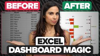
- Create this awesome Budget VS Actuals dashboard!
Discover how to align your budget with actual expenses in our engaging video. I’ll teach you how to create this dashboard so easily and how to present it professionally.
➡️ Download the Excel File here!
Excel File: yourcfoguy.ck.page/budget-vs-...
⏱️ TIMESTAMPS
0:00 Intro
0:24 How can you build the dashboard
0:33 Explaining the dashboard
1:04 How to populate the variance columns.
4:00 Donut charts - create beautiful charts and format them
7:48 Adding formulas to the Donut charts
10:45 Set up the first Donut chart
12:32 Create the second Donut chart
14:09 Finalize the 4 Donut charts
14:27 How to present the Budget VS Actuals dashboard
14:38 Outro
ABOUT THIS CHANNEL
Looking to level up your career in Finance & Accounting? You're in the right place. Each week I upload videos around Accounting, FP&A, and Excel to help you grow in your career and learn something new.
⚡️ Check out my channel here: / @yourcfoguy
Don’t forget to subscribe!
🔎 FIND ME AT
[www.yourcfoguy.com](www.yourcfoguy.com/)
➡️ Subscribe to my Newsletter!
www.yourcfoguy.com/newsletter
🔗 FOLLOW ME ON SOCIAL
Get updates or reach out to Get updates on our Social Media Profiles!
LinkedIn: / joshaharonoff
Twitter: / yourcfoguy
#Budget #Excel #Dashboards #accountingprofessionals #BudgetVSactuals #yourcfoguy


Thank you for sharing this with us!
You’re welcome, thanks for watching!
Great content
Thanks for watching and sharing your feedback!
This is fantastic. The presentation style is awesome but i would suggest a faster delivery as i watched at 1.5x and understood everything easily.
Very helpful feedback! If you have any other suggestions please do feel free to share as I have a lot to learn
Great hope ypr channel get big quickly
I hope so too :)
I have a request!
Could you please come up with the videos on:
Balance Sheet, Profit & Loss Statement and Cash Flow Statement and the relationship between them.
I'd be grateful to you always.
Coming right up!
@@yourcfoguy Thankyou❤️
Ditto requested.
Feel free to share any other topics you’d like to see! In the meanwhile, here’s a video on the p&l
ruclips.net/video/sAxd35HhQxs/видео.html
My personal experience isn't the same, so I just cannot recommend to use Donut chart in case of Cash Flow/Ending Cash/Net Income as a chart type - the reason is so simple in theory it looks very good that all the variances are below 100% but in the practice this isn't the case and it can occur quite often values like 200% ,300% ..etc. which make the presentation of our KPI quite difficult according to the tutorial's approach...
Perhaps at a consolidated level, it can be used in the case of a profit rate in these cases a bullet chart can more easily display the extreme values...
You raise some good points - donut charts are difficult if the amounts are greater than 100% or less than 0%. What exactly is a bullet chart?
@@yourcfoguy ... I prefer card-like KPI-s -> Rev, Profit, CF, ROE, CCC - value, delta indicator, %dif as single or cumulated KPI + quarterly/monthly bullet -> act vs fc or act vs budget or act vs fc vs budget, bullet its a classic column/bar chart using series overlap + no fill features with only borders... so don't get me wrong the progressive circle versions are so cool or a line chart with trendline etc... just in practice I've always had unusual %rates, especially between divisions or profit/cost centers because of company-specific reasons 😅 and when I planned the design, I had always fancy dreams and than the reality just destroyed them 🤣 or our CEO/CFO-s special demands 🤣
lol I hear that - thanks for sharing your experience with us!
*promo sm*
Can you elaborate on that?