What a great video. It is very helpful and you take your time to show each step . How do I download the source data so that I can attempt the process myself?
Thank you for the video. Very informative. Quick question. I have values that total 100% but for some reason, I cannot get the % sign to be visible. Anything below 100% will show the % sign. Any suggestions? Thank you.
Hi there! Let me check my files (it's been a while since I did that video). It may be something as simple as making the font size a little smaller or increasing the size of the text box.
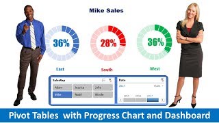
Hi. This is a great tutorial. I tried using this for an application I have. It works great when the filter returns all categories. But if one salesperson has no result for one category then the circles shift to the left. Eg if one country sold no hamburger then the doughnut for milkshake displays in the 3rd position and uses the formatting for hamburger rather than milkshake purple. Is there any way for pivot table to always return all categories even if value is 0?
Thanks for the feedback. In your pivot table options, make sure that the For Empty Cells option is checked and then enter 0 (Zero) in the field next to it.
Good video! I've seen speedometer type progress charts in Excel. I'm assuming they are using doughnut charts like this video - could you do a video on how to create a speedometer chart?
What if the progress is over 100%, how do you get to keep the consistent formula with all the others, but make it so the progress chart is full? I have a category that is at 116% and if I keep the same formula it shows up negative.
Also - I am trying to cut and paste my progress charts onto a dashboard tab - but when I do so the Text boxes that I have set equal to the percentage do not change with the information if I refilter on another page?
For your text box question ... In the text box, you will need to reconnect to the cell that has the percentage you want to display. If you simply cut and paste it from another sheet, it will not reference the sheet you copied it from. Update the formula to link the value to the other sheet.


I love the pace & depth at which you walk us through setting up these progress charts. Thank you so much!
Thanks for the kind words!
What a great video. It is very helpful and you take your time to show each step . How do I download the source data so that I can attempt the process myself?
Thanks for the kind words! I'm working on a website where all of the source data for my tutorials will be. Stay tuned! :)
Great explination and I appreciate you talking slow enough so I could do it while you were explaining how to do it. Keep up the good work!
Thanks for the feedback!
Thank you for the video. Very informative. Quick question. I have values that total 100% but for some reason, I cannot get the % sign to be visible. Anything below 100% will show the % sign. Any suggestions? Thank you.
Hi there! Let me check my files (it's been a while since I did that video). It may be something as simple as making the font size a little smaller or increasing the size of the text box.
Hi! I love this look! How can I show Core Budget with year to date figures and then the deficit in 2 rings of the same doughnut?!
You could offset multiple rings each with a different data source - that might solve your scenario.
excellent tutorial!
Glad you liked it!
Hi. This is a great tutorial. I tried using this for an application I have. It works great when the filter returns all categories. But if one salesperson has no result for one category then the circles shift to the left. Eg if one country sold no hamburger then the doughnut for milkshake displays in the 3rd position and uses the formatting for hamburger rather than milkshake purple. Is there any way for pivot table to always return all categories even if value is 0?
Thanks for the feedback. In your pivot table options, make sure that the For Empty Cells option is checked and then enter 0 (Zero) in the field next to it.
Good video! I've seen speedometer type progress charts in Excel. I'm assuming they are using doughnut charts like this video - could you do a video on how to create a speedometer chart?
Yes, you are correct, they are using the doughnut charts. I'll work on making a video about how to create speedometer charts
Great video! It seems quite complicated but you actually make it easy. Thanks
You're very welcome! There are a bunch of steps, but once you do it a couple of times - it becomes easy.
What if the progress is over 100%, how do you get to keep the consistent formula with all the others, but make it so the progress chart is full? I have a category that is at 116% and if I keep the same formula it shows up negative.
Also - I am trying to cut and paste my progress charts onto a dashboard tab - but when I do so the Text boxes that I have set equal to the percentage do not change with the information if I refilter on another page?
For your text box question ... In the text box, you will need to reconnect to the cell that has the percentage you want to display. If you simply cut and paste it from another sheet, it will not reference the sheet you copied it from. Update the formula to link the value to the other sheet.
For the 100% issue ... If the progress is over 100%, the donut chart might not be the best option as it has a finite display area (100%).
@@ExcellentDude Thank you so much for your response!
You're welcome. I just posted a video on how to make a thermometer style chart which may work for your percentage data.
Great work!
Thank you! Cheers!