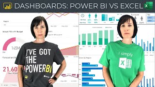
Great tutorial, I’m always looking for inspiration for my dashboards. I’ve noticed the year slicer was not showing full years on this dashboard. I usually put a grey background on my visuals, it softens the white, works for me better.
I think a really helpful segue would be to creating a really clean template file in PowerBI so you set all of the options you want in the template so that you end up with at least a mostly minimalist design. It's a fair amount to cover, though, because of all the options on the various visualization types.
Great video! Very helpful!! Do you by chance have a dashboard design class?? Something that goes more in-depth on the rules or guidelines around design, functionality (when to use slicers vs data validation lists vs VBA), number of kpi to include, choosing a color scheme, advanced functionality like drill through and/or hyperlinks.
Great to hear you found it helpful! There are no hard and fast rules regarding the number of kpis or whether to use Slicers vs data validation or VBA etc. In my Excel Dashboard course I cover design and many different charts/visuals and what chart types suit different types of data. The idea is to equip you with the skills to enable you to build dashboards for any type of data. For more information please see my course page here: www.myonlinetraininghub.com/excel-dashboard-course
Definitely helpful tips as ever, but I would say that the white background and bright text is hard to look at for me. I much prefer a darker background if using white or pale text. (not sure if that's just me!?)
Parabéns Mynda! você é incrível. Eu, moro no Rio de Janeiro "Brasil" Como não tenho muito conhecimento em English sempre fico criando dashboards com sua própria base de dados para melhorar meu conhecimento...Já aprendi muitas coisas com você e só tenho a agradecer por compartilhar seu conhecimento. Se possível você tem algum site onde eu consigo baixar os arquivos em Português? Obrigado
hi dear , thanks for ur inspiring video. i have a problem of inserting text into a text box by linking formula . half of the text get cut due to character limit.....is there any method to pass this character limit in text box ?
Thank you. Another great video. I personally like a softer white on the charts and a light grey for any padding. Do you have any feedback on a softer white than the white which was displayed on the dashboard in your video.
Hi, I don’t think I’ve seen you cover what I experienced recently. I was saw a pivot table with a slightly duplicate Field Name that did not appear in the table . For example CookiesJar and CookieJar2 were both field names but CookiesJar2 was not in the table. I realized the person used Group Selection on CookieJar then named Group2 CookieJar2. I also realized this was great until I added more data to the table and notice some data in CJ2 now needed to be in CJ. I hope my description is clear. If so, is there a way to add and remove data from the grouping selection without affecting previous grouping? (Not dates it regular text data)
With PivotTables you can add a field to the PivotTable twice, or more. When you do this, each additional column gets a number appended to it. Therefore, CookieJar2 is simply the CookieJar column added a second time. Often we do this so we can see the data aggregated differently in each column e.g. one summing the values and another showing the average.
great stuff as ever, thank you. I'm wondering is the a way to get excel to generate an automated email if a certain criteria is reached. For instance my Workplan counts down days until a deadline is reached, I have it set to change to Red when a deadline is reached but would be interested if there is a way of generating a email (or a calendar item)? Don't know if either of these are possible but if it is thought you may know. Simon
Here is a tutorial on using VBA to automatically email: www.myonlinetraininghub.com/vba-to-create-pdf-from-excel-worksheet-then-email-it-with-outlook That said, you might want to check out Power Automate too.
hii. Love your work :) Quick question, is there a way of formatting a cell colour based on to cells with the same value, example.. if E4 and F4 both 'PASS' then A4 will conditional format to green colour.? I have tried many ways but i cannot seem to get it working :/ Thanks In advance
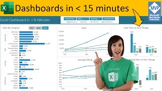
That's because I zoomed out on the dashboard to record the video and they became compressed. When viewed at full size they aren't truncated like tat. You can see the dashboard here: ruclips.net/video/TK0CJBaqvnY/видео.html


I really appreciate the work you do to help us, improving our skills
It's my pleasure 😊
The ONLY excel channel i watch...thank you
Wow, thanks Larry! 🥰
Great tutorial, I’m always looking for inspiration for my dashboards. I’ve noticed the year slicer was not showing full years on this dashboard. I usually put a grey background on my visuals, it softens the white, works for me better.
Nice tip to use grey background 🙏
I think a really helpful segue would be to creating a really clean template file in PowerBI so you set all of the options you want in the template so that you end up with at least a mostly minimalist design. It's a fair amount to cover, though, because of all the options on the various visualization types.
Nice idea, Pieter!
Hi Mynda. More great tips and advice! Thanks for making us all better at EXCEL a day at a time. Thumbs up!!
You are most welcome, Wayne!
Great video! Very helpful!! Do you by chance have a dashboard design class?? Something that goes more in-depth on the rules or guidelines around design, functionality (when to use slicers vs data validation lists vs VBA), number of kpi to include, choosing a color scheme, advanced functionality like drill through and/or hyperlinks.
Great to hear you found it helpful! There are no hard and fast rules regarding the number of kpis or whether to use Slicers vs data validation or VBA etc. In my Excel Dashboard course I cover design and many different charts/visuals and what chart types suit different types of data. The idea is to equip you with the skills to enable you to build dashboards for any type of data. For more information please see my course page here: www.myonlinetraininghub.com/excel-dashboard-course
Brilliantly explained as usual
Thank you for your efforts
So nice of you, Mohamed!
Excellent advice! Thank you!
Thanks, Aubrey!
Great Insights !!
You made it visually rich !!
Glad you liked it!
Thank you Mynda for these nice tips! Always find value addition whenever I watch your videos! Keep up the great work! 😊👍
Thanks for your support, Vijay!
Helps a lot!!! Thanks a lot Mynda!!!
You're most welcome, Shiffa!
Definitely helpful tips as ever, but I would say that the white background and bright text is hard to look at for me.
I much prefer a darker background if using white or pale text. (not sure if that's just me!?)
I agree, the darker background is easier to read for me.
For accessibility purposes, typically a white background is better, but I think you should go with whatever works best for you.
It's one of your greatest tips. How do you ensure that the shared dashboard dynamically fits the size of the user screen, like PowerPoint and PowerBi?
There's no automated way to do this with Excel.
Very useful and succinct. Thanks
Thanks so much, Seamus!
👌👌👌really helpful
Glad to hear that
Could you please put some videos about Microsoft power apps?
I'll think about it, Hari!
Great tips, thanks Mynda!
Cheers, Chris 😊
Great design tips - will put them to good use straightaway
Great to hear, Mark!
Hi Mynda!Really Great Tips...Thank You :)
Cheers, Darryl! ;😊
The dashboard still seems too bright for my taste. Is darker generally better, or does that make choosing a color scheme more difficult?
For accessibility purposes, typically a white background is better, but I think you should go with whatever works best for you.
You are a legend Mynda!
You're too kind 😊
Mynda you are the best. Thank you
Glad I can help 😊
Parabéns Mynda! você é incrível. Eu, moro no Rio de Janeiro "Brasil" Como não tenho muito conhecimento em English sempre fico criando dashboards com sua própria base de dados para melhorar meu conhecimento...Já aprendi muitas coisas com você e só tenho a agradecer por compartilhar seu conhecimento. Se possível você tem algum site onde eu consigo baixar os arquivos em Português? Obrigado
Obrigado! That's wonderful to hear! I don't have any examples in Portuguese, sorry.
Great tips ! Thanks.
Glad it was helpful, Lorenzo!
You made things be so easy!!!!
Great to hear, Francisco!
hi dear , thanks for ur inspiring video. i have a problem of inserting text into a text box by linking formula . half of the text get cut due to character limit.....is there any method to pass this character limit in text box ?
No, character limits can't be worked around. You could try splitting the text into multiple parts across multiple text boxes.
@@MyOnlineTrainingHub thanks
Thank you. Another great video. I personally like a softer white on the charts and a light grey for any padding. Do you have any feedback on a softer white than the white which was displayed on the dashboard in your video.
Thanks, John! I think a softer white is fine. Contrast is important for accessibility, so as long as you still have strong contrast then that's fine.
very good video.... thank you
Thanks so much, Amrish!
Hi, I don’t think I’ve seen you cover what I experienced recently. I was saw a pivot table with a slightly duplicate Field Name that did not appear in the table . For example CookiesJar and CookieJar2 were both field names but CookiesJar2 was not in the table. I realized the person used Group Selection on CookieJar then named Group2 CookieJar2. I also realized this was great until I added more data to the table and notice some data in CJ2 now needed to be in CJ. I hope my description is clear. If so, is there a way to add and remove data from the grouping selection without affecting previous grouping? (Not dates it regular text data)
With PivotTables you can add a field to the PivotTable twice, or more. When you do this, each additional column gets a number appended to it. Therefore, CookieJar2 is simply the CookieJar column added a second time. Often we do this so we can see the data aggregated differently in each column e.g. one summing the values and another showing the average.
@@MyOnlineTrainingHub both were in Row, that’s why I checked the data table repeatedly because I had only seen grouping on dates
great stuff as ever, thank you. I'm wondering is the a way to get excel to generate an automated email if a certain criteria is reached. For instance my Workplan counts down days until a deadline is reached, I have it set to change to Red when a deadline is reached but would be interested if there is a way of generating a email (or a calendar item)? Don't know if either of these are possible but if it is thought you may know. Simon
You can generate an email with a formula using the hyperlink function which would rely on someone to click on the hyperlink or you can write a macro.
Here is a tutorial on using VBA to automatically email: www.myonlinetraininghub.com/vba-to-create-pdf-from-excel-worksheet-then-email-it-with-outlook
That said, you might want to check out Power Automate too.
hii.
Love your work :)
Quick question, is there a way of formatting a cell colour based on to cells with the same value, example.. if E4 and F4 both 'PASS' then A4 will conditional format to green colour.?
I have tried many ways but i cannot seem to get it working :/
Thanks In advance
Thanks, Scott! You can use Conditional Formatting for highlighting cells: www.myonlinetraininghub.com/excel-conditional-formatting-with-formulas
Good teacher
Thank you! 😃
You are the best.❤️
Glad you liked my video 🙏
Hi i have a question. Is it necessary to have a knowledge of vba before designing a dashboard ?
No, absolutely not. I never use VBA to build dashboards ;-)
RESPECT!!! ❤❤❤❤❤❤
Thanks, Eduard!
There are four slice buttons named the same "20 ...".
I think the ... is because there is not enough place, and it would be years like 2019 etc, but I'm not sure.
That's because I zoomed out on the dashboard to record the video and they became compressed. When viewed at full size they aren't truncated like tat. You can see the dashboard here: ruclips.net/video/TK0CJBaqvnY/видео.html
Wow excel like powerbi
:-) glad you liked it.
I simply EXCEL ilu u
Thank you Mynda for these nice tips! Always find value addition whenever I watch your videos! Keep up the great work! 😊👍
You are most welcome!