Stylish Butterfly Chart (Version-1)

HTML-код
- Опубликовано: 7 дек 2018
- #ButterflyChart #ComparisonChart #PK’sChart
Hello Friends,
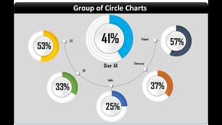
In this video you will learn how to create a beautiful and stylish Butterfly Chart. This is version-1 this Stylish butterfly Chart.
Please download this excel file from below given link:
www.pk-anexcelexpert.com/styl...
See our Excel Products:
www.pk-anexcelexpert.com/prod...
Visit to learn more:
Chart and Visualizations: www.pk-anexcelexpert.com/cate...
VBA Course: www.pk-anexcelexpert.com/vba/
Download useful Templates: www.pk-anexcelexpert.com/cate...
Dashboards: www.pk-anexcelexpert.com/exce...
Watch the best info-graphics and dynamic charts from below link:
• Dynamic Graphs
Learn and free download best excel Dashboard template:
• Excel Dashboards
Learn Step by Step VBA:
• VBA Tutorial
Website:
www.PK-AnExcelExpert.com
Facebook:
/ pkanexcelexpert
Telegram:
t.me/joinchat/AAAAAE2OnviiEk5...
Twitter:
/ priyendra_kumar
Pinterest:
/ pkanexcelexpert
Send me your queries on telegram:
@PKanExcelExpert


I can't thank you enough for these wonderful presentations. I made all my PPTs infographics with your videos. May God bless you sir🙏
Glad you like them!
Thanks for sharing such a beautiful video
Thanks for your valuable feedback
Is a good video!!! Thank you for your contribution.
Thanks for your valuable feedback
Your Channel is ideal for charts
Thanks for your valuable feedback
Thanks for all the time
Pk's charts are best
Great creativity...awesome sir 👏👏👏👏
Thanks for your valuable feedback
Appreciated Sir.👍
Thanks for your valuable feedback
Hello Sir, All your lessons are excellent. I've to know that these charts can be linked to Pivot table dynamically or not?
अद्भुत !
Thanks for your valuable feedback
Good work
It would be better if u use two colors say, red and blue. So whichever team is higher shall get blue color and the other one get red
Awesome.
Thanks for your valuable feedback
awsome stuff
Thanks for your valuable feedback
Dear PK, could you tell us the short cut you used to modify KPI-1 to KPI-5. Thank you so much
Thanks for the informative video. If the kpi values change will the chart automatically reflect the new values without losing its formatting? I want to create a last 6 months value chart, updated every 3 months. Thanks
Good Sir....................
Thanks for your valuable feedback
perfect
Thanks for your valuable feedback
best sir...
Thanks for your valuable feedback
Is a good video and Thank you for everything Is it possible to upload this file to benefit all subscribers to the channel ? and finally thank you
Hi sir ,Could you you please explain the logics behind support coulmns please
I need to add target line on both sides…can you help with that please
super film
Thanks for your valuable feedback
Excellent tutorial…thank you so much….I want to put conditional formatting on chart bars…which means colour of chart bar should change basis achievement (example above 50% should reflect green ….above 30% should reflect in yellow and below 30% should reflect in red colour..please help out
Salam Dear Sir....
ek aisi video banawo jo formulas most important office mein use hoti ho os formulas ki video banawo sat mein samja bi dy woh sab formulas jo office mein use hoti ho ms excel ki video jetni lambi ho parwa nhi k step step samjha bi dy bari mehrabani hogi..................
Dear sir,
pls slove my question
excel vba userform in date search update and update date automatically transfer to sheet 2
why you use kpe name size...that type of help
Tornado chart kaise bnate h ?