Dynamic Comparison in Butterfly Chart

HTML-код
- Опубликовано: 30 ноя 2024
- #DynamicChart #FormControl
Hello Friends,
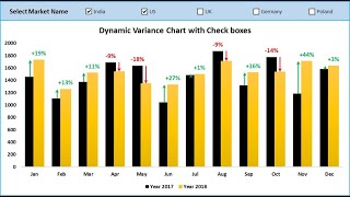
In this video, you will learn how to create a Dynamic Comparison in Butterfly Chart in Microsoft Excel. Dynamic Comparison in Butterfly Chart is useful when you want to compare the Sales or any other parameter for two employees or two Teams for multiple dates. We have used Form Control Combo boxes to select the Employee name to compare the Sales. To make the dynamic and rolling dates, we have used Form Control Scroll Bar.
Download the practice file from the below link:
www.pk-anexcel...
Watch the video for Comparative Analysis Dashboard in Power BI:
• Comparative Analysis D...
Power Pivot tutorials:
• Power Pivot
Learn and download our interactive Excel dashboards free of cost-
• Excel Dashboards
Download the Free Project Management Dashboard
www.pk-anexcel...
Download the Calendar Control in VBA from below link
www.pk-anexcel...
Download our free Excel utility Tool and improve your productivity:
www.pk-anexcel...
See our Excel Products:
www.pk-anexcel...
Visit to learn more:
Chart and Visualizations: www.pk-anexcel...
VBA Course: www.pk-anexcel...
Download useful Templates: www.pk-anexcel...
Dashboards: www.pk-anexcel...
Watch the best info-graphics and dynamic charts from below link:
• Dynamic Graphs
Learn and free download best excel Dashboard template:
• Excel Dashboards
Learn Step by Step VBA:
• VBA Tutorial
Website:
WWW.PK-AnExcel...
Facebook:
/ pkanexcelexpert
Telegram:
t.me/joinchat/...
Pinterest:
/ pkanexcelexpert
Visit our Amazon Store
www.amazon.in/...


![Kodak Black - Versatile 4 [Official Video]](http://i.ytimg.com/vi/VcP_1Ua__vY/mqdefault.jpg)


PK thank you for showing how to make that beautiful butterfly chart. That is a nice visual comparison between 2 employees, and it was fun to learn. Thank you!
You're work is amazing! Thank you!!
Most welcome
Excellent and very well explained for everyone’s immediate use thanks a lot pk ji
Thanks for your valuable feedback
One word - SUPERB!!!
Thanks for your valuable feedback
Master pk, it is a pleasure to see your videos, it is great what you share with us.
Greetings from Mexico.
Thanks for your valuable feedback
PK Dada I am your big time Fan.
Thanks a lot
Thank you so much PK after long time. Worth for watching 15 minutes...
Thanks for your valuable feedback
Waiting for your video, since from few days your videos not seen... great sir
Thanks a lot
Thank you so much PK. Its awesome.. keep sharing more n more tips n tricks 👍
Thanks for your valuable feedback
I love you PK. Learned a lot from you love - phil ❤️
Thanks a lot 🙏
You are a star....
Thanks for your valuable feedback
Thank you Sir. Always a great learning time.
Thanks for your valuable feedback
Excellent job PK. Good visualization after long time. Keep it up
Thanks for your valuable feedback
Very nice explain Sir .!!
Thanks for your valuable feedback
Superb work sir
Please school management in Excel and vba
Thanks, very useful!
Thanks for your valuable feedback
Superb PK SIR
Thanks for your valuable feedback
Another great video PK, I have adapted it for my own use. The only issue is that the center section (white area) does not stay central and it starts to look lop sided. Very nice looking chart though and I have to admit, I have stolen a few ideas from you over the recent months!
PK's charts are as artistic as they are functional. I also enjoy his work very much. If you want the white area to stay centered change the Left Padding column to =MAX(Data!$B$2:$K$49)-B2; or if you know the maximum value for each day (say 100), then Left Padding to =100-B2 and copy down.
Adorei. Muito obrigada (I loved it. Thank you) 👏
Thanks for your valuable feedback
Your explanation are good but very lengthy...suggest please drastically shorten it for more acceptablity
Super
Thanks
Plz u can do it in user form or no
Sir please make next version pk utility add-in