How to Visualize Survey Data on a Likert Scale and Include a Net Promoter Score

HTML-код
- Опубликовано: 21 авг 2024
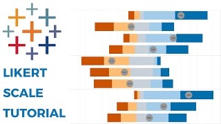
- We've all answered Likert scale questions. These are questions like "How likely are you to recommend our product?" and they are typically on a five point scale (e.g., from not at all to very highly likely).
In this video, I show you how to visualize Likert scale data and how to include a Net Promoter Score (NPS). To get the data that I used, simply download the workbook and unzip it. You will then see a folder named "Data".
Useful links:
1. What is a Likert Scale? bit.ly/LikertSu...
2. What is a Net Promoter Score? www.netpromote...
3. Download the workbook - www.vizwiz.com...


THIS is a great viz!! I do a lot of work with Patient Survey results and THIS shows totals, percentages, and how overall “feel” of a doctor’s performance. Thanks soo much for posting this video!!
Great video. Being able to add things like NPS as a layer, is one of the reasons I really like Tableau, and miss using it regularly.
However, at work I only get to use Power BI. I am seeing if I can recreate the majority of these steps on that platform.
Thanks again.
Thanks for sharing!
Thanks a ton Andy. How did you fix the tooltip issue? Also can you please tell me that why did we had to create two (a positive and a negative) calculations for 2 (the middle one)? We could have done with a single one.
You can see how I fixed the tooltip in the workbook. Just a couple simple calcs. As for the middle, you have to use two calcs so that it splits evenly on the positive and negative side since it's neutral.
Great Viz Thank you Andy
Great video Andy!
Quick question: Instead of % from NPS calculation, can I make that into a weighted rating? Like a star rating of sorts?
Yes, absolutely!
Thanks Andy for all these wonderful and helpful tips. I learn a lot from you. Also can u pls explain how to colour between the overlapping lines. That would be great help.
I included a link in the description.
Thanks Andy. Great video. How do we get the bars to display % of each measure name instead of Distinct Count.
You'll need to calculcate that instead.
Great video! I now have the visual (thanks to this super helpful video!) I’m trying to add labels with the percentages. Any advice on how to do write the calculated field for the percentages? When I use Analysis -> Percentage of, it defaults to 100% and shifts everything to a traditional stacked bar. I would love to include both the distinct count and percentages per response for each Likert Scale option, but also have the labels on the visualization for each response type showing the percentages.
It sounds like you are using the correct table calculation. You probably need to adjust the settings. For example, in the view I have, when I go into the table calc settings, I choose Specific Dimension, then in the box below that, check the box that is the field you have on color, and uncheck the box for the field that’s on your rows.
Here’s a table calculation overview video that will help too. ruclips.net/video/XPYtenDXCdI/видео.html
Great Video Andy.. Thank you, My doubt is how to do Reverse Coding of Likert Scale Questions?
You can simply reverse the scales and adjust the weighting.
Hi Andy ! This is great. I have a question. I am working on a survey project for an organization and the view should show each manager score and their downline but the data set aggregates the score in tableau but I don't want an aggregation, I want the direct score of each employee to show in hierarchy. managers score is not an aggregation of downline. How do I go about this? I want a view where manager clicks on his name and will be able to see direct line score.
At what point would you define a score as something to be a concern? Any time it is negative? Or is there a score like 20 or 30% that a business should try to remain above?
That’s impossible for me to answer. It’s up to the people using the data to determine what the threshold should be.
thank you for sharing this great vedio,it's very helpful. how did you fix the tooltip to show positive measure value and combine the 2 grey bar
I believe it’s a reference line. I also think I show that in the video if you watch the whole video. You can also download the workbook to see how I did it.
Thanks so much - unfortunately, I can't do the first step (3:24) of converting the value (measure) to a dimension; I've disaggregated it to see if that will work. Any help is appreciated!
Great video Andy! I'm currently doing a project and my percentages are showing as -3348% etc. My NPS at the top goes from -4000% to 10000%...I can't figure out my issue...
It sounds like you're not aggregating the data properly.
Great Video....exactly what I'm looking for.
I when to the site to download the workbook, but I cant find the download link.
I'm also looking for the calcs to fix the Tool Tips.
Thanks again.
Click on the download button on the toolbar at the bottom of the viz.
@@vizwiz It's been about an year and half since I followed this technique, and my organization LOVES IT!
But they can't leave well enough alone. I've been tasked with doing another dashboard that only shows the lowest 3 scoring questions. Is there way to do this? if so, can you give me some pointers.... Thanks!
(FyI... we have 4 departments, and I'm hoping to fit all 4 visuals on one dashboard)
@@rpremaza you can filter by the rank of the NPS. Something like RANK(AVG(NPS))
How would you assign the response values with a likert scale of Strongly Disagree, Disagree, Neutral, Agree, Strongly agree?
Would the disagree’s be negative?
You could assign them as -2,-1,0,1,2 or a 1-5 scale. Either works.
@@vizwiz that’s exactly how I did it and this worked perfectly. Thanks!
Hello, you duplicated the numbers 0, 1, 3, 4, 5. My NPS scale is on 10 (1-6 = detractors, 7-8 = passive and 9-10 = promoters.). Do I have to duplicate 1 to 10 ?
Yes
This is great, thank you! With 5-point Likert scale data, isn't it more common to attribute #1, #2, & #3 as the Detractors and #5 as the Promoters? Or, is this completely up to the discretion of the researcher?
I have seen it that way sometimes, but rarely.