Excel Quick Analysis- How to present Table and Chart together

HTML-код
- Опубликовано: 12 окт 2024
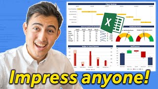
- #howto #excel - this video explains how to modify a table for presentation of data and how to combine a table and a chart together in a page for presentation.


I love how you broke down the steps. Now I can impress my team with better visuals!
Yeee, go and help your team out. Glad you find it helpful
Thanks for this! I struggled with presenting data, but now I feel more confident.
I am glad it could help
Fantastic video! The Quick Analysis tool is a game changer for my Excel projects.
It really is!
This is super helpful! Combining tables and charts really enhances clarity.
Glad it was helpful!
Excellent explanation! The visual examples made it easy to follow along.
Glad it was helpful!❤
Thanks for this! I struggled with presenting data, but now I feel more confident.
Glad it helped!