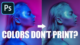
WEIRD Photoshop Trick Fixes Saturation

HTML-код
- Опубликовано: 7 фев 2025
- Download the Action: f64.co/upside-...
How to use the Inverted adjustment Layer to fix over-saturation
Have you ever seen Stranger Things on Netflix? It is one of my wife and I's favorite shows to watch when the kids go to bed. We have far surpassed all the episodes and are longing for the next season. We are babies of the '80s after all.
One thing I noticed in that highly addictive Netflix show is how much it can teach us about photo post-production. There is this alternate universe in the show, a very ugly place, that routinely finds itself seeping into the ordinary world. That got me thinking about the Invert Adjustment Layer in Photoshop.
When you first use it, it can be an ugly place, and quite frankly it does nothing fantastic to portraits, babies, or beautiful landscapes. However, there is important data in that upside-down world and if we can learn to harness it, we can unlock some incredible knowledge about our photos.
The Inverted Adjustment Layer flips the colors to their complement. That’s all it does when we see it on the Color Wheel, it is evident, but when we see it on our image, it just looks like a mess! However, that data can be used to our advantage!
In this tutorial, I am going to show you how to use the Inverted Adjustment layer set to the Color Blend Mode with an Opacity of 50% to assess whether or not our image is oversaturated! It is a pretty powerful technique to evaluate your colors, but don’t let that keep you from making artistic color decisions either!


🤯🤯🤯 that is pure genius! So glad Netflix led you to discover this mindblowing tool! Thanks so much for sharing and thanks for the action 😍
Hey Blake I love this technique for identifying and neutralizing over-saturation. It struck me as I was trying it out, however, that it may have a potentially more powerful application in 'enhancing' saturation selectively but with more precision than just throwing in Hue/Sat layer and eyeballing it. By using the inverted adjustment layer in colour mode to first neutralize over saturation, you can then use it to increase a targeted colour until it's 'just' pushing into oversaturation (or more if you want). I've already tried it a couple of times and I think it could be a real tool for colour special effects.
My brain just about exploded, but great info. I liked the way you tied in color theory rather than just have us move sliders. Great job!
Thanks! I know it is a lot to take in, but that Color Theory stuff is probably the most important part of the lesson! No way I could leave it out :)
I am always amazed at your exploration and experimentation in PhotoShop. As always, thank you for another effective tool we can add to our post processing toolbox. And I cannot leave this comment without also thanking you for your comprehensive educating style.
Thanks so much! I really appreciate your feedback. It really is my pleasure, I love sharing this stuff!
Blake, I was playing around with one of my images with Invert adj layer set to color and reduced to 50% opacity to check for over-saturation in one of my images. I added a hue/sat adj layer on top of that and increased the global saturation of master channel to about +75-80 within the settings for the hue/sat adj layer settings-NO change to the apparent black and white apperaing image. When I went back to the Invert adj layer and lowered the opacity BELOW 50% something interesting happens, the saturation starts to come back, and apparently a little sharper or a lil added clarity to it. Somewhere about 43-38%opacity, depending on your image. If some colors appear to saturated goto the different color channels in the hue/sat adj layer and modify them. So background image layer>Invert adj layer set to Color blend mode (opacity reduced to 50%)>Hue sat layer global saturation set to +75-80. Seems like it makes the image POP a little more, very cool effect. I would guess that it is placing colors back over the B&W image??
Fascinating info, you have a great understanding of colour and the use of photoshop especially. I would not have thought of using an inverse layer like that. Thank you for sharing some very practical and useful insights Blake.
I just do a lot of experimenting :) :)
WOW That was really helpful. Now I have this as as a script to check the saturation-level in my daily editing picture routines. Many thanks!
Super helpful video, i have been enamoured with adjustment check layers lately as i do a fair amount of compositing
I know the feeling! Always good to have a second set of eyes when ours fail us!
Another great one, thanks Blake for sharing your expertise!
Thanks for share the trick ! I have new monitor and really messed up my color grading lately especially with over saturation problems .. hope with this trick it's gonna help me until I can replace my monitor
Thanks, pretty interesting stuff. You have some great tutorials. My biggest challenge is remembering all of the information and trying to figure out what to use when!
you and me both :)
GREAT GREAT GREAT VIDEO! Very hard to judge color and images sometimes as its pretty much relative!
I know! Even with experience it can be hard to judge, especially when we are so close to it.
Very interesting. Thank you very much for sharing such information and technique
My pleasure!
Exceptional training video, thank you for your time and expertise. And the action as well.
Always my pleasure 😁
Looks very exciting!!!
Fantastic video Blake, thank you, been photoshopping a long time, just found out about your channel from the two videos you did with Sean Bagshaw. Learned so much from your videos. Superb content.
Pretty fun tutorial with very useful information! Thanks!
:) glad you liked it!
A very cool tip Blake....very useful. Thanks again
My pleasure! Thanks for watching!
i think you can do something similar for light. if i remeber right.. 🤔🤔 Great video!
Brilliant episode Blake! Thank you!
:) Thanks!
That's genius, thanks brother.
My pleasure 😁
Wow Blake - you really do have a firm grasp on color and its relation to the eye....keep up the great videos, (even though some go WAAAY over my head) .....but, ill get there some day :)
Very cool.Thanks as always and also for sharing your actions.
My pleasure!
Thank you. I exported your procedure to Affinity Photo successfully.
great video and tip, its such a big deal i almost mute colours to avoid this.
Oh no! Don't do that :) You are an artist! Express yourself with color... just do it with tact, lol.
That was helpful Blake, thank you.
Excellent Video!!... Very Useful!!.. Thanks!
My pleasure! Thanks for watching!
So why 50% opacity for the inverted layer with colour blend mode? Sorry, didn't quite get that.
Always learning!!
If you add an invert layer and change it to 50% it will be a greyscale photo, changing it to the color blend mode allows the luminance to show through from below.
Okay so I watched this video. It's terrific like most of yours. But then I had to check out Stranger Things. Holy Crap. I'm hooked.
Great show!
@@f64Academy Between playing with Photoshop and watching Stranger Things I am losing sleep. :-)
Thank you, that was great.
You're very welcome!
WOW !!!!! Thanks !
My pleasure! So glad to get that reaction.
Exellent, Blake.
:) thanks!
Wow Blake....that was SUPER helpful - thank you :)
Thanks! My pleasure 😁
useful, thanks
How about putting the f64 color wheel on a tee shirt? I will buy one for sure
Oooooh I like that :)
@@f64Academy That way when I am away from my computer where the wheel is up on the wall I can always look down or in a mirror and I'm good to go
i stared @ the image with the Cyan too long now my eyes are messed up lol
My bad! Lol
Useful stuff.
Thanks!
Getting back...
great info
I appreciate it.
You can also create a saturation mask. I can tell you how.
ویری نائس
Interestingly this technique doesn't work at all in lab-color-mode. Anyone who can explain why that is?
Lots of things are different in Lab, some adjustment layers are not available.
Gr8 tutorial as usual. Thanks. I'll make a tutorial in Brazilian portuguese, if you don't mind, based on yours, given the due credits.
In would prefer you don't. I spent days producing this content, I prefer it to remain as it is without being copied.
Chill out! Cool to know you wouldn´t allow it, although I hadn't asked for permission, I just said I would do one slightly based on yours and that it would be in my language because I think that knowledge has to be shared. You see, the thing about knowledge is that it doesn't belong to you anymore the minute you've given it to the world or a student would never become a teacher just because a teacher taught him/her. But please don't worry, I won't do it, ok? I still think you are one of the greatest photoshop instructors out there. I wish you all the best and that the gods of knowledge continue blessing you with wisdom and happiness. Thank you very much for everything I've learned from you. I'm still a faithfull subscriber to your chennel. See you! :)
👍
Interesting stuff, but are you unwell? Your skin has gone a mighty funny color... or is my monitor dying on me?
Could be a white balance issue on my part :) Not important compared to the content, haha