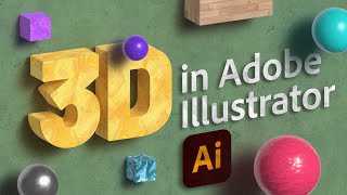
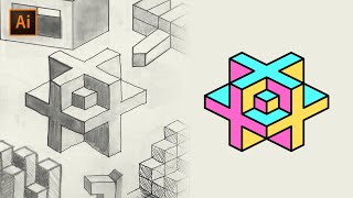
3D Isometric Text Effect in Adobe Illustrator
HTML-код
- Опубликовано: 16 сен 2024
- CREATE THIS COOL TEXT EFFECT FOR YOUR NEXT PROJECT! | Learn to use the Pen Tool and Smart Guides and texture to create this isometric style text effect in Adobe Illustrator
💰 Buy the Photoshop Course and Support the Channel → bit.ly/28NuwFy
🏆 My Instagram: / tutvid
🎯 Subscribe for Daily Tutorials → goo.gl/DN4Nln
-
In this Adobe Illustrator tutorial, we’ll build a simple text effect and use the Pen Tool to create inner and outer edges for our letters and then use a series of colors, gradients, and blend modes to make flat text appear to transform into fully 3-dimensional isometric typography that looks awesome in almost any color! You’ll learn about the power of Smart Guides, Masking, Vector Grain Effects, Gradients, Brushing, Blend Modes, and much more!
⚡️ written tutorial here: bit.ly/2B63NDL
INSTAGRAM: / tutvid
TWITTER: / tutvid
FACEBOOK: / tutvid
SNAPCHAT: tutvid.com
tutvid is a RUclips channel dedicated to creating the best Adobe Photoshop, Premiere Pro, Lightroom, and Illustrator tutorials. My goal is to create the best, most informative, and entertaining tutorials on the web. If you enjoy my videos, the best way to support what I do here is to purchase my course linked above or simply subscribe to the RUclips channel by pressing the red button.
✉️ business inquiries: nate@tutvid.com
-  Хобби
Хобби


Your videos have taught me soo much and helped improve my videos! thank you :)
Thanks! Glad you enjoyed the video! 👌
I always enjoy your videos!
Thanks, much appreciated.
an awesome tutorial
Best tutorials tbh
Really appreciate the kind words! 👍
awesome tutorial as always, I just wanted to ask you a question about your video. I would appreciate if you tell me what software you use for your recording (My English is short, sorry )
I use an app called Screenflow (it's Mac only, though)
Nice one! It kínda bothers me that some of the angles doesn't add up :) Like the top right of the Z (the vertical line/angle). In both the reference and your work. Not a biggie though I guess.
I went with the easy "fix" of just making a straight up/down line. I maybe should have talked a little more about perspective and making it better. Thanks for the comment! 🍻
can you please make a video on how to mask an image in multiple vector shape in illustrator? I can mask an image inside a text before creating outline . . . but i can't if i try after creating outline the text and then try masking the image. I tried to mask one image into multiple vector shapes together but it don't work. Waiting for your suggestion.
thank You bro..
I have a problem. The "snap to point" option is activated yet the pen tool does only snap to the anchor points and not to the path intersections. Could someone help me? Thanks :)
Gooooddddd !!! thanks
Thanks a million! 👍
helpful one
Glad you enjoyed it! Thanks for watching!
Nice video Sir
Thanks, rahul! 🍻
Cool
Thank you very much 😃
I can't help but stare aghast at those two straight vertical corners on the Z and how wrong they look, it reminds me of my own childhood attempts to recreate the optical illusions of M C Escher... and not in a good way.
I went with the simple/fast straight up/down line. Maybe I could have spent more time talking about the perspective of the letters. I was too excited about sharing the rest of the design, I guess 😂
Seems fair, but the odd part is that clarification of "We're not going to go corner to corner..." at 07:00 - My gut feeling is that it would have been faster/simpler/easier sticking with consistency and not needing to add that bit!
IF the letter is o how do you go about it
You will need to offset a duplicate of the letter and use the Pathfinder's Divide feature to create the exact shape you need to the edge(s)
Hope that helps!
Nate - great video as always. Was wondering if you could do a tut on how to create the text effect here - www.eastendprints.co.uk/products/genius.html
Thx
It's looking very difficult..!
I can be bit :D
the perspective is wrong