CSS Media Queries | Mastering of Web development

HTML-код
- Опубликовано: 26 май 2024
- Summary
🎥 CSS Media Queries
Highlights
- Understand the purpose of media queries: Adapt website appearance to different screen sizes 📱
- Use media queries to set different styles for desktop, tablet, and mobile devices 💻
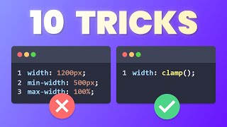
- Specify minimum and maximum screen widths to control when styles are applied 📐
- Override default styles with media queries to customize the UI for each screen size 🎨
- Choose between a desktop-first or mobile-first approach to prioritise specific screen sizes 📱💻
Telegram Link
t.me/techshareskk
Instagram
/ tech.share.skk
Playlist links
Angular Project
• User & Notes Managemen...
Angular Tutorials Zero to Hero
• Angular Tutorials
Angular Unit Testing
• Angular Unit Testing
For Angular Reactive forms
• Angular Reactive forms
For Javascript Objects Series
• Javascript Objects
For Concepts of JavaScript
• Concepts of JavaScript
For Projects and POC
• Projects and POC
#webdevelopment #html #css #javascript #angular  Наука
Наука