Typography sizing and line height in web design

HTML-код
- Опубликовано: 29 июн 2024
- Updated version of this video - • How to set up your typ...
In this video we look at how to quickly set up our typography in Figma for a very easy and efficient workflow in Figma. These tips can of course be applied to any design software that you like to use - I’m just loving Figma right now.
Thank you so much for checking out my tutorial! Please subscribe for more design tutorials - I’ll be covering Animation, HTML email design, HTML email code, Web Design and Web Development with Webflow.
Links discussed in video:
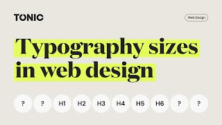
Type Scales:
type-scale.com/
Figma Lorem Ipsum plugin:
www.figma.com/community/plugi...
Follow me:
Website: www.tompiggott.co.uk/
Newsletter: www.tompiggott.co.uk/contact#...
Instagram: / tompiggottdesign
Facebook: / tompiggottdesign
Dribbble: dribbble.com/tompiggott/
LinkedIn: / tompiggottdesign
Music: “Still Standing” by Anno Domini Beats


![ian - Fit Check (Feat. VonOff1700) [Official Music Video]](http://i.ytimg.com/vi/sDGWDBg45Dw/mqdefault.jpg)


Updated video here for you guys - ruclips.net/video/eW2-ghXuYC8/видео.html
Excellently super clear instructions, thanks so much Tom! From a print designer slowly going digital here in Sydney Australia : )
Cheers, Tom. I've also been looking for a simple formula for calculating line-height. Thanks a lot, bro
This is EXACTLY what I was looking for!! Thank you!!
I love your content. I hope you have a video about how to pick typography for a project. How to build that vocabulary for typography.
So true about the font size! Significant issue which rarely gets considered.
This is really useful, thank you for showing this really useful tip!
I watched almost 6 videos on this topics but wasn't able to find tha answer, but you did that, you just got a new subscriber, keep rocking man❤
Thank you Tom, learnt a lot, i would love the same video about color styles
Yes, I second that 👌
I am making a style guide for a my business for the first time and this really helped thankyou
This helps a lot for starting my career. New subscriber.
Thank you Tom! This was helpful
You are a hero Tom. This video practically saved my life. Subbed!!!
Haha well that’s great! We have a newer version of this video that you might find more useful - ruclips.net/video/eW2-ghXuYC8/видео.html
Thanks a lot Sir. That was very helpful.
Tom is amazing.
I love your video. It helped me solve part of my problem
Very nice content! A heartfel thank from a newbie :D
The ratio of font style
thank you tom I have been looking for a solution to fix the text thank you
Thanks, Tom,,, Very useful tip
So great video. Thank a lot. Its very useful for my studying.
instantly subscribed! I landed on a goldmine
Tom is amazing
Thanks for this site
Thanks for the video =)
Who the hell disliked this video??? Thank you much, very well explained!
Very informative, please tell us how do you use components in Figma?
nice content
Thank you
Maybe it is "looks rubbish" but you just helped a lot with. Subscribed. Thanks
For mobile you should design on an 8 points grid, faster, sharper, consistent
Amazing video, thanks a lot. Question on using type scales across media though, should I be using the same type scale across my print and digital designs? For my brand, I have a lot of print designs (packaging, stationary, etc...) in addition to the digital stuff (website, digital marketing). Should I be using the same type scale between print and digital assets?
Good question. Not necessarily, but it could be very useful to keep all your work uniform across the board. Why not give it a go!
Thanks for the video Tom! Just one question, how do you determine the spacing between the headings and the body text? Or between different headings?
Hey Moritz. It’s down to preference and what you’re designing really. I tend to design to an 8 px grid so as long as the gap is divisible by 8 you’re generally good. Completely up to you though. Whatever works for balance!
@@wearestudiotonic Same here. At times i had to use a 4px spacing, but i generally try to keep it at 16px, just for the design to breathe more, but 8 is the standard i guess.
This is a great video, thank you. I have a question for you Tom - when choosing h tag font sizes - is it best to always use the scale directly above or below or can you skip a scale and go bigger or small by 2 scales?
For example...base 16px using major third...
48px > 39px > 31px > 25px > 20px... and so on
If h1 is 48px - would using 31px work for h2 or would you advise always to use the scale directly below, which would be 39px in this example?
James Kelly I would probably advise to keep to the scale. If those sizes aren’t quite working for your designs you could either try a different scale or just make up your own. They’re essentially just good guidelines but sometimes a design needs to be a bit more custom so feel free to make it your own!
@@wearestudiotonic great advice Tom, thanks!
@@wearestudiotonic how it work make own scale? what theorie is behind?
Great Tutorial. I have a question. Is the same scale used for mobile and table?
In web design, I don’t do that. I use this as a base for desktop, then I either keep body copy the same size, or maybe increase it a little, then I decrease my headers by about 70-80%. It sort of depends on what you’re designing and who it’s for. Hope that helps!
you can use percent for leading. example: “120%”
Please post more tutorials in webdesigsn
Dam good video
Nice
What’s another option for the Lorem Ipsum plugin cause I can’t find it in my plug-ins community
Hi Tom. can you explain how to use 2 fonts together? Abput harmony of fonts?. How to choose 2 fonts which can harmony to each other?
Hey Bill. I've not been posting much on here because I've been setting up my new design studio. We will be launching a new channel for the new studio in the next couple of months and this is one of the videos my business parter, who specialises in branding, will be producing. I'll put out some updates on this channel when the new one is up and running.
this works also to mobile design?? I mean, is there another web to guide like type-scale to work in my mobile - desktop tipografy work?
These fonts for desktop right? Then what about mobile font sizes? Pls tell me
Yeah for desktop. Then it’s up to you about the other breakpoints, and depends on how many breakpoints you would be developing to. I find a good general rule is to reduce to about 70% of its desktop size on mobile.
@@wearestudiotonic thank you so much,😍
😍😍😍😍
really super, upload design system
I always have a problem implementing my 1440px frame width design to 1920px width browser. Either fonts and other elements seems kinda small, when I have fixed container width with big margins or I have to scale whole content and it is too large. Do you have any tips for designing/implementing such resolution?
Maybe a wireframing guide? 🤔🤔
@iconic I often have the same problem. I think it just comes with practice. What you need to think about is how many people in your target audience will have massive screens. If a lot of them do, then maybe don’t design to a max width container and design by % widths instead. So your container is 80% view port width for example. I also try to remember and tell myself that my design will never look perfect across every single screen. Another thing I do is keep a collection of websites I love in a list and then use the inspector to see how they’ve done things. I know this isn’t the most helpful info but hope it helps a little!
Would consider Lunacy a decent tool for professional work?. People rarely talk about it.
Great video but nothing about letter spacing?
Hey Martyn, I’m glad you enjoyed it. We find that letter spacing is really down to branding. But that being said, a good tip it to remove a little bit of space in your first 2-3 headers if they are really big - maybe 1-3px max. Some fonts like inter for example look just a little bit too spaced out at larger sizes.
For desktop as well
nice, but what about spacing between headers and paragraphs?
Good thinking. We’ll put it on the list to make a video about soon!
On a new project, do you always start with the typography and spacing? Is that the first step?
I usually do, but it's up to you really. Sometimes it can be good to design the look of a homepage first without any typography restrictions - perhaps it's a site that needs ridiculously huge headers or something else out of the ordinary. Once you've then got a good design going, you could set up your typography based on that design. Hope that makes sense!
@@wearestudiotonic thanks for the instant response. I was confused because i thought the line height property was set in CSS for the entire HTML document, for the whole project, right, which then affects/dictates how all the UI elements render/sit on a page? And then when you set individual line heights for headers, paragraphs there can be conflicts, in terms of text not sitting very well on the page visually. So is then is there merit in using typographic grid lines of say 16px height in your Figma design file (which i saw people using), on the canvas and try to lay out the page that way, so as to help the developers with the implementation? I hope i am making sense :)
@@aerozg No need to do that. It's very easy for developers to set different properties for each type class. They will set a default type style first to the body tag. This will apply to all type in the project that doesn't have a class applied which would otherwise overwrite this default. Then they would set up a class of H1 and give it a font size, line height, colour, text decoration etc. Then they would do H2, then H3 and so on... Hope that helps
@@wearestudiotonic thanks, this is a broad discussion but to me it's interesting to see different processes by different people. As a designer i tend to first design a homepage "by eye" first, right, without any restrictions, just to brainstorm the look & feel, and then i will apply a more systematic approach, by using a 12 or 16 column vertical grid, and also a horizontal typographic grid of 16px height to help me with all the UI elements spacing, visual hierarchy, rhythm, using white space, margins, padding and so on. A lot of designers that i know don't really understand how & why to do this and they struggle with the layout, because they are designing for a static medium which is their Figma/XD/Sketch canvas, as opposed to the dynamic medium which is the HTML/CSS/JavaScript/React/Angular code. The website lives in code, not in the design tools. That's why the dreaded designer-developer hand-off is still a big issue. Don't get me started about not delivering all the button/link states, empty states, input states and so on .. :)
Cheers!
Thanks for this video Tom. I have questions, how do you scale typography from web design to typography for mobile design?
Second question, If a component is an H4 in web design, does it also have to be an H4 when translated to mobile design?
What if the H4 scale in the mobile design version does not match the layout size requirement, can we replace it with the closest scale even though it is an H5 or H3 mobile?
Third question, Do headings (H1 to H6) have to be the same typeface? Or is it okay to use a different font, for example: H1 to H3 using Lato then H4-H6 using Nunito.
Thanks in advance. I am very confused about this, would be very helpful if you would share your advice. Thank you again !
Hey Ali.
1 - I usually reduce my headings to around 70-80% of their size from mobile landscape.
2 - I actually use a new system now where instead of naming my classes H1, H2 etc, I name them heading--XXL, heading--XL, heading--L, heading--M, heading--S and heading--XS. This way when we build the website, we can add an H1 element, and give it any of the heading sizes we want. The huge benefit of this is that when sticking to the correct HTML set up of only having one H1 on the page, the next heading being an H2, then H3 etc - the headings don't need to get smaller and smaller down the page. We could have an H6 that has a CSS class of heading--XXL for example. This way neither the design nor the HTML suffer.
3 - You're the designer, you can use whatever typefaces you want :) Most of the time my headings are all the same, but sometimes I make the heading--S and XS in the body copy font instead. Depends what the design needs but there's no official rule.
When I get some time I'll make a new video of how we're working over here in Figma these days - show you guys our mini manageable design system that we use for every website.
@@wearestudiotonic Thanks for replying Tom. Regarding the second question, I'm actually a little confused about how it will be applied on the developer side.
Do you also document the desktop and mobile version of the typography scale for design handoff?
I'm currently working on a page that requires a layout with a huge heading size for a marketing page, but on another page (dashboard) it must be different and use a typography scale with a compact size. So, what is your suggestion for separating these heading classes for pages with different needs?
Thanks again Tom!
@@alimahfudli2848 in that case I would probably make another class called heading--JUMBO and make that one massive.
Re handoff - I usually do the development myself, or someone in my team and we've built a template in Webflow that matches our typography system and automatically scales everything down for us through the break points. I know most developers don't have this in place though so I would make a a separate style sheet in Figma to show how the type changes size through the different break points.
Re how it works, in development the developer would code like this for an H1:
Headline text
So the are just telling the browser that this text element is tagged as an H1.
Any CSS classes can be applied to this, so it could be like this:
Headline text
Now the H1 takes on the sizing properties set up in the CSS for the class heading--XXL. Any class can be applied to any element.
So you could also have an H1 with a different class on another page:
Headline text
It can be a good idea to talk to the developer before getting too far ahead and ask how they want it as everyone develops in a different way. Always good to be in the good books with your dev!
What informs how you choose your Scale? Just visual preference?
Yeah, depending on what project it is and what feels right. It’s usually minor or major third for me
How to indent text like this,
"1. Hello this is sample text
for checking"
Did you notice this, I gave space on the second line, I tried this but it didn't work.
Hey - here's how you do that help.figma.com/hc/en-us/articles/360040449773-Create-a-bulleted-list
Can this method be used for any screen design?
Yep. Just adjust your base body copy size depending on the project 👍
@@wearestudiotonic Thank you so much. God bless.
Thank you for this, I was missing the reasoning what influence line-height. Your explanation was on the point.
I especially liked when you explain the differences with very small text and very large text line height and amount of words.
Thanks
Really glad you found it useful! Plenty more videos coming soon.
But how do you translate those sizes to mobile?
Sorry for the late reply. We usually find that reducing the size to 70% is a good way to start. It really depends on the look you’re going for. Make sure you don’t reduce the small headings too much though, if at all. Always good to load up Figma Mirror on your phone to check and see what feels natural.
Yeah, I didn't understand anything you said.