10 Tips For Better Colors In Your Paintings

HTML-код
- Опубликовано: 4 июл 2024
- Get your FREE Color Coaching Guide chipper-knitter-8576.ck.page/...
Take your painting to the next level with my courses!
paint-coach.teachable.com/
Patreon - / paintcoach
Get your FREE Color Mixing Video - chipper-knitter-8576.ck.page/...
www.paintwithpaintcoach.com
Varnish Spray - amzn.to/35e8yPp
MY BRUSH SET - www.rosemaryandco.com/the-pai...
BOOKS I LIKE
Daily Painting by Carol Marine - amzn.to/31VcoLe
Mastering Composition by Ian Roberts - amzn.to/3nB1pPI
Fill Your Oil Paintings with Light & Color - amzn.to/39z7gum
Landscape Painting Inside & Out - amzn.to/3i7rpgy
Alla Prima II - amzn.to/3CH7srt
My Point of View - www.michaelshaneneal.com/stor...
Edgar Payne: The Scenic Journey - amzn.to/3wJrRbn
Composition of Outdoor Painting - amzn.to/3fFeQHM
The War of Art- amzn.to/308h9gN
Carlsons Guide to Landscape Painting - amzn.to/2ZBppWH
Materials I like
Basic level oil paint - amzn.to/3f44Vww
Higher quality oil paint - amzn.to/3f5CkGS
Linen Panel - www.jerrysartarama.com/centur...
Gamsol Paint thinner - amzn.to/3dyJzWf
Chelsea studios non toxic paint thinner - amzn.to/3j3BmO6
Galkyd Lite - amzn.to/2Q1dLCI
Linseed Oil Medium - amzn.to/3o0DLe6
Palette Paper - amzn.to/3nYOXrx
Easel - www.stradaeasel.com/
H Frame Easel - amzn.to/3jWAABK
Canvas Pad - amzn.to/35fMFsW
Stretched Canvas - amzn.to/3dGCvqW
proportional divider - amzn.to/3dkbfP8
Easel Light - amzn.to/3lrHuyI
I Pad holder - amzn.to/38M7vU4
Brush Dip - genevafineart.com/products/br...
Air Purifier - amzn.to/2UAT4wg
Apron - amzn.to/2xn1EGl
Paper Towels - amzn.to/3bclANb
Water Mixable Oils
Cobra - amzn.to/3jLCmVM
Aqua Duo - amzn.to/3lu2OUm
Winsor and Newton - amzn.to/3lr8ZIE
Water mixable mediums
Gamsol gel - amzn.to/3jJ1Pza
Linseed oil - amzn.to/34DqBKx
Cobra medium - amzn.to/33Jpg5V
Filming
Camera - amzn.to/33G0xzg
lighting - amzn.to/2GNkb3s
Camera arm amzn.to/33IRbCG
Mic set up - amzn.to/34Gd2Kn
Hi, I am the son of two artists and began painting in my hometown of Richmond, Virginia before I could walk. I was a rare combination of artist and athlete so I moved to Los Angeles in 2008 to play football for USC. I left the team my sophomore year to focus on painting and filmmaking, applying the same focus and discipline from my football career to my art. I primarily work in oils, and spend most free days painting "en plein air" in my new home of Sarasota Florida.
DISCLAIMER: Links in this description might be affiliate links. If you purchase a product with the links that I provide I may receive a small commission. There is no additional charge to you.
www.paintwithpaintcoach.com


What helped me understand how color works is doing the color charts exercise that the great painter Richard Schmid recommends in his book. I take them out and look them over periodically to remind myself how varied and adaptable a color can be.
I have a really hard time understanding english art books as a lot of them have really advance english and i just get confused
@@Karina-kp5fx Do you have a specific question or problem? There are a lot of people here who would be glad to explain things and help you.
which book of his?
@@brentrill I believe it's "Alla Prima: Everything I Know About Painting". He also talks about them in some of his videos.
Oh yeah that book is fantastic! Lots of great examples in there for sure. I saw an original painting by him the other day and that in itself was a learning experience.
I am primarily a digital painter but these tips helped me reevaluate how I approach color. Thank you very much!
As usual, your tips are very comprehendible and helpful. My favorite tip on this video- starting just about anywhere with a color and you’ll still be able to get to where you want to go with mixing. Plus, value being more important than color. So helpful. Love the student example explanations, too. Nothing gets me back to painting like your videos. Gotta get in the reps.
Master, You are a very effective, practical teacher. I really appreciate the way you break it down like your talking to a 5th grader. You convert something that's complex into something digestible or applyable.
The white tip you made will help me massively even on sketching.
Thank you for this! I’m a watercolorist, but I still found much of this immensely helpful!
Nice video! Have you tried switching to cyan, magenta, and yellow for your primaries? You can make red by mixing magenta with yellow. You can get royal blue by mixing cyan and red. Also, with the CMY primaries, your oranges and greens come out more vibrant if that’s what you’re needing.
Thank you for this advice! I just discovered your channel today! I will be binge watching your videos! I'm a third generation artist, grandfather was Ken Zylla, mother is Sandra Zylla, both have been my inspiration to continue the family art! Recently I've gotten back into art after highschool and I've been trying to learn color as I've been mainly a photo realistic graphite artist. Can't wait to learn and watch more from you!
That is an excellent way of describing gray. Value is one of the three components of color, it is important to understand that one hue (IE what most call one color) can be played around with value and saturation to open parallel dimensions of colors to that one, it makes understanding the nature of color much more fundamental and gets people closer to how things really are.
Just found your channel. Great content, and you are SO talented! Another color trick people often don't know is that mixing warm and cool colors can also muddy the color.
you're the teacher everyone needs, thank you you helped me improve my painting a lot
Haha. I am a beginner with painting, although 20 yrs or more with photography.
I am working in digital with infinite painter.
I did most of my first stuff with color and watching your videos, I thought I should instead use black and white so I could learn values first.
So now I am doing that. First, create a layer for sketching out, then take the background layer and convert to black and white. Then hit it with a medium blur effect, then use a posterize effect.
Because this is in greyscale, I used a different color while staying monochrome.
However, not every color desaturates the same, so this is a nice exercise to do as well to get comfortable with values and different colors.
After this, I might even try a duochrome with this same concept.
Using very limited palettes feels very good for learning basic stuff like this.
First, I hope to train my eye for values, then I can add in true colors later on.
Lot of excellent ideas to be found in your videos.
Your explanation simplifies everything. Great learning. Thank you👍🏻👍🏻👍🏻
The way you guide is so simple and easy to understand... It's very helpful 🙏
i've been subscribed for a while to apply what i learn to digital painting and today I tried out oil paint for the first time, i had SO much fun with it and probably never would've been inspired to try it without your videos. thank you!
I feel insanely lucky watching this video. I can't wait to try out painting! I never had, yet I spend like most of my waking hours downloading watching painting video essays and downloading HD paintings on my phone. Your videos motivated me immensely!!!
This is so perfect, thank you
So many valuable tips, I’m excited to see how they’ll adapt to watercolors, where you’re painting light to dark!
veeery comprehensive video! summarizes all important points. Thank you!!
Awesome tips as always Chris!!!!!! Thanks!
Great course!
This video is super helpful!! Thanks a lot for making it and making it free for all too!
Just brilliant- stumbled across this and so grateful for all this advice which is so clearly and well explained
Such a helpful video- so glad I watched! I loved the recipe metaphor; it really helped me understand how I need to approach color mixing. I thought I needed to memorize which colors (and how much of each) I should mix to get a specific color (like a recipe).
I'd been heavily considering buying the new portrait course you came out with because this is my subject of focus right now. I decided to put off buying it for a while, but seeing this video makes me realize I don't even understand colors the way that I should and has convinced me to buy the fundamentals of oil painting course. Before finding you on YT, I was stuck painting with acrylics. Oil painting always seemed so intimidating. Over the last few months, I've started oil painting and I love it so much more than working with acrylics. You break things down in a very easy to understand way. Excited to see where the fundamentals of oil painting course takes me. Thanks, Chris!
You are always so helpful! Thanks a lot. Enjoyed this video.
thank you , incredible video
This is SO HELPFUL.
Very good tutorial, thank you
Great stuff Chris, thank you!
This was so helpful!! Thank you so much
Really well explained and demonstrated, thank you.
I'm more drawing person than painting but it's still absolutely suitable and useful! ty, i understood most part intuitively but it's always nice to know the theory behind ur feelings
That's one of the most useful videos on color, for real...
Excellent! Thank you.
I used to have ha huge problem painting a surface within the painting varying in color due to the radiosity from colored objects. The radiosity changing color on other objects really did my head in, thinking it was an optical illusion or my eyes needed checking. It can be tough painting it from a picture and a lot tougher with real life. It was a lot of trial and error.
I'd love to see a tutorial in this issue.
WOW! This was very helpful! Big thanks😊
Better reinforce that wall because it's carrying the unbearable weight of massive talent both yours and Nick's 🔥🖤
Love these tips.
I'm learning digital and this sounds very useful
Your a great teacher!
Thank you!! This helped so much
Really good video, going to be coming back to this a lot
Great tips chris! Thank u.
Excellent! thank you
מושלם, נפלא! תודה רבה !
Oh, thanks for this video! I think you are great artist! I'm new to this, to this art of oil painting, so I find this video useful! It help me to understand some more! 😄😌❤
Wow... Awesome tips sir..
The analogy with cooking is interesting. My advice 1 would be to first decipher the information on a color tube. Opacity/transparency etc. The coloring power of a color is something more subtle. In fact, many colors are already prepared mixtures (eg Naples Yellow) and some colors already contain white for example. The chemical reference of the pigment is usually written on the back of the tube and so I avoid these colors with two, three and even 4 pigments. For the association of colors, I think back to this sentence of Picasso: "If there was only one truth, everyone would make the same painting"
Thanks, Chris! 💪🏼🎨from🇩🇪
Excellent tips Gold, thanks
I'm starting to paint from life a LOT more now, and I'm actually finding it easier to judge values and check colours accurately. I can mix a colour, wipe it onto the brush, hold my arm out with one eye closed, and see for myself that I missed the colour by a mile - then it's back to the palette I go to dirty or brighten. With a photo reference it's a lot harder to do, at least for me. I'm starting to not like painting from photos at all. So I've been living on still-life and interiors all winter.
Loved your 10 color tips. Also, your paintings on Instagram are remarkable. I’m working towards Plein Aire painting and looser. You are a wonderful artist to learn from. Thank you!
Thanks! Good for you on doing plein air! It’s the hardest type of painting in my opinion but it gets you better at painting faster than anything else
Great tips. Thank you 😊
Really good stuff. Helped me a lot :)
Very useful as always
nice video! im not really a painter but im interested in it, thank you for all of the tips!
Good tips. Thanks
thank you for your awesome videos!
Great video! Super helpful
I love your work
Very helpful. Thank you.
Thank you for this tutorial!! The white cloth and seagul tests are excellent! Instead of paper towels, I make and use clean "rags" from thrift stores (cotton sheets, pillowcases, bath towels, etc).
Finally someone who talks Pratical 🔥
My favorite tip is the value before colour and using a black and white photo to see if you have enough contrast
Great tips.
You know you have a good painting teacher when there is still paint on their arm from doing what they are teaching about!!
Oh a white balance card. Great idea!
I used the same brush and blob of color to learn mixing and its limitations
Great tips
Wow, thank you
Hi Chris, do you have any tips on painting a portrait from life? I'd love to know if you have any advice on the differences between painting from a photograph and painting from a live model.
Many thanks, love your work ❤️
Yes thank you ⭐️🌞🤗🙌🙏😀
I teach my students to see colors within colors. To look for the reds, greens, oranges, yellow ochres, and more in trees for example and play those colors up. And always use complementary colors.
I agree with you that color gets second nature.
Thank you!
Great video!
Oh goodness. This video reminded me that I need to get more blue shop towels lol.
Used all of them (a whole roll) during my senior seminar class this last spring semester, and regular white kitchen paper towels just aren't as good in my opinion.
Hey Chris great video! Hope to see some more Plein air videos, just got my pochade box and it is much harder than I expected haha. Keep up the great work!
I’m a very experienced plein air painter. If you have any questions, I’d be glad to help.
@@arachosia Thank you, thats very kind. I think my main problem is the drawing / what to include. The light changing can throw me off, and I am unsure if i'm supposed to set up in the shade or sunlight.
@@Nick-eg6cx Deciding what to include and leave out takes time to learn, but basically try to focus on what it is that made you want to paint the scene you’re looking at and then eliminate things that detract from that. Use a viewfinder to help narrow your focus. Squint to help reduce distracting detail.
The changing light is a challenge. To combat this, paint the shadows in first so that they are locked in place. They will change constantly in reality, but do not keep changing your painting as the shadows move. Just stick with the initial shadow pattern that you established right off the bat. Never chase the light, as you will never keep up. After 2-3 hours, the light will be so different that you will just be making stuff up at that point, so don’t keep working beyond a few hours. You can return to the same spot at the same time of day on another day to continue working if you need more time.
Paint with your canvas in the shade. If you paint with sunlight on your painting, you will think all of your values are lighter than they actually are, and then when you bring the painting indoors, you’ll realize that your colors are way too dark. It’s more comfortable to stand in the shade too, as it can get very hot standing in the sun for hours. Plus you can get sunburned pretty bad.
@@arachosia thanks for the detailed response, this definitely cleared some stuff up for me :D
Good advice thankyou
That’s cool content, thank you 😊
I make what I think is an awesome chromatic black with veridian or pthalo green, alizarin crimson and cobalt blue. It’s deep, rich and almost iridescent.
05:48 I have atip if u want to improve your sense of the value of colour then practice painting with single colour or minochrome painting.
Awesome.
really good
Nice thank you
my color tip - try not to use mineral spirit OR oil medium to stretch your colors. wipe brush dry and go right into your color dry. It'll apply more opaque to your canvas and wont mix with any under-color you may be painting on top of.
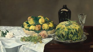
Some aspects of the student's painting are better than the teacher painting. The mass behind the vertical slice of lemon is better and generally it has more of the sense of full, watery, juicy fruit; there is a firmness at the edges, whereas the teacher's looks like a dried object and doesn't give the refreshing, succulent feel of fruit. The teacher's vertical lemon slice is better and the contrast in values is stronger, but I don't think the teacher's is entirely " better."
thx
Why has youtube pushed your recommendations so low? I barely get any.. I love your content!
the student one in the image looks far better than the overly highlighted teacher one
Very informative video! Thank you for posting it. On a side note. At the very least, you should be wearing a protective grove on your left hand.
Question... do you have a video on you plein air gear?
Thanks as always Mr. Paint coach! Your tips always hit hard! I loved the part about lightening color tones with non white colors.... great tip! And really hit home.
Hi Chris! I am a beginner painter and due to severe allergies I need to stick to acrylics and perhaps watercolors. My question is can I apply your color tips to acrylic painting?
I think all the principles should be the same. (You don't have to worry as much about painting from dark to light, as far as I know, because the heaviness of the paint isn't an issue with acrylics, but it's a decent workflow anyway.)
As someone who paints in acrylics, I'd say all the tips presented here can apply.
All Chris’ tips can be applied to acrylics and to watercolor. Just go from lightest value to darkest, though. Use glazes to get accurate color if need be.
These are great tips; thanks, Chris! May I ask about the white thing on your shelf in the background -- is that an air purifier for oil painting? BTW that's a hell of a tan line on your wrist.
Different objects with the same color in one picture do you paint the same color for all objects first and then either go lighter One of them and parallel or do you start with one object completed and then go to the next and do your coloring and shading? I’m asking because it takes a lot of brush cleaning if you do object I object, on the other hand it is easier to finish one object first and then go to the next
Would you go dark to light with acrylics too?
I was already squinting my eye at 10:35 when the photo showed up and I thought i lost control over my eyes when i 'unsquinted' and the photo still stayed blur 💀
I’m a new painter and need help with painting sand and gravel which are under my main subject.
I actually prefer the coloring in the student's painting.
Where can I find photos for reference that have lighting like that for citrus fruits?
the contrast of the teachers still life was better....but it made the fruit look dryer to me for some reason