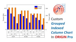
How to plot bar graph in Origin Pro for Journal Paper Publication

HTML-код
- Опубликовано: 7 фев 2025
- Please subscribe my channel using gmail or hotmail or any other email id, don't subscribe it using your university/college email id. because it will not count.
This video is on drawing bar Graphs using Origin pro software. As an example, we have used a sensor response data file as a sample for drawing bar graph for two different ppm gas. The graph is formatted as per the publication requirement. It is a beginner tutorial for new research students.


![Felix "Unfair" | [Stray Kids : SKZ-PLAYER]](http://i.ytimg.com/vi/Oswujxm2Ag0/mqdefault.jpg)


Very fantastic approach. I am doing Postdoc but till now never seen such an easy effort. I will suggest making more videos. Best Wishes
Thanks a lot
How to bold the fram label in origin. Because sometime, the frame label it was not clear after export the figure. Eventhough I have used the high resolution.
Fot it You can check my other video origin beginner tutorial. Also You can directly select the level then bold it or change the font size to increase visibility.
Excellent mam
🙏
Very good video
Thanks.
Great video
Glad you enjoyed it
Madam it is a very good demonstration. I would like to ask you that what is the process to write the X-axis variable(sample1, sample2..) with suffix i.e., while I will write the sample1, I want to write '1' as suffix of "sample". Please respond how to do that.
Glad you like it. Soon I will make a video on this topic and let you know.
On that particular one right click and select proeprties there you can change what ever you like
How will you download orginpro mam