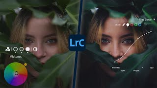
Portrait editing for me is so subjective, I was interested in the subtleties of your actions. In comparison of before and after, the teal look is not something I would choose BUT the process and tutorial I thought was very good. Nice work.
Great insight into the low key 'grunge look'. I do think that you have talked yourself into two more presentations where you swap subjects and looks. Matilda and you could both switch scenes and try out the different look.
Helpful route to a very contemporary portrait look; but as you say, it only works for some people. But it might be fun to try it on a totally inappropriate subject! You never know...
When you did the editing tutorial, you mentioned about doing a video on the Tone Curve. Although you touched on it a bit in this tutorial, will you be going into more detail with examples of how to apply this in different situations? Is it a bit like the Curve adjustment function in Photoshop? Another question I have is around a Lightroom feature I remember using several years ago called Split Toning, or something like that? It allowed me to make dual hues in the image and change the balance to be weighted evenly or more towards one colour or the other. Is this what the Midtones, Highlights and Shadows colour wheels are now? Because I notice there's a balance slider in that area too. :)
Nice insights, i wonder when the faded look as a default goto would die :D, sorry im just really tired of seeing it everywhere, unless it's deliberated and fitting the story, the expression on the charter in this photo is strong, in my opinion a higher contrast with darker shadows would help pushing that expression better forward, teal is fine but blue would push the shadows even further back and make the orange pop more, again lifting that moody/gritty expression of the charter :). well just a few thought from my end :D, keep up the great videos :)


LOVE THIS TUTORIAL....The moody, low key look is IN! Thanks
Portrait editing for me is so subjective, I was interested in the subtleties of your actions. In comparison of before and after, the teal look is not something I would choose BUT the process and tutorial I thought was very good. Nice work.
Great insight into the low key 'grunge look'. I do think that you have talked yourself into two more presentations where you swap subjects and looks. Matilda and you could both switch scenes and try out the different look.
That's such a good idea!
Helpful route to a very contemporary portrait look; but as you say, it only works for some people. But it might be fun to try it on a totally inappropriate subject! You never know...
When you did the editing tutorial, you mentioned about doing a video on the Tone Curve. Although you touched on it a bit in this tutorial, will you be going into more detail with examples of how to apply this in different situations? Is it a bit like the Curve adjustment function in Photoshop? Another question I have is around a Lightroom feature I remember using several years ago called Split Toning, or something like that? It allowed me to make dual hues in the image and change the balance to be weighted evenly or more towards one colour or the other. Is this what the Midtones, Highlights and Shadows colour wheels are now? Because I notice there's a balance slider in that area too. :)
Nice insights, i wonder when the faded look as a default goto would die :D, sorry im just really tired of seeing it everywhere, unless it's deliberated and fitting the story, the expression on the charter in this photo is strong, in my opinion a higher contrast with darker shadows would help pushing that expression better forward, teal is fine but blue would push the shadows even further back and make the orange pop more, again lifting that moody/gritty expression of the charter :). well just a few thought from my end :D, keep up the great videos :)