Seaborn catplot | Using catplot kind to create multiple categorical plots with Python Seaborn

HTML-код
- Опубликовано: 7 авг 2024
- This Seaborn catplot video shows you how to make and style a catplot in Seaborn Python. I first introduce you to what the catplot is and then I show you the basics on how to code a Seaborn catplot. I demo you how you can create different Seaborn category plots with the catplot by referencing the catplot kind argument including the strip plot, boxplot, and violin plot. I also show you how to use the Seaborn catplot hue argument. Next I explain how to leverage catplot's underlying FacetGrid to create small multiples from categorical variables. The catplot FacetGrid allows you to create rows and/or columns of small figures all at once! I also demo how you can sort the catplot FacetGrid using the row and column order arguments. Finally, we end by checking the catplot style options including how to set the Seaborn catplot title using FacetGrid methods.
0:00 Introduction
0:07 What is a catplot?
0:48 Catplot code basics
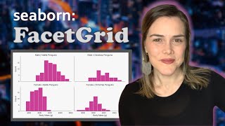
4:30 Catplot FacetGrid
6:50 Styling
9:36 Outro & Bloopers
Github Code:
github.com/kimfetti/Videos/bl...
Related Videos:
Seaborn FacetGrid -- • Seaborn FacetGrid | Ho...
Seaborn boxplot -- • Seaborn boxplot | Box ...
Seaborn stripplot -- • Seaborn stripplot | Wh...
Seaborn violinplot -- • What is a violin plot ...
Full Intro to Seaborn PLAYLIST -- • Intro to Seaborn
#seaborn #dataviz  Наука
Наука


Thank you, Kimberly, once more for being so helpful with your video tutorials and the way you teach with easiness and assurance, so that the viewer feel confidence and motivation to know more about the subject being taught. I love it so much!
This was massively helpful in understanding and applying the seaborn catplot, Kimberly. Thank you so much!
Really enjoying your Seaborn video series! Very helpful and just watching them gives me a lot more ideas on how to present data to my clients.
Thanks very much! So glad to hear that my videos have been helpful for your client work!
you videos have dominated seaborn searches, just telling u :)
Wonderful video and style of content presentation 💪💪👏👏
Thanks, I was having trouble to understand plots. It is really helpful.
Very clear explanation and just what I needed. Thank you.
Excellent -- glad to hear that!
the seaborn docs are not the best, and you made it SOOOO much easier to understand. Thank you so much!
That's so good to hear! The more I use Seaborn the more cool features I discover, but you're right -- they're not always explained in the docs. Glad I was able to help 😄
Exactly what I was looking for. Thank you!
Fantastic! Glad it helped. 😄
The way you explained 😍 ✌️ ✌️ 👍👍👍
This is the best explained cat plot❤
Thanks so much! Glad you enjoyed it 😁
I like the way how you are working with codes, it is really very easy for me to learn from you.
Thank you very much.
Excellent -- very glad to hear you were able to learn from my video! 😄
@@KimberlyFessel Thank you very much again. As a request, if you add PCA analysis and plotting (Principle Component Analysis) and clustering analysis and plotting in your next videos, I will be very grateful to you, because as I mentioned it became very easy for me to learn from your videos.
I love these tutorials! Thank you
Most welcome - glad you are enjoying them 😄
thank you! you've saved my life
Super content 👏👏👏💪
Really helpful videos 👌
Wonderful - glad to hear they are helpful!
Thank you !
♥️
Hello Kimberly. Thank you for your great tutorial video!
I've just plotted a seaborn catplot kind='bar'. It also drawns a vertical line on the top of each bar. Do you know what it means?
Awesome Thanks
Sure thing - most welcome!
Thank you
Most welcome! ☺
Thank you maam
Thankyou!
Most welcome! 😄
Is it possible to overlay plots with catplot? For example, if you want to display a pointplot showing means and swarmplot showing individual data points at the same time?
Yes - you can do this! The catplot returns a FacetGrid, so you can just make your first plot, say the pointplot, with the catplot but make sure you save its output in a variable, let's call it g. g will be a FacetGrid, so you can continue adding more information to it by doing g.map_dataframe(...). g will still leverage the same data and row/col splits that you use in your catplot function.
@@KimberlyFessel Thanks!
Hello so I am a 17 Years Old boy trying to learn Data Science and I found your videos so helpful. I was wondering if I can contact some day to teach me if it is possible of course.
It would a pleasure to give a way to contact you
So glad to hear that the videos are helpful for you! I currently teach full time at a data science bootcamp called Metis, so I am not available for private tutoring at this time. But I will continue posting more videos! 😄
show the numbers on top of the point multi catagorical
Magic
Thank you! 🔮
What if we have different y values then
How should we plot
Try to explain that also
These basics anyone can do
If you have multiple sets of y-values, you can try a secondary axis (ruclips.net/video/_FO8jUMa65M/видео.html) - good luck!