Launching a 405-line black and white ident that wouldn't work properly in 625 lines, never mind colour, in 1968, doesn't seem to be that future-minded somehow. At least the other new 405-line idents of 1968, such as Thames or the Granada 'G' with an up arrow symbol, were mostly versions of what would later follow in colour. The Harlech TV ident was a technical dead-end.
@@anonUK I've always wondered, how would the Harlech ID look at 625 lines? I'd imagine a lot of moire patterning/distortion would be visible due to the combination of the higher display resolution and the fine black & white lines (especially when they cross over) in the ID's animation....right?
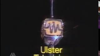
Out of all the ITV station idents of the 1960's, this one is my least favourite. You could get a headache after seeing this pattern, making it an acid trip from the 1960's.


This logo was very impressive for it's time, in my opinion.
Launching a 405-line black and white ident that wouldn't work properly in 625 lines, never mind colour, in 1968, doesn't seem to be that future-minded somehow. At least the other new 405-line idents of 1968, such as Thames or the Granada 'G' with an up arrow symbol, were mostly versions of what would later follow in colour. The Harlech TV ident was a technical dead-end.
@@anonUK I've always wondered, how would the Harlech ID look at 625 lines? I'd imagine a lot of moire patterning/distortion would be visible due to the combination of the higher display resolution and the fine black & white lines (especially when they cross over) in the ID's animation....right?
Out of all the ITV station idents of the 1960's, this one is my least favourite. You could get a headache after seeing this pattern, making it an acid trip from the 1960's.
@@ManF3It definitely stood out more from the rest of the ITV Idents at the time because most of them have Orchestral Fanfares
people must be stoned seeing this ident
Very very surprised you’re actually uploading videos now