One thing that I would change about this figure is that the y-axis title is a bit small. See if you can figure out how to increase the size of that text! Remember... it isn't really the y-axis title :)
Hello from Connecticut! I love your videos and shared your channel with my friends in the microbiome field. Keep up the good spirit. You make working in R fun.
It should be able to generalize from what I currently had it as. For 3x3 you'd need to add 6 more metrics (or whatever you want to call them) along with the relevant x, xend,y, and yend values. I touched on how to automate this in ruclips.net/video/-DfCitMqdUc/видео.html
Hi Pat, once again really appreciate for the video, exactly the same what I was looking for. I also found this package ggpubr and the function stat_compare_means doing nearly similar to what you have explained. May I know if you think its nearly the same as I found we can also facet and the package could add the astericks and lines without doing it manually. Also under the method sections there is a full suite of tests such as ANOVA, t-test etc. thank you
I’ve never used that package. For these videos I really want to stick to the basics of how to use the tidyverse. All the other packages are great but you have to memorize how to use them rather than learn concepts that are more broadly applicable
Thanks for the question! I don’t but it should be the same approach I used here. You’d have to replace the stars with the letter combinations that make the most sense
Hello Pat, this video is amazing! I'm working and learning R day by day. Currently, I'm analyzing some results. I have three groups and around 10 markers so I'm using face_wrap to see all these markers together. Some of them have significance and others don't. Do you know how can I put the markers in order of significance ? Hope you can help me!! Congratulations again for the video!
Matheu! if i understood correctly your question and what Pat says at other video, he explains that a result is either significant or not significant, you might just orderer them by this. and you can do this just by useing pivot longer to your markers ( pivot_longer(cols = c(marker1,marker2, marker3, marker4), names_to = "markers", values_to = "value") and then ordering them in the "factor line" : .....%>% mutate (markers= factor(markers , levels = c("marker2","marker3","marker1", "marker4"))) where markers 2 and 3 are significant and 1 and 4 not significant. im also pretty new at R. this may not be useful or correct!
Because it gives me an opportunity to teach how to use these geoms. Also the cognitive overhead of having to remember how to use another package for a pretty niche application is more than I can do sometimes
I just tried it and it worked! :) Very exiting. I like the way you explain all this coding stuff in your videos. Thank you so much for the fast help. All the best from Germany.


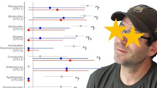


One thing that I would change about this figure is that the y-axis title is a bit small. See if you can figure out how to increase the size of that text! Remember... it isn't really the y-axis title :)
Hello from Connecticut! I love your videos and shared your channel with my friends in the microbiome field. Keep up the good spirit. You make working in R fun.
Hey Anita - thank you so much! There's a lot of awesome science happening in Connecticut :)
Big fan from Algeria 😍
Wonderful - thanks for watching!!!
You are amazing..
Thank you for this! How could the "lines" variable be adjusted for a multifacet plot (say 3-by-3) ?
It should be able to generalize from what I currently had it as. For 3x3 you'd need to add 6 more metrics (or whatever you want to call them) along with the relevant x, xend,y, and yend values. I touched on how to automate this in ruclips.net/video/-DfCitMqdUc/видео.html
Hi Pat, once again really appreciate for the video, exactly the same what I was looking for. I also found this package ggpubr and the function stat_compare_means doing nearly similar to what you have explained. May I know if you think its nearly the same as I found we can also facet and the package could add the astericks and lines without doing it manually. Also under the method sections there is a full suite of tests such as ANOVA, t-test etc. thank you
I’ve never used that package. For these videos I really want to stick to the basics of how to use the tidyverse. All the other packages are great but you have to memorize how to use them rather than learn concepts that are more broadly applicable
@@Riffomonas thanks, Pat
Hi , I wonder do you have any tutorial about how to add compact letter display on the bar/box plot ?
Thanks for the question! I don’t but it should be the same approach I used here. You’d have to replace the stars with the letter combinations that make the most sense
Noice
🤓
Hello Pat, this video is amazing!
I'm working and learning R day by day. Currently, I'm analyzing some results. I have three groups and around 10 markers so I'm using face_wrap to see all these markers together. Some of them have significance and others don't. Do you know how can I put the markers in order of significance ? Hope you can help me!! Congratulations again for the video!
Matheu! if i understood correctly your question and what Pat says at other video, he explains that a result is either significant or not significant, you might just orderer them by this. and you can do this just by useing pivot longer to your markers ( pivot_longer(cols = c(marker1,marker2, marker3, marker4), names_to = "markers", values_to = "value") and then ordering them in the "factor line" :
.....%>%
mutate (markers= factor(markers , levels = c("marker2","marker3","marker1", "marker4")))
where markers 2 and 3 are significant and 1 and 4 not significant.
im also pretty new at R. this may not be useful or correct!
Why use geom_segment, geom_line geom_text over ggsignif package?
Because it gives me an opportunity to teach how to use these geoms. Also the cognitive overhead of having to remember how to use another package for a pretty niche application is more than I can do sometimes
Hi, my R mentioned that there is no 'tibble' function. Can you help?
Try running library(tidyverse) first
@@Riffomonas it works, thanks!
I just tried it and it worked! :) Very exiting. I like the way you explain all this coding stuff in your videos.
Thank you so much for the fast help. All the best from Germany.
Wonderful! So glad it worked and was helpful 🥳