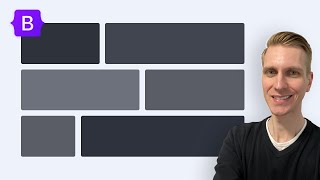
Bootstrap Grid System The Complete Guide - In Action

HTML-код
- Опубликовано: 16 сен 2019
- Bootstrap Grid System The Complete Guide - In Action
In this lecture, we are going to learn how to create a bootstrap grid system. We are going to understand the concept behind grid system.
Comment us if you have any question or
Follow us:
/ akki.2013
Donate:-
www.paypal.me/DailyTuition
Learn More From Our Website:-
www.dailywebtuition.com
Attribution
Icon made by monkik from www.flaticon.com
Background Music: www.bensound.com
Photos: www.pexels.com
If you have any question please comment me on my video or you can write it on channel discussion.
Thank You...!


My goodness, this video was a saving grace man!!! Well organised and explained the concept of bootstrap short and concisely most importantly on point !!
Thank you so much. This is exactly what I needed. Very simple and concise explanation of the basics. You saved me!
Perfect tutorial!
Better than what I would expect from any tutorial
Great tutorial, The best illustration of Bootstrap grid system that I've seen on RUclips. cheers
I think this is the best bootstrap grid system tutorial on RUclips, well explained thank you !
oh man, it cannot be any more crystal clearer than this. Well explained, thank you so much keep up the good work man
Most welcome 😊 keep supporting
Thank you so much! :) This is the best tutorial I've seen by far (And I've seen a lot, lol)
Offcourse 😂
The clearest explanation! Thank you!
Thank you 😊
Good job, one of the best explanations I have seen on youtube. Keep up the good work.
Wow, thanks!
best one I've seen so far!!
finally i understand this concept just because of you great content and great explanation thank you so much.
Most welcome 😊
Best video for Grid system in bootstrap
Best video on Bootstrap Grid System!..
Wonderful tutorial, I shall watch it a few more times while experimenting at the same time. Great work, keep it up. Thank you.
Experiment makes you feel more comfortable
Wonderful, best video, explained very nicely and made so easy to understand
Very helpful. Thanks for the tutorial!
Thank a lot boss.this tutorial is saving me job..for sur
Very very nice buddy. I have been trying to understand this from past few days. Now it is 100% clear. Thank you very much.
Most welcome 😊
Thank you! So many tutorials out there are just like
"So you have these letters. Its for responsive design. Here is the table." and then never telling you wtf is it the table about or how is it used for...
Brilliant explanation. I was searching for this explanation but this is the best video which explained how to use sm,md-lg with col size. I would say this is the best explanation of Bootstrap Layout system.
Keep supporting🙏
Nice Explanation, Thank you !
this one made me understand the grid content kudos man!!!!
Thank you so much. It always confused me so much!
You are great...really thank u very much👏👏👏👏
What an explanation most underrated video on bootstrap basics.
Keep learning
You are awesome, thank you for your explanation! Greetings from Costa Rica
Good.....Clear Explanation.
Thank you so much sir! Glad I found your video tutorial! It was the best, the clearest illustration of the lesson ever! I just want u to know that you just gained a new subscriber :)
Thank you 😊
well explained. Thank You
Thank you for making that easy to understand :-)
Thanyou for clearing basics of columns and row
good one
this is a really good explanation. thank you so much!
Most welcome 😊
great explanation.....
Thank you, you really clarified a lot for me.
Keep supporting
Thank you ive learned a lot 😇😇😇
Explained very well
That was an awesome explanantion
Thanks man really helpful 😊😊
thank you bro, you helped me a lot
Parabéns pelo vídeo e o seu canal e muito importante e útil!
Thank you so muuuuch for your help!!
Best ....thank you.
thank explained a lot thanks for sharing
I bought a 10 dollar udemy course to understand this, clearly the money should've gone to you brotha 👊 any way to make a donation for your free lesson?
Thank you for your donation. Appreciate 🙏
There's a paypal link in the description ;)
Thank you for supporting us 💗
LOL me too.
Thanks a ton Akshay! Great content!
Most welcome 😊
Thank you this was very helpful!!
Most welcome 😊
Thank you excellent tutorial!!
Most welcome 😊
Great video!
It is a great tutorial! Thank you!
Most welcome
Thanks bro 👍👍👍
This tutorial is💯.
Thank you so much sir, I appreciate the detailed examples
Keep supporting
Thank you for your great explanation
Most welcome 😊
Let the God bless you! :-) I got it at least! HUGE thank you!
Most welcome 😊
good job man
good explanation :)
Thank you!
thankyou so much sir🙏🙏😍🙏
thank you ! that was really helpful !
Most welcome 😊
Nice Tutorial
thanks for this
Well explained. Keep it up.! 🌟
Thank you 😊
Good job, thank you :-)
Nice
Thankyou ❤
thank you so much
Great Video !! Thanks you just gained a sub
Awesome, thank you!
Really helpful. Thank You
Most welcome keep supporting
thx sir good zoom video i see the code and output
Nice tutorial ,You have solved my confusion regarding gid system. May I have the color scheme u have used in this tutorial for background color of different cols. Thanx
thank you i love you
there's always an Indian guy who saves your ass from cs topics! :p
Thanka a ton man!
:)
Super
THANK YOUUUUUUU :')))!!!!
Thank you I cleared
Most welcome 😊
nice video.. thank you very much. subscribed too!
Thanks 👍
Best
good explanation i never seen
Most welcome 😊
Sir what is difference between components and dom elements? In react
But how does the colour was applied to the column......like where was the code written in your code snippet
how did you add the colors ?
how did you change the color automatically
Hello. I have a question, I have a row, and inside is two columns of col-6, so col-6 + col-6 is 12 right? however, the second div keeps getting pushed down to next line. Why is it doing this? What can I do?
Sometime margin and padding add additional space to div so we need to take care of it. Plz remove margin from the .col-6 divs
@@teslaofficial321sir I have same problem I donot add any additional option
hi bro,
you have to changing the class name but how to get background color for all div's
thx...to the point explanation. What is the difference between class=row and class=d-flex
We use row to create column grid layout and d-flex for flexbox layout. You can achieve the same result using both these classes.
@@teslaofficial321 Yeha I confuse me as someplace we are using row and at someplace we are using d-flex. I think d-flex gives us the flexibility to layout either in row or column while the row is just row layout. Thanks for the clarification. Your channel got great content.
@@ericcartman4799 thank you 😊
Can we declare for one screen and made other as auto fit (by declaring a bootstrap class)?? If possible how??
Yes it's possible. Use bootstrap grid column class for different screen
Can we declare col-md-6 and made other screen (sm, lg) as outfit?? If possible how ? Plz
@@vamsikrishna4166 yes. Use an, lg and ,md classes. Check out my other website design tutorial to Know more about it
how to center contents within a div
using good microphone will be better... ok Nice tutorial
Ok. 😊
Very clear.... Thanks, I need a question sir, how can I write you?
On instagram @akki.2013
@@teslaofficial321 OK I will
how can take the row on php looping with mysql data. when the lot of data make output not in row
Show me first how you want to display data? So I can tell you how to go further...
so, if i want 5 columns in a row, what should i code?
Use .col-2 five times and .col-3 one time
how to change the color of different column ? i don't understand
No. That's different concept. Here we are looking at grid
Very nice
What is the css of this could you plz explain it
bootstrap uses flex box,so u can look it up.
I got it. its nth-child()
How are you giving different css(color) to each row..i want css too...
i really need that too...
How to select everyone of these columns in css ?
Couldn't understand will you plz elaborate
@@teslaofficial321 don't worry anymore, i just set an id for each col to style it in css , thank you for the tutorial 😊
where is the css how to change the color of different colunmns and is it enough for responsive website
It is enough for layout. Other things would be changed
how can i setup own system in css?
I will upload a tutorial on Monday make sure you watch that. That will clear your concept
from where we can start???????
For what?
uno
dos
result giving:
uno
dos
result expected:
uno dos
Now why is the col giving me row? childrens should be positioned side by side just like a col
col = im a col
row = im
a
row
You have to put size of the column. Like this.
.Col-2
Change the html structure and use this.
inside that create .col-2 and inside that create div with uno.
Make sure you create separate div for doc.
Check this link to learn more
ruclips.net/video/cHAcSQyvBqQ/видео.html