How to Create Correlation Plots in R
US
Войти
How to Create Bubble Charts in R with geom_point() and scale_size()
18:46
R demo | Correlation Matrix | How to conduct, visualise and interpret
4:56
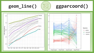
How to Create Parallel Plots in R with geom_line() and ggparcoord()
15:09
Boston FBI announce arrest of two Iranians in connection with fatal drone strike
03:21
Stray Kids Answers 30 Questions As Quickly As Possible
05:56
I GOT BULLIED INTO CUTTING MY HAIR :(
22:55
How to Create Correlation Plots in R
The Data Digest
Подписаться
4,9 тыс.
Скачать
Готовим ссылку...
Просмотров 48 тыс.
0
0
Добавить в
Мой плейлист
Посмотреть позже
Поделиться
Поделиться
HTML-код
Размер видео:
1280 X 720
853 X 480
640 X 360
Показать панель управления
Автовоспроизведение
Автоповтор
Опубликовано: 24 янв 2025
Комментарии • 76
Следующие
Автовоспроизведение
18:46
How to Create Bubble Charts in R with geom_point() and scale_size()
The Data Digest
Просмотров 7 тыс.
4:56
R demo | Correlation Matrix | How to conduct, visualise and interpret
yuzaR Data Science
Просмотров 6 тыс.
15:09
How to Create Parallel Plots in R with geom_line() and ggparcoord()
The Data Digest
Просмотров 3,9 тыс.
03:21
Boston FBI announce arrest of two Iranians in connection with fatal drone strike
WCVB Channel 5 Boston
Просмотров 312 тыс.
05:56
Stray Kids Answers 30 Questions As Quickly As Possible
BuzzFeed Celeb
Просмотров 425 тыс.
22:55
I GOT BULLIED INTO CUTTING MY HAIR :(
KillSMartyr
Просмотров 211 тыс.
11:35
YELLOWSTONE Season 5 Episode 14 Ending Explained
BrainPilot
Просмотров 311 тыс.
18:29
Visualize correlation matrix (Spearman) using correlogram in R
Wakjira Tesfahun
Просмотров 4,9 тыс.
8:46
How to make a correlation matrix in python
Karina Adcock
Просмотров 6 тыс.
18:11
Visualize your data using ggplot. R programming is the best platform for creating plots and graphs.
R Programming 101
Просмотров 143 тыс.
20:23
Scatterplots in R with geom_point() and geom_text/label()
The Data Digest
Просмотров 13 тыс.
12:18
Multi-Panel Plots in R (using ggplot2)
Peeling Back Data
Просмотров 40 тыс.
4:36
Create a Correlation Matrix in Excel In 4 Minutes!
Ryan O'Connell, CFA, FRM
Просмотров 1,1 тыс.
11:22
Pearson correlation with p values and fancy graphs in R
Agri Analyze
Просмотров 12 тыс.
23:46
How to create Multi-Panel plots in R with facet_wrap() and facet_grid()
The Data Digest
Просмотров 6 тыс.
13:03
Barplot and column plot using R (ggplot)
BioinfQuests
Просмотров 28 тыс.
05:17
Лавров в ШОКЕ от президента ГОПНИКА который перешел на русский мат
Сила Слова
Просмотров 76 тыс.
00:56
The Enthusiastic Security Guard Helped This Lady Pick Up Her Bag
Fun Parkour Mr Wang
Просмотров 6 млн
01:07
DOOM: The Dark Ages | Developer_Direct 2025 Gameplay Sizzle (4K) | Coming May 15, 2025
Bethesda Softworks
Просмотров 367 тыс.
00:56
Squid Game DIY Game Book 오징어게임 게임북 🦑
Pogeun paper
Просмотров 2,4 млн
00:13
Extreme Adjustments for Anna: The Intern's Big Test!
Dr. Max Reiner
Просмотров 6 млн
00:53
Шароверы вас переиграли!
Лютая физика | Олимпиадная физика
Просмотров 885 тыс.
00:14
Трамп: существует только два пола - мужчины и женщины
TRT на русском
Просмотров 7 млн
17:19
Кофейня приносит деньги? Я в шоке!
АЙДЕН
Просмотров 431 тыс.