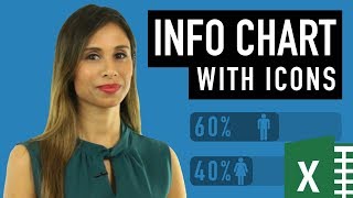
How to Create a Infographic in Excel (pictogram with icons)

HTML-код
- Опубликовано: 21 авг 2024
- Join 400,000+ professionals in our courses here 👉 link.xelplus.c...
Discover how to make a dynamic infographic or pictogram in Excel! No add-ins or third-party software needed! We'll use standard charts and Excel icons to create professional-looking infographics.
⬇️ Download the workbook here pages.xelplus....
Here's what you'll learn:
Start Simple: Understand the basics of creating a column chart and how to make it dynamic, so it updates automatically with new data.
Chart Types and Series: Learn to pick the right chart type and series for your data, ensuring your pictogram is clear and informative.
Icon Integration: Dive into how to incorporate male and female icons into your chart. Don't worry, you can use any icons you like!
Customization Tips: Get tips on resizing and coloring icons for maximum impact.
Overlap Technique: Master the trick of overlapping series to achieve the fill effect in your chart.
Dynamic Data Labels: Discover how to add and adjust data labels for clarity and precision.
Final Touches: Polish your infographic with a custom title and tidy layout.
★ Links to related videos: ★
Bar chart with icons: • Build Impressive Chart...
3 handy chart tips: • 3 REALLY Useful Excel ...
★ My Online Excel Courses ► www.xelplus.co...
➡️ Join this channel to get access to perks: / @leilagharani
👕☕ Get the Official XelPlus MERCH: xelplus.creato...
🎓 Not sure which of my Excel courses fits best for you? Take the quiz: www.xelplus.co...
🎥 RESOURCES I recommend: www.xelplus.co...
🚩Let’s connect on social:
Instagram: / lgharani
LinkedIn: / xelplus
Note: This description contains affiliate links, which means at no additional cost to you, we will receive a small commission if you make a purchase using the links. This helps support the channel and allows us to continue to make videos like this. Thank you for your support!
#excel


Download the chart template I use in the video from here 👉 pages.xelplus.com/male-female-file
Leila is God sent! This is the only method that worked for my case. My chart needs to reference data in a pivot table and change dynamically based on a user's selection on a slicer. All the other methods I used had a delay or required that the slicer button be pressed twice for it to work. Having everything on one chart like this did the trick! TY
Leila, you're absolutely amazing! The way you explain each detail and step by step. Thank you so much for sharing your knowledge.
Great! I love how you can take a fairly boring topic like column charts and make it into something creative and entertaining. Really good stuff.
Guau just... I can't even Express how impressed and thankful I am. You are great.
Great video Leila! I have been a self-taught Excel user for many years and am thought to be a “guru” by my peers. I have learned SO MUCH from your videos! You are the true Guru!
I'm glad to hear you find my videos useful Bill. I learn something new about Excel almost every day too.
Hey Leila, your videos gave me a promotion... You make excel fun to use.
Congratulations! I'm really happy to hear that. Watching videos is one thing, but actually implementing what you learn is another. Well done!
This is incredible!!! I’ve been using icons like crazy in PowerPoint but never thought of this idea!
Glad you like it :)
stumbled upon your channel yesterday, and fell in love immediately.. thank you for these awesome excel tips!
Thank you! I'm glad you find the tips useful :)
Your videos/tutorials do NOT disappoint! I LOVE them all!!!!
Oh thank you, Stacey!
@@LeilaGharani , of course!!! Been home almost 10m on a furlough. Learned a lot of cool stuff :)
I really liked your video! It was clear, concise and easy to understand. Your method of presentation was unhurried and I was able to follow the instructions (with a bit of going back to reeview sections I missed the first time around). My finished project functioned as yours did! Thank you so much! I intend to watch other videos in your series and will highly recommend them to others!
Glad it was helpful!
simply superb explanation. i have gone thru many info graphs but this video is simply superb.
Great infographic and good idea to use arrows when explaining
Thank you Vida. Glad you like the content & explanation :)
Amazing.... Simply amazing..... You are the best Excel teacher .... Thanks a lot 😀
I love it, tried this method for performance like actual vs target, thing is, when the performance is over 100%, the color overlaps the 100% outline. Very cool tutorial though and thanks.
Lots of small techniques in one video. I liked the positioning of the label. Always on top. Therefore you need the 100%. Thank you.
You’re welcome Bart. How was the Amsterdam summit?
WOW ! Bring different shade to chart! Amazing, brilliant! I'm your great fan !
Thank you! Glad you like it :)
Great concept and well explained Thank you somuch
You're most welcome
Awesome!!! Thanks Leila... saved my life.
VERY NICE!!!! Lots of steps but they aren't complicated. I like this.
Great video production, as well.
Thanks Oz - it's still not the newest version of Cam....
Very detail explanation - nice work lady!
Thank you. Glad you like it!
This is a-ma-zing! Really enjoy your way of teaching!!
Glad you enjoy it Ewelina!
Leila, Great Explanation. Perfect flow if ideas. Many Thanks
Leila, you are brilliant. Love your videos.
Glad you like the videos Lester :) Thank you for your support.
Awesome Leila, how brilliant you are!
Glad you like it Osama :) Thanks for dropping by.
Wonderfull!
Glad you like it Alejandro.
Thanks for the precise and clear presentation. I am proud of you
Thank you Dawuda. Glad you like the tutorial.
Its really interesting . Keeping me to watch till end and inspire to me make this chart for fun. Thank you so much . You are truly awesome .
You are so welcome, Abhishek!
I love the chart stuff. Awesome video.
Thank you! I love the chart stuff too :)
I love your videos! Please make more of these!!!
Excellent explanation. Thanks Leila!
You’re very welcome Kevin :)
I love it!!🤓
Brilliant video thankyou. One thing that might be helpful - for some reason when I selected stack and scale unit 1 for one of my icons it looked really odd - it seemed to replicated the icon hundreds of times at a very small size giving it a 'furry' look. I tried various things to fix it, nothing worked until I changed the unit size from 1 to 100 and it looks fine now. It wasn't an issue on the other icon though. Thanks again!
Awesome as always Leila. Thank you.
You're welcome Monte :)
It's very useful thank you Leila..
Yet another amazing chart trick. Shukria (Thanks) Leila.
Great Job! Thanks for the awesome insight. Improving daily
Excellent. It was fun trying this.
Thanks so much needed this for school
thanks LEILA, Please make videos about different types of infographic charts, like different types of gauge chatrs.
Ok Ali - It's on my list. Thanks for your support.
thanks for the detailed explanation
Very nice video ur really talented I m just thankful to u that u share it knowledge with us. I always learn from your videos. Your Technics r really awesome.
Thanks again.
Thank you Anubhav! I'm glad you find the videos useful :)
Great as always!
Thank you :)
That's perfect, thanks Leila! 👍
That was Awesome!!! Beautiful Staff Thanks :) :)
You're very welcome John :)
I've followed these steps repeatedly and the problem I keep running into is the colored part of the graph isn't filling the icons correctly, it's bigger than the 100% icon so they don't align properly. I'm so frustrated, what am I missing?? I'm using Excel 16.42 for Mac.
Please create video on "Hover in Excel"
Very nice tutorial👍
Thank you! Glad you like it :)
Great ... thanks for the lesson
You're very welcome Mohammed.
always great
Glad you like it.
Love it Thanks Leila !
Awesome excel skills!. Thanks for sharing!.
You're welcome Jorge & thank you. There's always more to learn though - keeps the fun :)
Super ❤
Amazing explained!
One question does is it possible to divide in multiple ways the male or female icons? So different % in the same icon.
Thanks!
Great video. What if you have multiple columns. I have 5 business areas and I want to chart Actual on Plan to show how much has been consumed. Because I have Cap Plan and Cap Act and Exp Plan and Exp Act when I overlay it overlays all four bars onto each other. I want Cap on Cap and Exp on Exp.
thank you Ms. Leila it's a good idea
Thank you Ismail for dropping by :)
Super awesome
Neat trick...thanks for the video!
You're welcome Doug :)
Excelente vídeo, gracias por la información.
Nice trick. Congrats.
Thank you!
Very well demonstrated! :)
Glad you like it Rahul :)
Leila Gharani : Is there anyway we can access SVG Icons even if we are not office 365 subscriber?
Yes - you can download them from the net. But you'll need a program to be able to open these and work with them. Otherwise, you can create your icons on PowerPoint (you have a lot more editing options there) and then copy and paste them into Excel.
Thank you very much, I've got it👍
Awesome thanks.
Muito legal Leila, obrigado.
Concordo!
Thank you very much to made this video :)
You’re very welcome Vikas :)
Thank you, again.
You’re very welcome Peter.
Hi. Thank you for uploading this video- it’s very helpful. Everything worked for me except that it looks blurred as I pasted the icon to the graph. Any thoughts on how to make it look sharp like yours?
Excellent tutorial Leila, as always. 👍
Unfortunately, my version of Office 365 does not have the "Stack and Scale with" option. 😞
Great Video.....
beautiful trick
Thank you. Glad you like it.
thanks.
Very nice video
Very very excellent
Thank you Zahid. Glad you like it :)
thanks sweet queen you are creative person
You're very welcome. Thank you for your support.
Doesn't work so good without office 365 icons.. Thanks for the video.
You’re welcome. Everyday Office has a good solution. You can also take the icons I have in the downloadable file.
Thank you for this Leila, I always learned new things from you.
Is there other way where I can used 100% stacked Column using icons also?
Can you please share it also with us.
Thanks for the lessions, makes Excel super fun now :) Bu i have a question can you make everything like this but as a pivot chart ?
Great
Interesting one - thanks
You're very welcome Abdul.
Abdul Hakeem Montazir
Top la conditionqwetjlkknq11
Awesome work Leila! Could you point me to the video where you show how you can retain the graphic fill while hiding the columns containing the source data please? I can't remember which one that was but I'm pretty sure you did a video on it.
Thank you! I have the link to that video in the description of this one. It's called 3 handy excel chart tips.
Leila Gharani Thank you very much!
You're welcome.
Awesome video, but I don't like the stretching, which can be seen in the end. Is there an option to make the icons keep their aspect ratio?
I was the second like 😂 almost 1st. I love and appreciate ur videos so much.
Thank you Naadiyah :) appreciate the support.
Thank you LG for very informative video. Also pls let me know how I can insert symbols of man/woman in my excel as picture format like you insert in this video.
Thanks
You’re welcome. You can download the spreadsheet - you’ll find the link in the description. You can take the pictures from there.
Great Video. But when I choose overlap, the data shows white not make and female with the correct colours
Great video! How do I do this running office 2010 or in google sheets?
This tutorial is I always been looking for, thank you so much for this, it helped me alot.... only found minor issue, this icon cannot work for excel 2013. (when i download the icon file, SVG. Excel 2013 is not support this file) but working great at excel 2016.
How I could not found in 2016
Hi, great video thanks. Although I have one problem which I don't understand the reason excel keeps on repeating my picture when I use stack or stack and scale with. Would you please help me?
Waw I love it
Hi Leila - Amazing tutorial - How can i add a target line to this infographic chart
Just wondering if i can use 2 or 3 value
Hey Leila great video, I have a question, as active in the tab insert the icons
Hi Leila, many thanks for this video. Does this only work as from "office 365"? I now have Excel 2013... Thanks!
Great video and I love the result. However, the icons don't stay in the chart when I re-open the file. Do you know why it doesn't save the images?
Can you also create one that fills from left to right?
That's great vdo. But I don't have icons in the insert in my Microsoft office 2013. How to get it? Please help me.
Dear Leila, I am not able to see the "Series Overlap" option upon right clicking on the chart under "Format Data Series". I am using MS Office 2021. Please help.
Hi, Thanks a lot , How I can Insert female or male icons inside cell.
Good
whenever I click on the "stack and scale with" option, the filled icon gets unfilled all the time, it goes completely blank on the filled image part, Please help on this.
You are completely amazing and beautiful!! I love you :-)
Oh thank you Ricardo! Glad you like it :)