Make an interactive distribution curve (bell curve) in Excel - Easy Trick 💡

HTML-код
- Опубликовано: 23 июл 2024
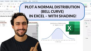
- Excel Bell curves or frequency distribution curves are handy for analysing and understanding distribution of your data. Recently, someone asked me to make a bell-curve to visualize salary distribution of staff. While you can use formulas or complex techniques to make these, I used a simple trick to make the bell curve and add interactive effect to it. Needless to say, my clients were impressed.
Let me show the method in this video and take it to next level.
Time stamps for the video:
====================
0:00 - The bell curve problem
0:36 - Making the bell curve with Excel
3:27 - Adding department as slicer
3:54 - Fixing the axis issues
4:48 - Taking the bell curve to next level (splitting it by gender)
5:42 - Closing remarks
Example file:
==========
chandoo.org/wp/wp-content/upl...
👉Checkout my online course on Advanced Excel & Data analysis
===================================================
💻📗💥 chandoo.org/wp/excel-school-p...
#Excel #BellCurve  Наука
Наука


Beautiful!!
Thanks Saul. :)
Thanks for this...i Made together with this video and highly satisfied because i made the second bell curve by myself.
satisfaction like here👇
New concept learned++
Thank you so much Mr. Chandoo!! I hope more people were kind-hearted like you!
Aww.. so nice of you to say that.
This is amazing! Thank you for your videos!
Glad you like them!
This was so helpful! Exactly what I needed
Awesome to hear that... 😀
amazing! thank you for sharing!
Thanks for such amazing tips! Many blessings!
You are so welcome!
Thanks so much for sharing your knowledge in an easy way.
Glad it was helpful!
Hi Chandoo. Nice approach! Thanks for sharing these tips :)) Thumbs up!!
You are awesome brother, loved your content.
Great stuff. Thank you.
Thanks you so much for the great information sir .
Superb explanation done
Excellent explanation thank you so much 💞
You’re welcome 😊
Great!!!
You are the best. Awesome👍😊
Thank you so much 😀
nice tutorial. good job. thanks
You are welcome
awesome. thx 🙏
You're welcome 😊
great one, Chandoo
Thank you.
You should have 10,000,000 subscribers!
😍
Thanks bro
Welcome
Greetings from Data with Decision Channel. Good job!
Greetings to you too :)
thanks bro
Welcome
Hi Chandoo, as always something amazing to learn from you.
Just a query, Is there anyway we can also show some kind of Descriptive Statistics along with the chart.
Great tutorial, Chandoo! I have a question - is there a way to restrict the smoothing curve to stay above the zero line?
Thank you Bro! Quick Question: How do you do it if the data is an Employee Scorecard Rating of 1-5 and grouping is by 1?
I did it with this guide but it does not look like a bell curve.
Wonderful video. When I try to Group the numbers in column A, I get a message saying that I can not group that selection. Also, when I click on a cell to group it, it highlights the A cell and the B cell. I can not only highlight the A cell. I wonder if that is causing me to not be able to do the grouping. Unfortunately, I can not post a screenshot here. Do you have any suggestions as to what could be going on and how to fix it? Thanks
Same problem
very cool way around long workout with formulas! Only one question: how do I distribute the data that it's in a bell (gaussian) distribution? my data in fact is, but if i visualize the order it is now, I am getting two top mountain, which I want to avoid... Like, after the grouping at 2:07 your data happen to follow gaussian distribution just by itself, it seems so. How do I achieve that?
You can adjust the group size or boundaries. But your data is in a different shape, that is what it is. You can't do much to change it.
That's nice, easier than frequency arrays. Now the question is, why would the salary increase data be normally distributed? 🤨
It can be.
You are awesome sir ,I teach in college, I want to master Data Analysis of students, result analysis , and all such task, please suggest me path to master this task in Excel, I mean which topics in Excel should I master
I suggest learning formulas, pivots and charts as a starting point. I am actually making a video on this very topic. Watch out for it.
@@chandoo_ sir I watch everyone of your videos , excellent videos you are making
Big thanks :)