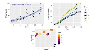
How to create line chart with points using ggplot2 & plotly - includes data pivot - R Project
HTML-код
- Опубликовано: 15 июл 2024
- A step by step follow along practical example - In an R script upload a spreadsheet, manipulate the data by pivoting columns, and then producing a line chart with data points (dots) using ggplot2 and plotly.
Timings:
00:00 Introduction
00:55 Set up R script and load data
02:20 Pivot using pivot_longer (tidyr package)
05:25 Set up chart (ggplot2 package)
07:45 Add trend line
09:05 Add points
09:55 Add labels to chart
11:55 Themes (theme()) changes to bar chart
15:00 Comma separate values on the Y axis
16:20 Add popup on hover over of dot (plotly) package
There is a lot more alterations which can be done to the chart using ggplot2 and plotly. A reference which you may find helpful - ggplot2.tidyverse.org/referen... and plotly.com/r/
The excel spreadsheet used in this project can be found at dataforknowledge.co.uk/r-proj...
Note: 3rd party data was used in this project therefore I take no responsibility for the quality or accuracy or interpretation of the data. The data can be found at www.gov.scot/publications/tea...
#rprogramming #ggplot2 #linechart #data #rproject #płoty #rscript #ggplot2linechart
#ggplot2linechartwithdots #dataanalysis #datavisualization  Хобби
Хобби


greatly explained, Hats off!
Thank you! Glad the video was helpful.
No RUclips video that explains this as clear;y as you did. Thank you very much!
You're welcome! Thank you!
I spent 12 hours trying to get this. I watched several RUclips videos and no one explained it as clearly as you did. This is wonderful. Thank you!
Thank you! Glad you found the video helpful.
Greatly explained! Hats off
Thank you!
Thanks for this tutorial
Thank you! Glad you enjoyed the video.
Thank you for this. Love the tutorials
would be interesting to see 100% fully polished publication ready charts and learn about the customisation that can be done
Thank you! Glad you enjoy the videos
@@DFK_data Pleasure. Truth be told, good ideas and engaging tutorials.
I have been searching content for branded word rmarkdown files. got experience in them? really fun and useful
I have just started to learn R over the last week or two and am progressing through udemy courses. I found your channel a few days ago and you are one of few that clearly defines the steps in each video. The Leaflet videos you did were good too. I am trying to work out today how to plot a Leaflet map using a data frame with a WKT Geometry column that contains Lines, points and polygons. I think I just need to do multiple filtered data frames to pass each type of WKT to the correct plotting function in Leaflet. Wish me luck!
Good luck! Thank you for your kind comments. Glad you are finding the videos helpful.