Statistics - How to make a histogram

HTML-код
- Опубликовано: 11 сен 2024
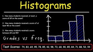
- This example shows how to make a histogram. Remember that the horizontal axis represents the values of the variables. The vertical axis gives us the frequency of those variables. For more videos visit www.mysecretmat...


didn't get taught this by my teacher who wasted 1 hour, but i learned it from you in 3 minutes!
Thank you! You're a life saver. You're basically the only teacher that does not waste half of their time explaining why this is done blah blah blah etc.
I'm doing test need a quick tutorial lol
Speed 2.5 and u learn it faster
Fr me too😂
Damn he liked after 9 years
Me too
Lol
For those who are saying this is a histogram, you are wrong. This is a bar chart, as the bars are meant to be connected , on the y axis there has to be frequency density not frequency and also most importantly the widths along the bottom are meant to be different not the same each time. I'm not being rude I'm just simply stating a fact.
Thanks for seeing this. For answering my confused
Hey Zack thank you for your input but I wanted to clarify as Im currently in Statistics and our professor and the book says and shows that bar charts are where the bars are not connected and a histogram is where the bars are connected. So can you maybe direct me to a place that shows the true answer
Teacher: Ok class today we are going to learn how to make a histogram
Class: Instagram??
Hi
Ok boomer
Yh that happened in my class
shittest comment ive ever read
DUSKY TV same
Can't understand this lesson from my math teacher but I understand it at this video. Thanks!
This is a histogram...you can tell the difference between a bar chart and a histogram..yes they both have simular layouts, however with a bar chart the data has been catagorised and not ranged/grouped. With a histogram the data is either a range/ grouped or just single. Another fact is that a bar chart has gaps between each data bar, whereas histograms the bars touch each other. I am an A grade student in maths. Therefore the man knows what he is talking about hope this helped :)
Someone with a brain people
thank you for the clarification uve got an amazing brain
Guys, he is a math tutor for a reason. I think he knows what he is doing.
THANK YOU YOU SAVED ME WHEN MY ENGINEERING TEACHER COULDNT EXPLAIN ANYTHING BE MY TEACHER THANK YOU, I APPRECIATE YOUR HELP KEEP DOIN YOU
Standing ovation! Such a simple explanation and your drawing is very skillfull
woah, i had a test today and i got a 95 percent! thanks!
Great job! :^D
This guy is like the best teacher I had ever 😂💯
Histograms are completely different! they are the different ranges of a variable (E.G 4 -10 minutes) against frequency density. which is calculated by dividing the range by the frequency. this is a bar chart
all you nerds screaming about how this guy's wrong after his well intentioned efforts...give me your lunch money
u in collage now?? or did u drop out because of how stupid u are
shut up nerd
Lmfao!
First up, you all can be kinder. Second... @Popsecret probably meant it as a joke. Third, it's not collage, you meant college. Oh and BTW I am NOT a nerd so please don't pick on me... Not on anyone actually. None of us are nerds. .. I mean, not unless you wanna be...🤓
No offense meant to anyone. I'm just posting this comment because I feel like everyone using apps like RUclips should really respect each other... And recently becoming one of the "comment squad members" I've realised that many people don't...u never know how much harm u may be causing to the person on the other side of the screen... So it's better you just be at your best... keep ur self happy and make as big of an effort possible to make others happy too.
Thanks for actually reading this. Hope it helps in anyway possible. 😊🤩
@Nicholas Giangregorio lmao
A histogram uses frequency density and class width, you've just shown how to make a bar chart.
Matt Hamman a bar chart has the bars spaced a histogram has the bars not spaced i know this because im in sixth grade vs a guy that does know math that might be 16 to 20 yearsold
Matt Hamman You may like HistogramPlus (www.excel-premiumutilities.com), probably the best histogram maker from within Excel
+wayne williams yes, but frequency is a big matter in this. He is right this is a bar chart not a histogram. He misleads you when making the bottom level of numbers. So he is right and you are wrong.
Your dumb
kmsl
Jeez this is more fun and more easier than what my math teacher explained to us!! Thx
Thanks dude, needed this because I forgot about a project I was supposed to do over the weekend. Much thanks!
Wow! Thank you! This is great! You have such a calm voice. I wish you were my BIOSTATS professor! Can you please come teach me? hah!
You're really good at explaining things :) even I understood and I'm a slow person XD
Thank you!! My professor just started a statistic class and it is the second week of class and I did not know what the fuck a histogram was. He never explain anything and I assume that everyone know it!! It was worthy to watch you video thank you so much!!
i needed review for a test in this was super helpful. I tried looking for other videos, but this one was the best.
Hi! Thank you for saving me in my second semester, i hope you become successful so am I! LONG LIVE TO YOU MAN AND SUPER THANK YOU FOR THIS.
I love ur videos they’ve helped me so much in my stats class and it’s barely started. Thank you so much!!!
At first glance, I can see that physically it is a histogram. But I noticed that the data you used are not grouped in intervals. Can you elaborate how the image you drew is a histogram even though the data used says otherwise?
"9's, 10's. All that good stuff!" Laaawl :) thanks for the vid btw
ok wow this dude is teaching better than my teacher, thank you so much
Thank you so much, this realy helped my daughter on her homework assignment. Wish I could hire you for her!!!!!!!!!!!!!!!!!!!
Today is my exam i studied it now only by you and i understand it. Thank you so much. :)
This was literally a lifesaver. I’m doing my homework and had no idea what these were! Thanks soooo much!!!❤️
Glad I could hep out. Keep up the great work! :^D
Thanks a lot now I understood it well
Lots of love~~~From India❤️❤️
OMG thank you so much... now I will get 100 on my test because of you!!! ❤💙💚💜💓💕💖💗💘💝💞💟
YOU are a life saver thank you so much!
thank you so much now i can answer my assignments and exam
DUDE YOU"RE 2ND LEGEND! FIRST IS EMINEM :D
Thanks! :^D
You are doing a very good jo y teaching students all around the world.
OMG! you are so easy to understand. thank you so much. hope I can pass my introduction to probability and statistics.
never knew it was something really complicated, but na it wasn't thanks a lot for this one man
Thanks a LOT. This helped me pass my science test
for grouped data.. should i put the lower boundary as the horizontal axis?
thank you so much i passed my test because your channel ! :D
Thank you for this. Found it very helpful :)
Watched this one time and I got it instantly🙂
I have a question. Does the Frequency always supposed to go on the y axis, or can it go on the x Axis. Is a histogram supposed to be vertical, or can it be horizontal??
thank u .. it will help me alot in my final exam
thank you, u saved my life
I'm not sure if I'm being stupid but I'm sure this isn't a histogram but actually a bar chart, am I right or just getting confused?
I FUCKING LOVE YOU MAN YOUR VIDEOS ARE SAVING MY FUCKING EDUCATION LIFE!
If we have huge data like 20 samples so how should we construct ??
Thank you for taking the time to help others! This was very helpful :)
what I don't understand is where did you got that data numbers to put into a histogram? i would like to have some answer here..
Like an online teacher the best.
I swear people like this guy make math look so ez
It does have intervals. What do you think the 7, 8, 9 ... are.
Thanks this was really helpful, Keep up the great work!
+arpita chatterjee You just used the wrong graph. This is a bar chart not a histogram.
+Emily M hg
I was away for 3 days and i missed how
to do a histogram and a quiz now first period tomorrow i have a test on this. But this video helped me a lot.
You have not bar graph note?
I am writing my online exam thought of learning it during the exam 😂
Thanks! @MySecretMathTutor
So, simply explained it!👍
Im literally in grade 10 bruv ,just thank you 🙇
this is not a histogram this doesnt have the frequency density it is a bar chart
This is not a histogram. This is a bar graph. Histograms cover ranges. In addition, as any stats text will tell you, the bars in bar graphs should not touch.
i kind of get it now , so let me know if i have rhis right
you group your data on x axis,
and you put how many items you have (for the scale) on the y axis?
thanks man have to finish a math test tomarrow , and building a histogram is the last question on there!!!!!!!!
this is a bar chart not a histogram!
Well it is a histogram
How
***** If it were a bar graph for every number in the data set, there would have been 18 bars. But what we did here was calculate trends, which show the amount of each number in the data set. Since there were 5 8s, the 8 bar went up to 5, and so on.
+Captain Katz It is not a histogram either
I literally specifically described exactly what a histogram is and how this is one.
Thanks I was confused and didn’t pay attention in class but now Ik how to do it and got an A
this guy is much more helpful than my math teacher
He is wrong...
Thanks man I appreciate the work
Wow!!! You made it so easy!!!
Hi sir im Indian ur explaination is good
You explained this way better then my math teacher
Thanks man. Helps a lot
how do you do it 2 sets of 18 data values? Do I really have to put 18 numbers across the x axis?
Thanks dood you saved my but I'm doing test corrections
HOW FASTLY YOU CAME TO THE POINT.THANK YOU
I now know how to make a histogram, thanksssss!!!!!!!!!!!!
A histogram is like a bar chart, in my opinion the only difference between the two is that in a histogram the bars actually touch each other.
Awesome sir it was really helpful, thanks
this video helped so much thx
you teach better than my teacher
Kinda different from what my math teacher taught me. Is this really how you graph a histogram? Tho it was easy to understand so tnx for that
THAT'S ALL THERE IS TO IT WOW EVERYBODY MAKE IT LOOK DIFFICULT THX FOR THE HELP IM SUSCRIBING
Your a life saver
Thanks! Had homework on it
What if you have, for instance 7.5 in the variables (the vertical line)?
You are helping me a lot
Project and assignment due today thx
it made my study easier
Really appreciate this,thanks man :)
this video helped me a lot
Thank you, very helpful
EXACTLY!!!! and people are all like noo you're sooo wrong.
Hey how to draw the histogram if Score is 0 and frequency is 2? I dont no how to draw it :c please help
Who else is here because mr Miranda doesn't know how to teach from hp highschool 😂
ty. needed this. SC NURSE.
Awesome! Keep up the good work. :^D
This was a great video Thanks for making it
what if your dealing with percentages and you have to make a histogram from that
Thanks this video helped allot 😀
Thanks sir 🥰
how does the bin size factor into this?
Thanks. I have an ssesment and my silly self was not paying attention. Thank you!