The Difference Between Rem Em and Px CSS | When to use which? (Understanding PX Em Rem Elementor)

HTML-код
- Опубликовано: 13 янв 2021
- I dont like being pitched just as much as you do, however, if you're curious about how we help web designers beyond these videos the link below tell you more....
www.agencyalchemist.com
-----------
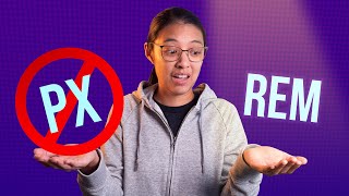
Today in this video we are looking at the difference between rem em and px CSS units within web design and Elementor. I explain when you should use which and things to consider when using em and rem.
Whether it is px vs em, or em vs rem, or even px vs rem, it can be a mind field knowing the difference and how these can affect your website design.
You will also get an understanding Px Em Rem Elementor with a real-life example of my website using these CSS units.
-----------
For super fast and reliable website hosting. I recommend Siteground hosting: www.siteground.com/index.htm?...
If you are thinking of signing up to Elementor, feel free to show appreciation to this channel and use our link here: be.elementor.com/visit/?bta=1...
What I use for my videos →
MacBook Pro 13-inch 2017: amzn.to/2J6M3kn
Camera (Apple iPhone 12): amzn.to/38oL8V5
Sound Recording (Blue Snowball Mic): amzn.to/3awuNAg
External Speaker (Bose Soundlink Mini 2): amzn.to/3rie3CL
Magic Mouse: amzn.to/3pcdGrL
Agency Website →
www.tristanparker.co.uk/
Instagram →
/ thewebdesignlife
-------
// BUILD A WEBSITE STEP BY STEP
• How to Make a Fitness ...
Channel inspired by creators: Wes McDowell, Darrel Wilson, Create a Pro Website, Jesse Showalter, CharliMarieTV, Neil Patel, Flux
TOP 5 WEBSITES EVERY WEB DESIGNER SHOULD VISIT: Mind-blowing web design | March 2020:
• TOP 5 WEBSITES EVERY W...
How To Create An eCommerce Website With Wordpress 2020 [ONLINE STORE!]: • TOP 5 WEBSITES EVERY W...
• How To Create An eComm...
Elementor Wordpress Tutorial - The Basics in 10 Minutes
• Elementor Wordpress Tu...
How to Make a WordPress Website with Elementor | (Best Elementor Tutorial):
• How to Make a WordPres...


🔥NEW course: Agency Alchemist Accelerator 🔥
agencyalchemist.com/agency-alchemist-accelerator/
Do you recommend not using Pixels at all? Just REM, EM, % and VH, VW
Just started web dev like 3 months ago and got into tutorial hell, then walked away from it for a while. Came back and started fresh, and got lost on a CSS tutorial, quick search and found this video and now i have a better understanding. Even took some notes! thanks man :]
Video starts at 1:26
Man this is the great video I have found so far. I have seen a lot of videos on youtube but they are all useless for me as I didn't understand any single explanation of them. Thanks to you now my concept become fully clear. I wish your channel grows bigger in a short time.
Really cool explanation, Thanks for clearing out confusion.
The clearest video about this topic so far! Thanks!
This was EXTREMELY helpful! Thanks for sharing :)
Thanks a lot!! I shld hv learned these simple, but impt stuff, from the start, certainly crucial to responsive web design
Thanks man, straight to the point and clear
Thank for the clarity on this topic!
Best explanation I found so far. Thank you
very helpful it was very frustrating to know about font units now its very easy to understand after watching this video
🔥NEW Exclusive Elementor and Web Design Group 🔥
facebook.com/groups/elementorwebdesign
yes, I was looking for a video on this topic for a long time. thanks for creating it.
You’re welcome. Hope it was useful
This video helped me a lot! Thank you so much!
nice! well explained, especially for visual learners like myself
This video was so good! Thank you
Nice vid man im actually in the middle of doing ems and rem on my course you explained everything really well 👍
Thanks man. Appreciate that.
Great stuff, many thanks!
thanks. found this really helpful
Great share, thanks mate
Thanks Tristan ✌🏻 you've perfectly explained in the video 🍻
You’re welcome. Glad you found it useful
Awesome! Thank you so much!
it was very helpful, thank you so much!
You’re welcome
Nicely done
Thanks for this video! very helpful 🙏
How should i set the parant element? or how does elementor now what is the value of my px if i dont do anyting and juse choose em?
great video
Thanks Tristan 🔥content.
Hey, you helped me out a ton!... what font is your logo?
Hi thanks for some great videos I have signed up... Quick question I'm using astra Pro theme and elementor Pro.
What do you recommend for font sizing for websites?
Could you do a set up video in relation to
Fonts sizes, theme colours, elrmentor container sizes and astra containing sizes... Please.
I have also been looking at kadence theme as there seems to be an easier set up that can dynamically change colours and fonts of your them with elementor... Any thoughts much appreciated 😊
Thanks Man!!
Thank you!
At 5:42 you say "main title has a size of 6 EM". But when you go to the digital market line you're talking about 0,82 REM but you point to the EM. Same with the paragraph. There you also talk about REM instead of EM.
So how does someone set the font size of the "parent element"? Does the desktop have to set to px and then that is the parent element?
Thanks, as you said, "very benificial".
Leaves too many questions unanswered. Thanks for trying.
Thanks for the comment. Apologies it didn’t quite answer all your questions. Appreciate the feedback.
@@tristanparker perhaps you could demonstrate in detail using Elementor rather than briefly.
Pixels are always pixels, sure BUT what about relative view size across today’s varied screen technologies from desktop screens to mobile displays, VR displays and soon to be Augmented Reality displays
but how to know what the parent and root elements pixle sizes are?
what about hero section height, section width, picture sizes with these values?
Thanks a lot😁😊😊
You’re welcome
Thanks for the great tutorial! I have a suggestion, why not create a video and go more in-depth with the examples? Thanks again!
Just the explanation I was looking for! Thanks @tristanparker . One quick question tho... I'm having an issue with the hero section of a website I'm currently building for a client. I work on a 24" screen and my laptop is 17", screen res in 1920*1080. My client has a small laptop, I believe 13" or 14". All my hero section is built with VW and VH and percentages, which works nicely for now, but when he visualizes the page in his laptop, the text displays massively, and some elements overlap with the nav menu. I asked what screen res he had, and said 1920*1080, just like mine, so I'm guessing this "shouldn't happen" since the screen resolutions are the same regardless of physical screen size? Is this correct? or am I missing something here?... This is exactly the reason I was researching for EMs and REMs right now... thanks in advance!
Yes percentages can become messy. I’m sure you can switch the height value from percentage to ems on smaller devices. You can also add extra breakpoints into your elementor settings too.
where are the parent and root elements? They relate to what ? What is the initial value ??
Question is, can we change the size of root elementor, if can where we can do this?, and still didn't know where is the location of parent elementor, I take the sample: if I use text widget with 1em font size (imagine that its a child) so what parent of the widget that will be parent for it?
just inspect it to find what the element above and thats the parent
In this context, what's a Parent Element?
WHERE DO YOU SET EM PARENT ELEMENT?
Thanks
Normally don't comment. Great Job!
In that case, I am honoured 😂 thank you for the kind words. How’s your web design journey going?
Now I know the difference between EMs and REMs but how about M&Ms?
😂😂
Thanks. REM takes a multiple of the Root HTML element whereas EM takes a multiple of the parent element. In your Elementor example where the heading and all text had a setting of EM, where is the font size of the parent element set? What is the "Parent Element". Thanks
I wondered the same thing too and I noticed in the Elementor example it was set to EM but he called it REM so just a little confused there but i'll work it out
Nice but not really beginner friendly. Thanks bro.
Thanks for the feedback.
At 3:42 shouldn't one of the child elements be 16 px instead of 18px, since it inherits it's value by the root not the parent?
Only if one of them were 1rem
「あなたのコンテンツはとても感動的です」、
It would have been much easier to understand if you would have shown the differences directly in elementor.
No answer to the question when to use which one
Demistified finaly!
It is a clear explanation of the difference between px , em and rem... but you didn't explain what the hell this is about!
First of all even when px are an absolute number, it is not an absolute measure, as 16 px on a 72 ppi screen is not the same size as 16 px on a 150 ppi screen, the latter will be a little less than half the size of the first one, if you look at those screens. And in the end that is what humans do, they look at screens.
What is an EM, this is a relative unit from typography and is older than your px. It is the imaginary square type is mounted on. In the old days this war very real and very physical as type where blocks of lead. The letter 'M' fitting on a square that is as large as an , you guessed it 'EM'. In typography there is also a thing as an EM-space and also an M-dash.
So even before computing and the internet there was a relative unit called an M-square or EM which always id the size of the related font size.
This is really what an em and thus an rem is, the size of a square that fits the letter 'M' of the font size (for em in that line, paragraph or 'block' as it is called in web-talk, and for the rem in the root of the HTML.
Want to know more: designwithfontforge.com/en-US/The_EM_Square.html
This is confusing