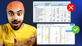
Highlight Sales Drops - Creative Line Chart Visualization in Power BI

HTML-код
- Опубликовано: 8 сен 2024
- In this video, we will learn to create an awesome line chart in Power BI where sales drops are highlighted in a very creative way. We'll also create a dynamic slicer to adjust the drop percentage and add a meaningful title that updates automatically based on the data displayed.
• Create Awesome Chart T...
===== ONLINE COURSES =====
✔️ Master 'M' in Power Query -
goodly.co.in/l...
✔️ Mastering DAX in Power BI -
goodly.co.in/l...
✔️ Power Query Course-
goodly.co.in/l...
✔️ Master Excel Step-by-Step-
goodly.co.in/l...
✔️ Business Intelligence Dashboards-
goodly.co.in/l...
===== LINKS 🔗 =====
Blog 📰 - www.goodly.co....
Corporate Training 👨🏫 - www.goodly.co....
Need my help on a Project 💻- www.goodly.co....
Download File ⬇️ - goodly.co.in/c...
===== CONTACT 🌐 =====
Twitter - / chandeep2786
LinkedIn - / chandeepchhabra
Email - goodly.wordpress@gmail.com
===== WHO AM I? =====
A lot of people think that my name is Goodly, it's NOT ;)
My name is Chandeep. Goodly is my full-time venture where I share what I learn about Excel and Power BI.
Please browse around, you'll find a ton of interesting videos that I have created :) Cheers!


Download the Line chart visualization here ⬇ - goodly.co.in/creative-Line-chart-visualization-power-bi
Create Awesome Chart Titles - ruclips.net/video/ssxlKI1NoNM/видео.htmlsi=bjzMM7KDdTJl8ICy
Join my DAX & Data Modeling Course - goodly.co.in/learn-dax-powerbi/
I have always had problem in understanding dax basics... But after lot of research you made me understand basics very well. Grateful to you chandeep. Bless up. 😊
magical insight...thank you Sir
Great work as always Chandeep. I loved how you explained the logic. Your use case for dynamic titles is super smart.
Excelente tutorial, magistral y muy bien explicado, como siempre. Enhorabuena y mil gracias.
This is fantastic, thanks Chandeep
Awsaome...as always!!!!
Great tutorial as usual Chandeep !! How to deal with a table with a granularity of the week (for instance the your Sales Table ? I am strugling !
Just awesome. thank you Chandeep
excellent as usual, thank you for sharing
Great video chandeep
Great approach!
What program do you use to highlight text (rectangles, underlines) during your presentation?
Could you make a video of Dax functions Filter and ALL.
When to use them together while calculating measures.
Please 🙏 make ❤ !!
Awesome
🎉🎉
Sir, Just you remind you that no video upload in Goodly Desi last 5 month. When new video upload in Goodly Desi?
focusing on the english channel for now :)