Create fantastic tables using gtExtras in R.

HTML-код
- Опубликовано: 15 июл 2024
- Welcome to a closer look at the gtExtras package in R! 📊✨ In this video, we'll explore how to enhance your data tables with the powerful and flexible features provided by the gtExtras package. Whether you're a data analyst, data scientist, R programmer, or enthusiast, this package will help you take your data presentation to the next level. If you're learning R programming then this video is for you. In fact, even if you are a beginner, you'll find this helpful.
What You'll Learn:
Introduction to gtExtras: Understand what the gtExtras package is and how it complements the gt package for creating stunning tables in R.
Key Features: Discover the key features of gtExtras, including customized table styling, advanced formatting options, and how to integrate visual elements seamlessly.
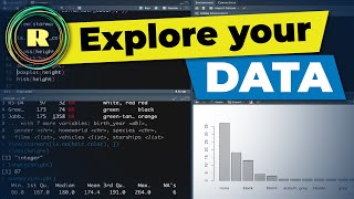
Practical Examples: Follow along with practical examples demonstrating how to use gtExtras to make your data tables more informative and visually appealing.
Best Practices: Learn best practices for using gtExtras in data science projects to improve your data reporting and presentation skills.
This tutorial is perfect for anyone involved in data analysis, data visualization, or R programming. Boost your data science toolkit and make your tables stand out with gtExtras!
🔔 Don't forget to like, comment, and subscribe for more tutorials on R programming, data science, and data visualization!
#RProgramming #DataScience #DataVisualization #gtExtras #RStats #DataTables #DataAnalysis #RPackage #TableStyling #DataReporting #gtPackage  Развлечения


😮--- literally me whilst watching this video. THANKS!!
Me too!😮
Awesome yet again 🎉 Greg , my R superhero 😎
Hi Greg, love your videos, do you think you could make a video on survival analysis on R? Kaplan Meier curves, cox regressions etc. Would be super helpful for a lot of us
Sir kindly do a tutorial on trend analysis like Mann-Kendal and WAVK Test
'Don't do drugs, Do your best, Boom shakalaka'-Greg Martin
👏👏
Cool
🎉😮😮
Thank you for this video! Can you please do one on how to make pie charts? I have been doing a lot of digging for good videos on them, but I haven't had any luck:(
That's because a good statistician would never use pie charts 😉
Excellent lesson. Is it possible to have a common x-axis? For instance, by centering?
I think those distributions do have a common x-axis, they just represent different values on it (you can see that from the different mean and median values)
This is fucking awesome!😂
Excellent content and very timely! I looked for something like this just yesterday! I’ll try it now🥰
We plot charts but the precise values are often found only in the text, which I found inconvenient as we need to either remember or add the values manually to a presentation slide. It is nice to have a summary with values visually 🎉
I got an error after trying the iris summary table: Error in loadNamespace(x) : there is no package called ‘svglite’. I could get it to work after installing the package 'svglite'. Thanks for your introduction, Greg!