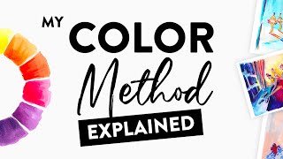
Essential Colour Mixing tips / your Oil Painting Palette!

HTML-код
- Опубликовано: 25 авг 2024
- How to mix colours in oils. Andrew Tischler tries to find his "Essential Palette" by identifying the best secondaries he can achieve by mixing. In limiting the palette to just 10 colours Andrew is able to make a wide range of Oranges, Greens and Violets.
www.andrewtisch...
/ andrewtischlerartist
/ andrew_tischler_artist
To order your Essential Palette (Australia and International) Please visit:
stlukeart.com.au
PROMO CODE NO LONGER AVAILABLE FOR PALETTE
For USA, to order your Essential Palette Please Visit:
www.sohoartmat...
Ask For "Andrew Tischler's Essential Palette"
Check out Andrew Tischler's Seascape DVD and read the 5 star reviews!
www.andrewtisc...
This Portrait Tutorial is no longer available.
A NEW PAINTING PORTRAITS TUTORIAL will be out late 2018
www.andrewtisch...
Free Giveaway Code: Now Expired
Check out the BRUSHES I use:
www.rosemaryan...


can honestly say this is the most practical and clearly explained use of colour I have seen. every video Andrew has posted has opened the door to my understanding of painting further. Can't wait to see the still life video. keep doing what you do.
Can only agree with you Robert! Saved me typing !!
I can see clearly now the rain has gone, I can remove ALL obstacles in my way! Thank you Andrew!!!!
Very helpful Andrew! The mysteries of color mixing unfolds! Thank you
you are the gread honestly because of you I did achieve few excellent oiland acrylic painting from bird to ameriendien face I am a beinger aven I sold more that 60 painting in last past two years you are my mentor and thank again even I am at 78 you are my mentor merci
Andrew Tischler is a master of oil painting ❤and master of anything related to oil painting!!! Salute 😊
The camera angles and video quality is looking amazing in this video ✨✨And that Painting on which you are working is also looking awesome..👍👍
Dear Andrew, thank you very much for making this video it has helped me a lot as color mixing or color matching is my biggest nightmare, I find it incredibly hard to find what colors to mix to find an exact match to the color I see on my reference picture. It would be amazing if you could make more videos showing how to do this. Another thing Id love to see is how to achieve distance with color mixing. Thank you so much for sharing your knowlwdge you are an absolutely incredible artist one of the most talented I have seen. 😊
You, sir, are an amazing artist and you provide us with invaluable tips about approaching a subject and how to successfully incorporate the myriad of processes that go into producing a masterpiece! You should be proud of your amazing gift and teaching skills!
Thanks Charles!
I really love how each and every one of your videos is packed with brilliant inspiration. Keep up the good work, mate. Cheers from Kuwait!
Thank you! I appreciate the feedback!
Andrew Tischler Has there ever been any consideration of having your videos in Netflix. That would be so amazing!
Your videos are so well made- informative, clear and to the point.
As someone about to take up painting this is useful. I guess it just take time and experience to know what colours to mix to get a tone you are after.
I haven't even bought my colors .I didn't even know where to start . Thanks a bunch u r amazing
Extremely helpful and straightforward! Thank you!!
I love your style of explaining.its cool .i love your all videos.amazingly helpful for all art lovers.
Thanks Nasima!
Great video! A lot to learn from it. I use a color palette similar to the primary cool palette that you showed at 4:32 + burnt umber and titanium white (five color palette). It does wonders and minimizes cost too! But I use powerful colors such cad orange deep or red light or pthalo blue on need basis. I also use Zorn palette.
WOW! thanks! This is extremely VALUABLE info and a GREAT demo !!!
Que sonho ter uns pincéis desses e umas tintas a óleo dessas pra pintar, esse óleo gel parece maravilhoso se Deus quiser um dia vou conseguir muito obrigada pelos vídeos um abraço aqui de Barra bonita sp Brasil
oh man Andrew that painting is looking amazing! The way you set up your still life with the lighting is amazing.
Mind blowing! Many thanks Andy! Feeling inspired.
I have never used Langridge, but I can recommend either Blue Ridge, or Williamsburg.
Hey Andrew, could you do a quick tip on different colours/warmths of light hitting/mixing with (basic) colours?
So happy I found you. The lightbulb just went on.
I am very impressed with your tutorials. I know nothing about oil painting but want to learn. I have found I enjoy your instruction and bought your brushes from Rosemary brushes. I am collecting paint and believe I have the necessary colors. Really looking forward to learning some techniques. Would really like to learn how to paint rocks, old rock covered in moss, cracked from use, like stairways. I have a vision of painting stone cases leading up and curving and even blending into the mists of the forest.
You did it again Andrew, great video!
Absolutely INSANE TALENT!! I checked out your website also. Very difficult to comprehend how anyone can make a painting look more real than photography. I feel like I'm actually there. If you could only add the smell of the air, it would be virtual reality! :-) You Andrew, are extremely blessed. Thank you for sharing.
Hey thanks so much for the comment!
These are very useful informations you have shared with us. Thanks a lot.
Amazing !
What is interesting is the palette with Lemon Yellow, Cad Yellow Deep, Pyrol Red,, Quin. Magenta, Pthalo Blue, and Ultramarine Blue are very similar to the impressionist painter Emile Gruppe's palette.
Most useful video I've seen on colors. Actual real world application rather than theoretical .. thank you ..
Love these videos! One question I have is how do you maintain control of your Pthalos? They can so easily overpower other colors in the palette. Artists at some workshops I've been to have stated they simply leave the Pthalos out because they can tend to influence your colors even by cleaning your brush in OMS where Pthalos have been cleaned as well. Can't wait for your next video!!
I may have to address this in the next quick clip, but a colour's power is not a reason NOT to use it! All the more reason I say! It's about having suitable colours to counter their effect, desaturate, mix or neutralise! Great question, let's make a video about it!
bravo Andrew; for your mixing tips; and thank you very much to be there for us a fan from Québec, Canada;
Your videos about portrait painting are much inspiring . A mature artists will gain knowledge by watching your demos...encouraging..Wonderful.. Anil from India.
Great video as always. Truly inspiring - Thank you for sharing
Quick CLIP! On Planning. Whether a still life or a landscape, nothing takes the place of good planning. Let's get a five minute piece on mental and physical preparedness for big and small projects.
thank you brather...
very nice presentation an excellent artist, I like that cat and 2 dogs was very nice so lovely ;)
Thank you for all the time this took.VERY informative!
Clearly explained thank you from the Netherlands.
Amazing quality ...I can watch these videos 24/7
your explaining style and video demonstration is excellent it is very easy to understand thanku so much keep uploading your new videos your fan from india
hey Andrew! I'm so excited to try your color palette, I think it really help me out with my painting. one of biggest problems is color mixing. so I'm also looking forward to your Ouick Clips#7 on Color mixing. you are a wealth of knowledge rock on Mate!
Hey Man! Yes, I am going to be talking all about how to match any colour with this palette. You're going to love working with these new colours! Cheers for the comment!
Awesome video! Very helpful. New subscriber
Very good examples. Thank you.
Loving your videos, and cant stop watching them. I am just about to start learning to paint, and I have chosen oil as my preffered option. As an absolute begginer, what would you recomend the minimum colours to use, I have Burn Umber and Titanium White in my list so far, but there are so many "tutorials" out there its hard to get a grip on what I should go for. Looking to limit my pallette to force me to learn to mix
Please do a "quick clip" about capturing "motion" in artwork. I find it difficult to achieve the illusion that something is moving fast, or stormy weather is raging.
Hey, great request. I will do this!
You are genius.. I following you. Thank you making for this types of video.
Ok, I just noticed your rotating chair with that arm-rest at the perfect height and position, and I want one!
same thing! what is this chair?
HAHA, he's creative with his accessories. Probably made it himself. ;>)
I think is a regular chair, with a low "back rest" (I don't know the english word for that part of the chair) and he is just sitting "backwards" on it... (with his leg throught where the back should go).
It looks like chairs that dental assistants use
@@Thiefofbeats is a dentist special chair. it use to suport when he is laying to the front working
Thanks sir
oh good I live in NYC close to SOHO lucky me
Hiya,
Stunning work. Really. I’m new to painting. Could you define what you mean by warm, cool, tone, desaturation, saturation . I thought warm was your reds, yellows, and cool was your blues, greens, etc but you seem to have an expanded or more subtle definition
Hi Andrew ... really nice tutorial you've made ... after watching I decided to test my colour palette against the secondary colours ... thank you and keep on doing such great tutorials
Hey thanks! Yes, much testing is needed before we arrive at a colour palette!
Do you think it could be useful and clever to mix different brands to have an optimal/balanced palette ?
Hmmm...not really! I used to use up to 4 brands in my palette, but when I realised Langridge made the best paint, I switched immediately. Sorry, I am a huge Langridge fan and that's why I won't shut up about this paint. It's pure gold!
The problem is I can't find them here in Belgium ... only seems to sell them in Australia and US :-/
The will ship them to Belgium! Get in touch with St Lukes!
stlukeart.com.au
Great video Andrew.
I would love to see a video dedicated to the use of various mediums such as the Oleogel you use. To me, that's always been an area of confusion with painting!
On the way! I will have to do a quick clip very soon about medium!
Good information. Keep them coming.
Hello Andrew, I'm Looking Forward For A Video About Mediums And Oils For Painting And How To Use Them
I was going to comment in the most recent video how much your mustache reminds me of Jack Sparrow/early Depp LOL, but now I see in here the style suits you so well!
excellent really happy watching u very impressive and well detailed video I will be carrying on watching thank u. even with skin tones really great thank u
Thank you for this! Can you please explain what sorts of additives or oils you mix with these oils? Maybe what the differences are between them?
Sure thing, I am working on that clip now, it'll be out soon!
YOU'RE AWESOME!
Great video again and I have to tell you that you are one of the very few artists I admire, I like perfectionism and I can tell you this I would have your paints on my wall but not a Picasso (I would sale it :)) or any other cubism paint.
I would sell that Picasso in a flash! haha! Thanks for the comment!
Hi! I love your tips! Could you make a quick clip about light and shade? Thank you!
Thanks Andrew ...... Have been loving the content over the last few weeks your informative and a great presenter with a boatload of skill.
I think if i were to request anything it would be how you would go about painting fire or lava.
I think it has to be one of the most challenging subjects and it would be great to get some insight from someone with your skill level ..
Anyway ....... keep up the fine work
Very interesting video. Thanks
Great work Andrew!
M.
Always interesting exploring the gamut available from your palette. I started, and for several years only used, a limited palette of five colours: French Ultramarine, Burnt Umber, Permanent Alizarin Crimson, Cadmium Yellow Pale, White. I have always been skeptical of the value of the 'split primary' idea, which arose through an early misunderstanding of the nature of colour and what 'primary' means. In particular, 19th Century painters did not understand that any three primary colours that exist cannot mix all visible colours, and any three primaries that can mix all visible colours cannot exist in life, but they exist in mathematical colour space. So the basic idea of split primaries, that the only reason they can't mix all the colours is that real-world pigments are 'contaminated' by one of the other primaries, is false. The real reason is saturation costs when your colours are far apart in colour space. Logically, it is better to take a six colour equally-spaced secondary palette than a six colour split primary palette; it gives a larger, and a more conveniently mixed, gamut. I think Graydon Parrish found that you could mix all possible colours available in paint with 19 carefully chosen colours (sometimes the specific make mattered). However, I haven't felt the need to push the envelope to the highest chroma across all hue angles, so 10-12 seem to be good enough.
Further to that, in choosing a high chroma set of six colours (to maximize gamut), it seemed wasteful to mix cheap earth colours with expensive cadmiums and cobalts; why not just have a couple of them on the palette, ready to dull excessive chroma? So I added a Sienna, an Umber and an Ochre back on.
Currently, I'm following Richard Schmid's advice in Alla Prima II to make a set of colour charts. This is proving a really useful exercise in giving me a reference for quickly seeing how to mix something very close to the colour I want with just two colours (plus white), which I can then nudge if necessary with a third.
love this. can you say the colors used for the last two mixes?
Awesome
You and your videos are so good and helpfull man, really keep up the good work
I’m confused. Primary’s were mixed but then ‘Burnt Sienna’ was said to be dropped from the first colour wheel. Burnt Sienna wasn’t used was it? Andrew is epic.
James Gurney in is book says that alizarim Crimson disappeared with time from the canvas, that's why he was using Pyrole Red.
I thought ultramarine was warm and pthalo was cool? Im so confused lol
Hey, Andrew! Is teal the same as Cobolt teal? Some tubes just say "teal" ..... just wondering.
Eleo
Thank you ❤️
so informative.Love.
Please exppain: What are the differences between arylide lemon and cadmium yellow light? THANK YOU ! ps you are now my FAVORITE painting guy in terms of your palette and your approach to painting in 3 stages, basically. That seems the best for me at this time. I'm new with oils but I LOVE them, and I love you too! hehe. And I use all non toxic stuff too! I use lavender essential oil as my thinner at first stages, and a mixture of the lavender and walnut oil later if needed for more flow to the paint.
Superb video as usual. Really high content and production value. Would love to see a time lapse of a painting like this. Do you start with a ground color? Do you draw the object with a pencil first? Do you block in each object in a midtone color? Do you go straight to modeling? Do you start with the darkest values etc etc.
I think your videos are without a doubt the highest quality art videos I've found on youtube. Both your skill and like I said earlier, production value.
Every painting gets planned to an extent, but I only draw in my initial forms with a brush, not pencil. Yes I do start with a ground and this can either be burnt umber, or burnt sienna, sometimes black. Generally I preserve my tones when blocking in, but I don't block in flat, rather, I allow for some modelling with tone.
Thanks so much for the comment and thanks for watching!
Thanks for the reply! Pretty much what I expected from watching your other portrait videos. I have some experience drawing but painting like this is new, and I work in acrylics (for the time being). Again, very inspiring stuff.
thanks for another great video Andrew! have you done any vids on Chroma specifically? I feel that it is the most underlooked part of colour mixing for beginners. colour theory/matching etc is essential but alot of beginners tend to use artificial looking colours. cheers Vaughan
Hey Vaughan! I will make a video on this topic for sure. There is a lot of ground to cover there!
i want to start my painting again after 8 years please guide me sir!! u r great👍👍
hi, can you make a video about how you clean after painting all your material and space? thank you very much!
Just found your channel and it's one of the best and quality of your paintings are top. Your limited landscaping palette which I'm looking at putting together - I see Langridge no longer do generic pythalo blue or pythalo green, only the shaded versions. Which shades do you suggest getting? or go for alternative brand for the generic? Thanks
Andrew: you mention Australia and USA for acquiring you pallet but what about the UK? I expect to be touring New Zealand in the near future so where should I check out there? Great video, I always seem to have trouble getting the tone I want and the idea of creating personal colour wheels is a great idea
Red green and blue plz
If there is a shade of color (such as Phthalo Blue Red version or Phthalo Blue Green Version) could you tell us? I'm having to guess which version of color to buy
It looks very comfortable long sessions
Nice!!!
Hello Andrew! What colors are on your palette these days? Also, I see here that you were using no cadmium colors. Why is that? Thank you!
i always thought ultramarine blue is a warm blue ,red bias phthalo blue a cool. blue ,green bias,interesting mixes,tfs
It depends on the manufacturer. Langridge makes a cold shade ultramarine. The pthalo is shifted towards green with more yellow pushing it warmer. When we get into red-shade and yellow shade it starts getting weird! I will cover this in a little more detail soon. Cheers for the comment!
Thanks it's good to know about the brand your using,yes brands do throw a curve ball with pigments,i know W&n have umb green shade in watercolour,phthalo blue range from pb 15 ,15.1,15.3 upwards,so much fun.
very interesting mate! cheers
G'day Andrew, thank you for sharing. Always learning. Love the painting behind you.
Hey Thanks Chrissy!
my new fave youtuber great videos! 💖
Tremendo artista !!
Hey Andrew do you have any recommended art distributors here in Cape Town South Africa? Your tutorials helped me build confidence as an artist. Awesome tutorials!
Hi Andrew, I want to know how to paint stained superfices such as old walls or floors. I´m thinking in Arturo Montoto´s work.
Excellent as always, I have subscribed .I am wacthing all your videos and as soon you have a DVD for stillfe I will be the first to purchase it.A question : you mention the color yellow oxide in some videos, but it does not appear in your palette.Is this color not from Langridge.?I am asking you because I like using red oxide from but I didn't know that an yellow oxide exists.Thank you!
nice
Hi Andrew
Really loved this short clip about your palette. I have researched the possibility of purchasing some Langridge oil paints but the prices and shipping cost to Malta where I live make the cost prohibitive. These days I tend to look at the pigment codes of colours. I have noticed that for example Langridge Quinacridone Magenta uses PR122 , a pigment which is used by other manufactures which I can purchase at a reasonable price here. Would trying to match pigments be an alternative? Thanks
Anthony Vella
Hello sir, Can you show the same technique for acrylic colour because I'm Confused about the acrylic name and oil colour name?
Hello sir ! I am from Pakistan, I like to see your videos about landscape painting. Sir please record a video about usage of complementary colors in landscape. Thank you.
Is this also applied to acrylic painting? You are amazing btw...
It is good for illustrating color mixing but no one said you can't use burnt sienna. That just silly. If you have a color use it if it is needed.
Hi Andrew. I have recently purchased your Portrait painting course and would appreciate your advice on substituting colours for some of your palette - Trans. yellow oxide( I have Raw Sienna and Indian Yellow); Cobalt Teal (I have Cobalt Green and Compose Green); Turquoise Pthalo (I have Pthalo Green) and Quainacradone Magenta (I have Quin. Rose and Cobalt Violet). Would any of these in my collection work? I have checked the prices of various marques and replacing them would be very expensive. Loving your work. Merle Drury