Looks great my dude! Currently trying to figure out Python but when I get back around to exploring R more I can tell this will be great! Keep up the great work!
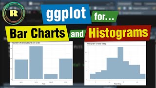
Your content is good. Please post more videos on R concepts. It's a very good and coceptual video that helped me to clear my doubts and gain knowledge about the barplots.
Thank you so much! That really means a lot. I keep meaning to post more videos, but hopefully I will find the motivation to post another one this week!
Hi guys, I am coding with R. My code worked untill yestarday. Today I'm getting the following error: "error in ggplot could not find function "ggplot"", please someone help me to fix this? Thanks a lot.
I really don't get why when I use the fill=color, i get an error: Error in FUN(X[[i]], ...) : object 'colour' not found Also with a bigger dataset the y axis sets a maximum of 2000. So I don't see the full graph.
Hey! I was able to replicate the error you got using the code "ggplot(diamonds) + geom_point(aes(fill = colour))", so I think you may have just spelt it as 'colour' rather than the american way which it is written in the dataset. This error can also happen if you don't call the dataset and write "ggplot() + geom_point(aes(fill = color))" For the second part of your question, I don't think I have ever noticed the y-axis setting a maximum. However, the axis limits can be changed by adding 'scale_y_continuous(limits = c(desired_minimum, desired_maximum))'. For example, you might add '+ scale_y_continuous(limits = c(0, 20000))' to your ggplot code. I hope this helps!


![Boxplots in R with ggplot and geom_boxplot() [R- Graph Gallery Tutorial]](/img/1.gif)
this content makes me bananas
in the good way
Looks great my dude! Currently trying to figure out Python but when I get back around to exploring R more I can tell this will be great! Keep up the great work!
Thank you so much! We will keep trying to improve things (like the audio quality) but I am really glad you are enjoying it so far!
Thank you.It is rewarding watching your video and God bless you very richly.
Thank you, that’s very kind!
thank you so much
That's okay! Glad I could help!
Your content is good. Please post more videos on R concepts. It's a very good and coceptual video that helped me to clear my doubts and gain knowledge about the barplots.
Thank you so much! That really means a lot. I keep meaning to post more videos, but hopefully I will find the motivation to post another one this week!
Hi guys,
I am coding with R. My code worked untill yestarday.
Today I'm getting the following error:
"error in ggplot could not find function "ggplot"", please someone help me to fix this? Thanks a lot.
Nice
I really don't get why when I use the fill=color, i get an error: Error in FUN(X[[i]], ...) : object 'colour' not found
Also with a bigger dataset the y axis sets a maximum of 2000. So I don't see the full graph.
Hey! I was able to replicate the error you got using the code "ggplot(diamonds) + geom_point(aes(fill = colour))", so I think you may have just spelt it as 'colour' rather than the american way which it is written in the dataset. This error can also happen if you don't call the dataset and write "ggplot() + geom_point(aes(fill = color))"
For the second part of your question, I don't think I have ever noticed the y-axis setting a maximum. However, the axis limits can be changed by adding 'scale_y_continuous(limits = c(desired_minimum, desired_maximum))'. For example, you might add '+ scale_y_continuous(limits = c(0, 20000))' to your ggplot code.
I hope this helps!
@@peelingbackdata3907 thanks a lot! This helps
Thank you so much, could you send the csv file and code