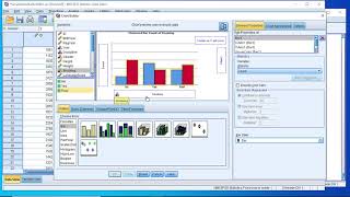
SPSS - Box Plots of Multiple Variables
HTML-код
- Опубликовано: 6 июл 2024
- Instructional video on how to create a diagram showing a box plot for multiple scale variables with SPSS. This could be used as a visualization for repeated measures.
Companion website: PeterStatistics.com
SPSS version used in video: 26


I had no idea how to do this was searching for a solution for 5 hours until I watched your video. Took me then 5 minutes :))
Thank you so much this was so helpful! You saved my presentation!
Glad it helped!
Thank you so much - the only video that really works and easy to follow!
Glad it helped!
I was searching for that everywhere! thanks a lot!!
Glad I could help!
Yes, Great!
Thank you
Thank you so much :) precise and useful!
Glad it was helpful!
Thank you sooooooo much!!! You are saving my life!
Happy to help!
Thanks for the video, it is possible to make the box-and-whisker plot with only minimum and maximum values, for example: FOREST (0.25982645-min)//0.3559550 (max) and so I have three more variables???
Thank you sir for your effort, please can you help me on how to displaying for example the precipitation data for July 2019 and July 2020 on one (1) box plot and whisker(not side by side)?
the easiest method is probably to use the chart builder as shown around 2:09 and then click on the 1-D box plot icon (the third option) and move your single scale variable to the x-axis. Hope this helps. Happy 2021
Thank you, this was so so helpful basically saved me!!
Glad it helped!
OMMGG, thank you!!!❤❤❤
No problem 😊
thank you
You're welcome
Very nice!
Thanks!
Thanks.How to add the p-value or * to compare between two groups on the plot?
I doubt this is possible. You can perhaps first do the pairwise comparison (ruclips.net/video/VKOjO5kfcYU/видео.html or ruclips.net/video/K-n2AG4jKPU/видео.html) and then use textboxes manually to add to which ones they are significantly different. It will be tricky though to clearly indicates which one(s) are sig. different from other one(s).
I missed some samples of interpreting a boxplot graph. Could vou do so? Thanx!
Indeed my videos are mostly about 'how to get X with program Y', and not much on if you should use X or how to interpret the result. The videos would then also become a lot longer. On my website I do explain a bit more on interpreting the results, but not (yet) for a box-plot. I am working on additional videos where I (try to) explain the result. Haven't gotten around to get to the box-plot yet, and am quite busy at the moment with work. :-(
Is it necessary to restructure data. When plotting my box plots it won't allow me to plot a number of different variables on one graph
to my knowledge you indeed have to restructure the data otherwise it won't work.
Is there any way to add significance bars between groups?
sorry, don't know if that is possible. 🙁
For the first plot, if i wanted to include a caption how can i do it
you can double click on a chart, which opens the Chart Editor. You can then add a title, text and other changes using the menubar Options.
Hope this is what you were looking for.
You are me hero, when i will grow, i want be just like you. jajajaja
thanks, glad to help.
hello how do you copy all variables in order to rename it as score? when i try making the box plot it on shows one variable as the score and not all 4
sorry, I can't seem to reproduce your problem, so difficult to tell why the instructions from the video do not work for you. Could you perhaps clarify where things start to look different for you?
is there a way for quartiles values to be shown inside the box plot
not to my knowledge. A quick google search on box plot images from SPSS also don't show any that have this.
@@stikpet don't worry it's just the professor being an as..ol , he knows it doesn't exist and told us to not send him the work if we didn't find the way lmao or we will get minus some points I looked for it for hours with no results, I will ask him to do it before us to see.
you could add simply some textboxes in the Chart Editor and write the values manually :-)
There is an option to show data label points, but that is for individual points (like outliers), not the quartiles themselves.
You could perhaps create an extra variable that has the quartiles only, plot those besides the original and show those data labels or something. It won't look nice though.
Oh hi I have a problem drag the variables into the Y-axis when creating the box plot
Difficult to tell what the problem is, if I cannot replicate it. Perhaps the measurement level is not set properly?