Use a Radar Chart to Explain Your Data

HTML-код
- Опубликовано: 22 авг 2024
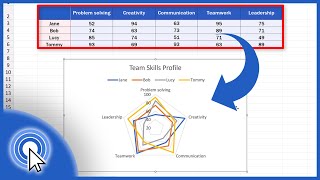
- Today will we talk about how to use a radar chart to compare the performance of two project managers on multiple factors. Don't worry. It can all be done with a three-part description and analysis. Here is an example for a fictional IT consulting company.
“STIOT’s ability to develop and deliver mobile apps that look and function beyond our client’s expectations ultimately relies upon cultivating high-performing teams. Our project managers play an essential role not only creating value for our clients, but also ensuring the long-term success of STIOT by continuously developing our greatest resource - our team members. Team C.C. (a.k.a. Captain Crunch) is an exemplar of a team with a project manager who attends to her team. None of the team’s experiences at STIOT falls below an average rating of 3.8. On the other hand, Team L.C. (a.k.a. Lucky Charms) unfortunately does not live up to their namesake. Despite feeling valued at STIOT (3.6) and motivated (3.5), team members felt left in the dark (2.2) and uncertain about their future at STIOT (2.4). Considering the unique skill set developed within our teams as they provide clients with best-in-class digital experiences, it is imperative that STIOT retains motivated employees. The Team L.C. Project Manager may want to host a daily morning meeting or a “team huddle” to not only provide project updates and weekly goals, but also to create an environment of collaboration where team members can ask others for advice or feedback on particular problems they face in their work.”
If you love the background music as much as I do, check it out with these links below!
------------------------------
With You by Smith The Mister smiththemister...
Smith The Mister bit.ly/Smith-T...
Free Download / Stream: bit.ly/3p4gR7Q
Music promoted by Audio Library • With You - Smith The M...
------------------------------