Choosing The Right Chart For Your Data
HTML-код
- Опубликовано: 11 сен 2024
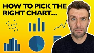
- Data visualization is an integral part of data analysis and communication. Choosing the right chart or graph type for your data is crucial for effectively communicating your findings to your audience. In order to do this, it is essential to have a basic understanding of the different chart types available and the types of data they are best suited for. This video provides you with a comprehensive overview of charts and offers tips on how to choose the right chart for your data.
One of the most common types of charts is the bar chart, which is used to compare discrete categories. For example, if you want to compare sales figures for different products, a bar chart can help you visualize the differences in performance between the products.
If you are working with continuous data, such as measurements over time, a line chart is often the most effective choice. Line charts show changes over time and can be used to identify trends and patterns in the data.
For data sets with multiple categories, a pie chart can be used to show the proportional breakdown of each category. This can be useful for displaying data such as market share or demographic data.
If you want to show how individual data points are distributed within a range, a histogram can be used. Histograms display the frequency of data points within a range or bin, making it easy to see where the majority of the data falls.
Other types of charts and graphs include scatter plots, area charts, heat maps, and bubble charts. Each chart type has its own strengths and weaknesses, and the choice of chart type will depend on the type of data you are working with and the story you want to tell.
When choosing the right chart for your data, it is important to consider the purpose of the visualization, the type of data, and the audience you are trying to reach. By selecting the appropriate chart type and presenting your data in a clear and visually appealing way, you can effectively communicate your findings and insights to your audience.
More resources to explore:
Page: How to choose the right chart for your data
infogram.com/p...
Blog: How to choose the right color palette for your charts
infogram.com/b...
Blog: Chart do's and don'ts: The ultimate data visualization guide
infogram.com/b...
Join today at infogram.com
Learn more tips, articles, and tutorials on how to use Infogram: infogram.com/blog
Follow us on social media:
Linkedin: / infogram
Twitter: / infogram
/ infogramapp
Instagram: / infogram
(Music: Glass Boy "35=15")
#charts #graphs #datavisualization


![How to Pick the RIGHT Charts For Your Data [TYPES OF GRAPHS AND CHARTS]](http://i.ytimg.com/vi/aUk4npRmjL8/mqdefault.jpg)
![[DOKKAN BATTLE] Worldwide Campaign Announcement Video Part 2!](http://i.ytimg.com/vi/JpT5Voak6WA/mqdefault.jpg)


Omg how come I didn’t know about you guys. I’m loving the platform. Easy and fun
why isn't some sort of text download with these charts available. How much information can one absorb at one time. Just way too much information to absorb.
what kind of data analysis software do you use ?
What software do you use to get the icons
wow he still doesn't respond to you dang
are you talking about editing software or just software?
Hello,
When working with our tool, you can use custom icons, as well as icons offered by Noun Project.