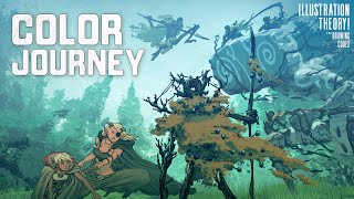
Another great hangout Tim. You are on the right path. Looking forward to more amazing studies, draw alongs, creations and workshops. Keep inspiring! I am curious to discover more from asian artists when it comes to tone and colour contrast.
Sir Tim, Your channel is a goldmine for someone like me who is learning to draw. I truly appreciate you putting out amazing quality videos and sharing your knowledge with the rest of us. I am forever grateful that I found your channel.
I do think the path of originality has merit. Since you have to do a crapton of trial and error you get more of an intrinsict understanding if how all the parts work together and for a personal style it helps it be more you as the cadences were fine tuned from the outset by you.
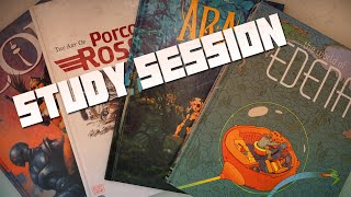
So I'm trying to make sure I get this. In your pinocchio on page 63, are going mostly tonal or color? I think tonal. Same question for page 73. My 2 fav pages. I love love love your water. I can't tell if it would look good in black or white though...


Another great hangout Tim. You are on the right path. Looking forward to more amazing studies, draw alongs, creations and workshops. Keep inspiring!
I am curious to discover more from asian artists when it comes to tone and colour contrast.
14:54 wow. That shirt..lovely
Sir Tim, Your channel is a goldmine for someone like me who is learning to draw. I truly appreciate you putting out amazing quality videos and sharing your knowledge with the rest of us. I am forever grateful that I found your channel.
This video needs to be shown in high school art class; it hands you the answer rather then you struggling to be "original" which doesn't exists.
I do think the path of originality has merit. Since you have to do a crapton of trial and error you get more of an intrinsict understanding if how all the parts work together and for a personal style it helps it be more you as the cadences were fine tuned from the outset by you.
So I'm trying to make sure I get this. In your pinocchio on page 63, are going mostly tonal or color? I think tonal. Same question for page 73. My 2 fav pages. I love love love your water. I can't tell if it would look good in black or white though...
28:02 enki bilal. Wow
12:44
Tim Mcburnie - The Drawing Codex, You're awesome! Let's be friends and play together!