Do you guys like to keep your colors consistent through multiple Illustrations!? Or vary between them? Let me know in the comments below! :) And I hope this video had some good tips for you!
I've been feeling very intimidated by starting out with procreate as someone who does not draw at all, but your videos are so lovely and informative. I'm so grateful for all your content. Thank you!
These tips were super helpful. I never knew how to get the different shades of one color for highlights and shadows to where it would be consistent and this really helped! Thank you!
Excellent! In college my eye opening class was a book called color notation. This helped me with values, hues and color families. You are explaining a portion here and it is appreciated.
You are a really amazing teacher, thank you so so much! This is going to make such a difference. I’ve been stuck for ages not sure how to use digital colour well. I’m going to go and watch all your other videos now! Hugely appreciate your insights and your channel 😍🙏🙏
Greetings. I’ve returned to your channel multiple times for your tutorials. I’m learning my way around Procreate. Doing clothing apparel printing. I learned something last night watching your Canvas Tips video. Man… I had so many setting CRAZY. And returned this morning with my Ginger Tea and Learned More… THANK YOU FOR YOUR VIDEOS. And, I definitely HIT YO SUBSCRIBE BUTTON…
I just bench watch like a dozen of your videos. Thank you. I’m waiting on my new iPad and brand new to digital art and your videos have helped me realized how procreate is such an amazing app. Love your work too.
One more helpful step in choosing colors. Explained a bunch, thanks! The very last step…the bonus step….awesome! Something I have always wanted to know and understand. Thank you!
I would advise to switch off the TrueTone on the iPad, as it can alter the look of your colors depending on the lighting conditions of the surroundings.
It doesn’t have anything to do with the brush itself. You hold down your pencil when you close the square or circle and procreate will make it perfect.
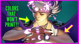
When creating a new custom canvas, you have two modes at the colour mode section - RGB and CMYK, you can choose CMYK there. Your inkjet printer should have a colour matching feature that you can just print your RGB file 👍
@@ghostpaper Thank you! I was trying to select it in a canvas I had already created and didn't see CMYK as an option, but now I see the option when creating a new canvas. This is awesome. I really appreciate your replying so quickly.
I am new to digital art. If I begin a print on demand shop is it advised to merge layers together at the end before sending my art for printing is is there no advantage? Not sure of print requirements at this stage or much for that matter😁
Hey im a producer, and i want to tell u that you can use my music as you like in our channel (always giving me credits) is copyright free and youre free to use it


Do you guys like to keep your colors consistent through multiple Illustrations!? Or vary between them? Let me know in the comments below! :) And I hope this video had some good tips for you!
I made so much color palettes, I will use your method to streamline my work flow haha
yes, consistent colors would be nice
I've been feeling very intimidated by starting out with procreate as someone who does not draw at all, but your videos are so lovely and informative. I'm so grateful for all your content. Thank you!
You’re welcome! Good luck on your illustration journey!
Thanks for these tips, very helpful and straight forward walk through!
These tips were super helpful. I never knew how to get the different shades of one color for highlights and shadows to where it would be consistent and this really helped! Thank you!
really cool illustrations!
Many thanks, very valuable information!
Excellent! In college my eye opening class was a book called color notation. This helped me with values, hues and color families. You are explaining a portion here and it is appreciated.
Your first tip changed my life and the last 8 months of work for the better!!!!!!! Thank you!
And also this is the first video that feel really will help me to chose my colours as it is the hardest part of my creative process
That last bonus trick is a gemstone, thanks!
The last tip is so cool! Thank you!
You are a really amazing teacher, thank you so so much! This is going to make such a difference. I’ve been stuck for ages not sure how to use digital colour well. I’m going to go and watch all your other videos now! Hugely appreciate your insights and your channel 😍🙏🙏
Greetings. I’ve returned to your channel multiple times for your tutorials. I’m learning my way around Procreate. Doing clothing apparel printing. I learned something last night watching your Canvas Tips video. Man… I had so many setting CRAZY.
And returned this morning with my Ginger Tea and Learned More…
THANK YOU FOR YOUR VIDEOS.
And, I definitely HIT YO SUBSCRIBE BUTTON…
I just bench watch like a dozen of your videos. Thank you. I’m waiting on my new iPad and brand new to digital art and your videos have helped me realized how procreate is such an amazing app. Love your work too.
Wow some great tips in there! Had no idea about the triad colour harmony!!
Best explanation ever! Thank you!
One more helpful step in choosing colors. Explained a bunch, thanks! The very last step…the bonus step….awesome! Something I have always wanted to know and understand. Thank you!
You’re welcome!!
What an awesome way to harmonize with color palette
Wow! Great video! I love the moment of adding colors to my illustrations but I am always very unsure if I am doing it right.
That’s awesome! I’ve been having a hard time using the color picker on colors I’ve already placed in the photo, this will make it so much faster.
i love your videos theyre so helpful n u sound so nice
Thank youuuu this is such a time saver 😩🙏💙 can't wait to try it out!!
Really educating sir..keep doing more videos please 😊🙏 about illustration ..
That's awesome. Thanks alot. Specially loved the last trick of harmonious colour. Thanks alot
Im glad you stayed until the end of the video! 👍🥳
TORONTO!
All of your videos are rlly helpful, thank you :DD
I do not have the same color profile options as you do.
That was so helpful! Thank you!!
Thank you so much this is so helpful and your teaching style i appreciate a lot.
Excellent tutorial! Thank you.
Awesome video and thanks! 🤩
Great Brush Set!!!
Shouldn’t you also turn off true tone, which I noticed you had turned on?
This is gold! Thank you! :D
I would advise to switch off the TrueTone on the iPad, as it can alter the look of your colors depending on the lighting conditions of the surroundings.
Amazing
ok this is brilliant! can i ask why use overlay instead of multiply? and why are they so different?
Overlay uses the values of white and black while multiply uses only the darker values 👍
@@ghostpaper ah!! that makes sense. I've learned so much from you! thank you.
Great knowledge
Great 👍🏼 will try it 😻
I dont see anywhere RGB... I see only CMYK VIGC CRPC.. i want the brightest colors.. what should i do? Plz help!
Brilliant tutorial! What kind of brush are you using? I’m wondering how you were able to make those squares so perfect!
It doesn’t have anything to do with the brush itself. You hold down your pencil when you close the square or circle and procreate will make it perfect.
what brush you using in this video for color blocks?
IF I want to print from an inkjet, what is the best color mode? I don’t see CMYK as an option.
When creating a new custom canvas, you have two modes at the colour mode section - RGB and CMYK, you can choose CMYK there. Your inkjet printer should have a colour matching feature that you can just print your RGB file 👍
@@ghostpaper Thank you! I was trying to select it in a canvas I had already created and didn't see CMYK as an option, but now I see the option when creating a new canvas. This is awesome. I really appreciate your replying so quickly.
Very nice 😁🙏
I am new to digital art. If I begin a print on demand shop is it advised to merge layers together at the end before sending my art for printing is is there no advantage? Not sure of print requirements at this stage or much for that matter😁
Hey im a producer, and i want to tell u that you can use my music as you like in our channel (always giving me credits) is copyright free and youre free to use it
Im Boggled lol