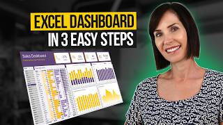
Interactive Excel Dashboard for BETTER Data Visualization (Free Download)

HTML-код
- Опубликовано: 26 сен 2024
- Build an interactive Excel dashboard for better data visualization in less than 20 minutes .
❗Master Excel with 20% off all my courses until May 16, 2024: bit.ly/visuali...
⬇️ Download the example file here and follow along: bit.ly/visuali...
LEARN MORE
===========
📰 EXCEL NEWSLETTER - join 450K+ subscribers here: www.myonlinetr...
🎯 FOLLOW me on LinkedIn: / myndatreacy
💬 EXCEL QUESTIONS: Get help on our Excel Forum: www.myonlinetr...
#Excel #ExcelDashboard #ExcelDashboardTutorial


❓What is the biggest challenge you've faced when creating dashboards, and how did you overcome it?
Master Excel with 20% off all my courses until May 16, 2024: bit.ly/visualization24courses
I'm having a heck of a time because my budget and actual data is formatted by month in columns. When trying to create a relationship between workbooks, it doesn't work. I've all but given up. 😢
@@sarahbelle2140 Hi Sarah; I would recommend to use Power Query and unpivot columns
My pivot table with sales per month does not arrange the months chronologically.. My months are arranged alphabetically and I am unable to formart it into a chronological order.. How do i go about it
biggest challenge is keeping up with your speed of showing but it was really good
@ddlast6 there is likely an easier way, but I've started using this format for months. 01 - January, 02 - February, etc, this way they'll always be in order. Good luck!
It took me almost 2 hours, but I completed it without so much details to shapes (last couple of minutes). It really gave me some guidance to building Dashboard, which part of data to use for which kind of charts, what and how to format, all in all, excellent tutorial.
Congratulations! Great effort 👏
I get a kick out of the "Dashnord" on the agenda - you are a real person and not AI. :)
😆 didn’t spot that! Thanks for watching 🙏
I was thinking maybe they use dashnords in Nordic countries. 😉
Or did the AI do it to make you believe she’s real??
Hi Mynda you are the👑 Queen of Dashboard👑 Inserting the Shape to chart for shadow effect is killer
Thanks so much! 😃
Hi Mynda
I must say that your inspiration is fantastic, the techniques in this video may be well known, but the way you design it and make it work together is truly admirable.
Thanks for your kind words, Ivan! 🥰
I love these dashboard videos, thanks Mynda!
Thanks for your support, Chris 😊🙏
Lovely just you are and your lesson! you are naturally gifted to teach! I swallowed it like kids meal under a year, this is only because of you! 'The last excellency is simplicity' that is the way you went through. Blessed!
Thanks for your kind words!
Useful and beautiful! Nice work Mynda! Than you!
Glad you like it! 😊🙏
Best coaching ever, could please make a full playlist on excel and powerbi.
Thank you! I have got some playlists for both, but if you want to follow a structured learning path, then please check out my courses: www.myonlinetraininghub.com/courses
I always love your work and content. So much to learn from your channel. Thank you 😊.
So nice of you 🙏😊
Very nice in short time
Thank you ☺️ glad you liked it.
Thank you. The tricky things I have which ruin the pretty dashboard are big deviation between categories or sales and negative profit numbers. It'd be nice to see how you manage it in the next videos. Thanks again.
Instead of thinking about how to make the dashboard pretty, better to focus on what's the most important point you're trying to convey and choose a chart that makes it easy for the reader to see this. It might be that the chart you're using is perfect, but your data is just disparate. I cover some options for visualising disparate data here: www.myonlinetraininghub.com/charting-disparate-data-in-excel
Looks wonderful 🤩
Thank you 😋
I really-really like the design of this dashboard and the color theme - thanks! ;-)
That's wonderful to hear 🙏
Really inspiring 👍
Glad to hear that 🙏😊
You make this look soooooooo easy 😊😊
Glad you enjoyed it. Everything is relatively easy with enough practice.
Kamu hebattt, from Indonesia 🎉
Termi kasih!
Can't believe this is done in excel!!! Better than power BI
Thank so much ☺️🙏
Thank you so much. One more spectacular experience.
Glad you enjoyed it! 🙏😊
Nice, Mynda! Thanks
Glad you liked it 🙏
Thank you , your videos really helped me a lot and made excel easy..
I always gets confused, having a doubt while making pivot table ..
How do I know which data colums should I keep in values , which in rows and columns , can you clarify me this .. and also after selecting how to select the perfect graph. I am confused whether to select bar chart line.. can you clarify me please or make a video on this ...
Thank you
Great to hear. There's no golden rule for PivotTables other than fields containing numbers typically go in the Value fields because these are the ones you want to sum/average/count etc., but it's not strictly limited to this type of data. As for the chart types, I cover this in my Excel Dashboard course: www.myonlinetraininghub.com/excel-dashboard-course
Thanks a lot for this. Quite insightful.
Glad you enjoyed it!
EXCELLENT. Thanks
Thanks for watching!
Excellent. Thanks for sharing.
Thanks so much!
Thank you Mynda ❤❤
Thanks for watching 🙏😊
Your guidance was excellent. After the data for the slicers has been (report connections ) done , my chart was not dynamic as per the slicers. Let me know where I did the mistake
Sounds like you didn't connect the slicer to each PivotTable as shown in the video.
Keep up sir the good work.
Thank you, I will 😊
Love it 😍😀...
Thank you! 😊
This is hard to figure out. So I’m trying to make a graph that shows my credit cards and loans. I wanted to show the Limit and the balance per month on top of each other. That’s easy, the issue I have is the total. Once I place a slicer, I want the “total” to be the current month balance and with slicers show per month. But I can’t figure out how to make them all be seen at the same time without showing every month. I hope the explanation is understandable. I don’t want all the months to be seen, I want the legend to only be the loans name and slicer filter per month.
Hi Jennifer, Please post your question and sample Excel file on our forum where someone can help you further: www.myonlinetraininghub.com/excel-forum
How u give black colour to sheet
I showed that at the beginning. select all the cells and set the cell fill colour.
Hi, can I know the version of Excel that you're using for this presentation? Thank you.
Microsoft 365, but it will work in Excel 2016 onward.
Can I create a map for my city, as you created a map for a country?
The built in Excel maps only map to the state level of detail. You can use the 3D maps though: www.myonlinetraininghub.com/excel-3d-maps
Why my excel have no Insert Map chart? How do I get the map chart?
From memory, it's available in Excel 2016 onward.
First
Thanks for watching!
Thank you for this video! Very good. @myonlinetraininghub What video software do you use? This instructional video is very well edited, and honestly, I'd love instruction on how to make instructional videos, so details on video-making software for this specific use case is at the top of the most-needed list. :)
Thank you! I use Camtasia Studio for the screen capture and then I have an editor who uses Premiere Pro.
Hi, great video as ever! Do you normally set up ya dashboards at 100% zoom? I've created a few using your tips and advice and have to zoom to around 60% usually to fit everything in
Glad you liked it! Yes, I always set them up at 100% zoom.
Hi, I'm Juan Carlos Ocampo. A good idea is to post the videos in different languages, such as Spanish, for example.
Hopefully, RUclips will translate it automatically for you soon.