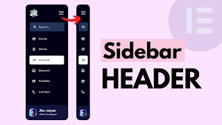
Toggle Menu For Desktops (New Astra Feature)

HTML-код
- Опубликовано: 5 апр 2021
- Download Astra Today 👉👉🏽 bsf.io/astra/
✅✅ 👇🏽👇🏽 Here are some of our recommended products 👇🏽👇🏽 ✅✅
Astra - The Most Popular WordPress Theme 👉🏽 bsf.io/astra/
Schema Pro - Add Schema To Your Website 👉🏽 bsf.io/schemapro/
Ultimate Addons for Elementor 👉🏽 bsf.io/ultimateelementor/
Ultimate Addons for Beaver Builder 👉🏽 bsf.io/ultimatebeaver/
Convert Pro - Convert Visitors to Subscribers 👉🏽 bsf.io/convertpro/
WP Portfolio - Showcase Your Work 👉🏽 bsf.io/wpportfolio/
-------------------------------------------------------------------
📰📰 Video Description 📰📰
Announcing Astra 3.3 with the brand new Toggle Button element for desktops. After releasing back-to-back updates to Astra, we're back with a brand new update to the most popular WordPress theme of all time.
Astra 3.3 introduces a brand new feature in the form of a new element for our immensely popular header and footer builder and tons of performance improvements under the hood. This video specifically talks about the new feature. If you want to read about the performance improvements, please click the link below. 👇🏽👇🏽
wpastra.com/astra-3-3/
The new Toggle Button element in Astra 3.3 allows you to add a toggle switch to the desktop version of websites, which was only possible for mobile and tablet versions earlier.
Most people believe that toggle-menus are not practical or useful for desktop devices. But they don't realize that toggle-menus are used by the most popular websites in the world - Facebook, Twitter, RUclips, and Reddit, all use the toggle menu. It is also a popular feature used for landing pages, one-page websites, and many other use cases. It can be a powerful feature to use on your website as well. Watch the video and understand all the benefits of the Toggle button element and make sure to update Astra to Astra 3.3 to get all the amazing performance benefits. Leave a comment if you have any questions.
-------------------------------------------------------------------
💘💘 Find out more about us on our website: brainstormforce.com/ 💘💘
💘💘 Subscribe to us for more WordPress tutorials and guides!
ruclips.net/user/TheBrain... 💘💘
💘💘 Follow us on our Facebook Page : / brainstormforce 💘💘
💘💘 Follow us on Twitter : / webrainstorm 💘💘
💘💘 We're on GitHub Too : github.com/brainstormforce/ 💘💘


When customizing the Off-Canvas there is the setting "dropdown target" with options "icon" and "link". Can you please explain what this does please (i.e. behaviour of icon vs link)
Great explanation and great tone, my friend.
Thank you for the kind words.
Hi and thanks for the video. I have Astra Pro. What I would like to do is have the hamburger on my homepage and the full menu navigation on the other pages. In other words, have a different menu option for the homepage. Is this possible? If so, how can I do this?
thank you for the explanation . What do I have to do if the toggle/hamburger don't work on the mobile?
thank you so much this video destroyed my stress. i feel better now
😘😀😘
Glad the video was helpful to you! 😁
hello nice video.. How can one creat the fullscreen toggle button I see on Pinterest images that looks black and round, with a little magnifying glass in the middle and white curce around it . for website product images ?
The burger menu icon stays in position with the dropdown option but it disappears on the other options (full screen and fly out) Also, on these other options, the close icon is much smaller and in a different position. It would be great to keep the burger icon on screen for all options and animate it to a close icon as per your dropdown option (like other sites with off canvas nav). Or keep the icons the same size and in the same position. I have a button and phone number that jump to the right when selecting the mobile menu on desktop and on mobile. It's a little clunky.
show how to create the off canvas menu created woulda been a big help
Tap Targets are not appropriate size issue in pagespeed insights when I am using mobile footer menu in astra theme
Very cool! Would luv if a background image could be added to the slide out
Much appreciated! :)
We will surely consider the same and see how that can be implemented in the future.
This is a really modern add! I'd love to implement it on my site, but I don't know why it's not appearing (just updated to Astra 3.3.2). Is this perhaps an only Astra Pro feature?
Hello Christian,
Glad that you liked this feature!
And, yes this is a Pro feature available in the Astra Pro addon version 3.3.0 onwards.
You can read more about it here - wpastra.com/docs/toggle-button-for-desktop/
Nice. 1 question? Can I add this toggle on desktop and leave it always on?
What I mean is that without any clicks the toggle switch is always on as I need a vertical menu and this might give me that. Thanks
Hello Noor,
Glad that you liked it!
Sorry, as of now we do not have the option to make the toggle switch always on.
Is it possible to create toggle menu pop up from left or right side instead of upside down?
my primary menu had the home button first, the off canvas toggle menu shows it second last, how can I fix this? I prefer the Home button as the first button
hello, it seems that the "toggelbutton" won't show up on my website. If i change the background color of the "toggle button" i start to see it and i can use it but the icon is invisible
I don't see header BUILDER at all I use to but not now ver 4.5.1 Everything is in Pro now
how did you add social icons to it? thanks!
Anybody know how to centre a full-screen off canvas menu vertically in the viewport?
I click on the +, but i don't have the toddle button option. How can I add it?
Astra Pro user here, All I want to do is Only show Toggle Button ( which is the Primary Menu ) for the whole site wether on mobile or desktop. How. ?Thanks
Hi guys, I've Astra Pro, buuuut "Header Builder" is not appearing in the Customizer. Any tip? I'd love to have a toggle menu in the desktop version.
Filipe Reis, please check if you the latest version of Astra installed. Then, check Astra Options and check if you see the option to switch header builders. If you do, then you should be able to switch to the new HF builder. You can always contact support for more help.
I don't have Astra Pro, just normal. I have the hamburger menu for tablet/phone but I cannot figure out how to change the color. I've done it before, but I can't figure it out... also want to make the tablet/phone menu not transparent
I obviously see how you did it lol but those options aren't there for me
May someone please assist my toggle button is not responsive on Mobile anymore what can i do im using Astra theme. Please 😭🙏🙏
Is it possible to set it up so off-canvas menu is closed when clicked on a screen?
Hello,
Yes, it is possible if Flyout is chosen as the Header Type.
I have problem with taggle menu’s it shows instead for header menu
When I add new menu it’s still show taggle mode on desktop
Do you know how can I fixed?
mrmic, I would suggest you get in touch with support with all the details.
How to change sales bubble pop up woocommerce
Give us the ability to change the icon for the toggle menu
Thank you for your suggestion. We may add that feature in a future release.
dude you completed skipped the designing section? what a waste of time!
Hello James,
We do cover the Design section starting from the following Time - ruclips.net/video/wb14cCqGwiU/видео.html
Do refer to our documentation for further details here - wpastra.com/docs/toggle-button-for-desktop/ :)
Showed nothing just bla-bla-bla!!!!