Stop over-engineering your CSS

HTML-РәРҫРҙ
- РһРҝСғРұлиРәРҫРІР°РҪРҫ: 2 РёСҺР» 2024
- рҹҺ“ I have a FREE course on helping get more into this mindset of working with the browser: courses.kevinpowell.co/conque...
A lot of people over-engineer their CSS, so in this video, I take a look at how we can use around 25 lines (including empty ones!) to make a pretty decent-looking site рҹҳҺ.
вҢҡ Timestamps
00:00 - Introduction
00:22 - Making it responsive (fixing the images)
01:29 - Typography
02:05 - Adding a darkmode
02:35 - Adding a max-width
#css
--
Come hang out with other dev's in my Discord Community
рҹ’¬ / discord
Keep up to date with everything I'm up to
вңү www.kevinpowell.co/newsletter
Come hang out with me live every Monday on Twitch!
рҹ“ә / kevinpowellcss
---
Help support my channel
рҹ‘ЁвҖҚрҹҺ“ Get a course: www.kevinpowell.co/courses
рҹ‘• Buy a shirt: teespring.com/stores/making-t...
рҹ’– Support me on Patreon: / kevinpowell
---
My editor: VS Code - code.visualstudio.com/
---
I'm on some other places on the internet too!
If you'd like a behind the scenes and previews of what's coming up on my RUclips channel, make sure to follow me on Instagram and Twitter.
Twitter: / kevinjpowell
Codepen: codepen.io/kevinpowell/
Github: github.com/kevin-powell
---
And whatever you do, don't forget to keep on making your corner of the internet just a little bit more awesome!


I'll admit to completely over doing things. I seem to have a natural ability to take something that looks ok and make it not only look terrible but also stop working. Of course now that Kevin has shown me how to not be a plonker I quess I'll have to go back and re-work everything - thanks for all the extra work Kevin рҹҳ“
Same here, I actually started to use more ChatGPT ending up overcomplicating my CSS. My biggest pain point at the moment is to cover the lowest possible resolution for mobile. Looks like my client's customers got most of the time tiny phones in usage.
@@klausklausi7484 same here. 320px is so effing small ...рҹ§җ
We start with "layout-ish" things around 360/480 (portrait/landscape). Anything below is just blocks running from top to bottom, hyphenation enabled and font-size fiddling.
Only later (larger) - and if _contents_ require it - we start flexing and gridding stuff.
We use an *Adaptive Design* rather than dull *Responsive Design* up-/downscaling of content areas, fonts, and white space. Components partially use container queries to be smarter if the browser is too.
That's why we also ditched the "classic" set of media queries (576, 720, 1040 etc. => rem: 36, 45, 64) to change layouts.
Out layouts change only *if the contents would look shabby* not b/c old Apple devices once had these screen dimensions (which most no longer have) - and we have way more Android users anyway.
As a consequence we use min/max/clamp/fit-content etc. For some page types there might be a full page layout change only at 35em or 50em, others may break once at 42em and be done or transform completely at 140em and up.
the only way out is through
Are you English Dave? - I know itвҖҷs a super random question
@@szmr Scottish and I'm a firm believer that random things are good рҹҳҒ
It actually seems like a very fun challenge to try to recreate a design using the least amount of css possible!
Actually small rant here: in my years of working with designers, I found this exact sentence that you just said to be the problem that is behind all of the CSS issues I ever had. Web development should not be about "recreating designs". It should be about understanding what your users need and making a functional, responsive, accessible and maintainable UI out of it.
The role of a designer isn't to say to devs "can you move this div 5px to the right, it would look a lot better". What they should be saying instead is: "this is the general flow we want the user to follow, here are some rough sketches. Reproduce something similar with the least effort, then I will try to understand the underlying CSS and change my designs based on what you coded".
If designers would know CSS is would be a lot simpler to work with them
The amateur stops when he can add no more.
The professional stops when he can remove no more.
Being good at css means knowing how to use as little as possible of it.
Thank you, master Kevin.
It's amazing how simple you can make CSS look and feel in just under four minutes. Thank you for the amazing content! Love from Brazil! вқӨ
This is one of the best example of simplicity in CSS. Loved it!
I just fall in love watching your teachings. Your tips and tricks is a life saver рҹҳҖ
Thanks allot рҹҷҸ you've made my projects simpler
Thank you addressing this. Less is more. I use the principle of least power to help keep bloat and complexity in check.
For me, the form fields always need a lot of love. IвҖҷm working a hefty side project, and I havenвҖҷt done a lick of actual styling, but had to do a similar вҖңbare minimumвҖқ style so that I could bear to look at it while working on it. Could not ignore the form fields.
I should do a "minumum for good looking forms" video as a follow up :D
Yes please! And a basic semantic html that makes flex-grid & display easy to manipulate.
@@KevinPowell Yes ! In your video this form don't look really good imo
@@KevinPowell Yes Please!
Wooow! That was so simple! This is one of the most useful CSS videos I have ever seen! Thanks for your great content Kevin! You are awesome!
One of the most useful videos on CSS on the web вқӨ
Awesome! Glad to learn color-scheme, main, img, etc... They sure are helpful for future projects - Thanks!
This dude single-handedly saves like everyone who has HTML CSS problems. We need to protect him at all cost (excuse my bad English, it's not my first language)
nicely done, Kevin! thank you, it's super useful
As I start building a new personal site, this is exactly what I needed to hear, lol. Thank you!
Kevin, I'm currently learning CSS and I want to say you have THE BEST content!! I also like your character рҹҳғ Thank you for your content!!!!!!!
Its a great reminder for me to go back to the conquering responsive layouts course again, to refresh on the topics covered, and a reminder on taking a mobile first approach.
Another awesome video. Thank you Kevin.
Great stuff, keep it up! рҹ’Ҝрҹ”Ҙ
Great vid. As others have mentioned, a video that acts as a quick-and-dirty guide on simple, good-looking forms would be great.
You make me love to write CSS, thanks for the incredible contentвқӨрҹҳҠ
This video is so important!!
It's amazing how much CSS does for you, and most things that people hate about it are actually sensible defaults that prevent them from breaking everything. Once you embrace the cascade and stop fighting the engine, it's not that hard to make accessible, inclusive, beautiful things!
Agreed!
I love your channel so much вқӨ
thank you Kevin! simple is best haha! Is there someing like this content more? it's so useful
"Ancient magic but always effective" Great man! I love your videos!
"It is us who ruin the responsive of the web"
- Kevin Powell, CRL
it gives me so much pleasure to see just a few lines of css fixing an entire layout.
This is the type of tutorial we need!
I have to admit... You make some damn good videos.
I've completely switched over to Tailwindcss, and I don't see myself going back anytime soon.
That being said, your videos are the kind where, "I'll probably where never manually write out css again, but I'll happily watch a video of yours".
This was amazing. This is one of those videos where I hit the Like button before I'm halfway through.
I often find myself asking "Do I really need EVERY element to be a flex container?"
This was actually relally great, especially the color-scheme property I had no idea. I consider myself a strong front end dev. Currently doing a vanilla site with semantic HTML to capture my improvement in JS as well as to act as a reference for DOM manipulation in case I ever need it. I would say I don't over-engineer CSS and I love cascading it SASS but this was great. Always enjoy learning new things, thank you.
Well that is already on par and just as functional as what I've seen done with literally 10's of thousands of lines of css. Well done!
CSS will definitely create issues if it's sloppy and will also create lag if it's a small book; CSS = post processing and can easily get out of hand.
Good vid.
Thanks for your help evry time
Nothing makes me realize how much I've over engineered a site like going back through to make it work on mobile after the fact. I definitely have a lot to learn when it comes to CSS
thank you kevinnn
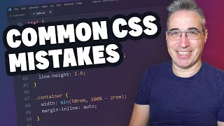
Thanks Kevin !! My new kinda reset
*,
*::before,
*::after {
box-sizing: border-box;
}
html {
color-scheme: light dark;
}
body {
font-family: system-ui;
font-size: 1.125rem;
line-height: 1.5;
}
img,
svg,
video {
max-width: 100%;
display: block;
}
main{
width: min(70ch, 100% - 4rem);
margin-inline: auto;
}
Absolutely love your videos! I saw this a watched this one a while back and thought I will code along with you later, but there was no starter files (I get that in this case it's not that important) but Its more reassuring to follow a tutorial from start to finish
Nvm: I take it back it's more to fun to build the layout from scratch and find assets for it even if its a small page made for messing around
I'm glad you brought this up because I'm totally THAT GUY who starts off with too much code and has to prune away later. This minimalist approach of building up from nothing seems much better.
I love this kind of video
I like to keep images inline, and I do this little trick to get rid of "space" below the image:
img {
vertical-align: bottom;
}
I like it better than making it block.
I like your videos! Please, keep doing it. :)
Thanks!
Thanks so much!
Kevin, can you make a video about the Utopia css project? It would be awesome to see you dissecting it since it uses flexible spacing/typing. Also it would be interesting to hear the pros / cons.
@Kevin Powell Most of us over-engineer CSS because "We need flexible design for desktop and mobile" and early f*ck up things like overflowing vertically the whole body/visible area on mobile/desktop displays, then what's your best CSS template for problems like this? Fixing manually the image size is the norm, but I've never seen some standard around that, especially when we're talking about online shops/inventory systems/catalogues/etc ...
thanks man
Because of you I am rewriting the whole frontend of my blog... Why? To remove Bootstrap from it :P I am halfway there and the site already looks much better. Thank you for those videos, they are awesome, I learned a lot :)
Bootstrap is great for things that take up a lot time, like carousels or sliders. Normal buttons or forms though? I find that Bootstrap makes it harder to style the items due to its built-in CSS properties. For small things like that, or columns, I prefer just doing it myself.
@@elle.3792 I was doing everything in Bootstrap. I am not a professional just hobbyist. Mostly for its grid system, to just make site responsive. Not long ago I found this channel. I seriously didn't know that CSS Grid exists lol. I was playing with Grid and Flex recently intensively and I think I don't need Bootstrap (as a whole) anymore :) I don't know but probably if I need carousel then I can include Bootstrap carousel only or some other carousel library :)
I'd like to use the conic gradients of the full rainbow or other specific combos for buttons.
Amazing thing is that I removed 200kb of CSS now and just replaced it with one of the line from Your video just to make task done and the task was: "Opera Touch and some browsers makes dark mode automatically - prevent it please". COOOOOOL!
Amazing video as always! I want note one thing and maybe help someone:
I've recently started putting svg in the max-width and display block reset, and I've come to realize that it's not such a good idea. I've been banging my head against the wall two times now, because I had some reeeealy weird problems with my svgs. That reset was causing themрҹҳ…
Just wanted to share my experience
Yeah, display: block is something you should be careful with. max-width: 100% on the other hand is nice.
@kevin can u do a SVG masterclass explaining the main properties of a SVG element like that you used in the white glow button video using svg
Amazing.
This video should be foundational for anyone learning CSS (as well as for those who have been using it for years...)
You can even set color scheme in HTML with a meta tag! рҹҷӮ
Brilliant
Love it
I would like to see how you implement color-scheme along side your custom light/dark theme, because it's got a conflict when I try to use both of them, and the color-shceme took over
If itвҖҷs possible please make a video about styling datetime input field
Please make a video on images setting them on background and all animation we can do with images рҹҷҢ
thanks
I have something betweeen medium to high of css on my projects. I work on Vue and doing all of stuff on my own. Most of things after all needs to be styled in some specific way.
But I wonder if its better to have a class like "flex" where tags have a lot of classes (like tailwindCSS),
or maybe focus on one component i.e. "Card" which would have some of the styles like "card-flex" that could be used on "Card" element, and for example button in that element which should be flex as well.
or just rewrite styles with proper naming.
Great mini tutorial, just one question - why did you use ch as unit of message for your width? Why not %?
In my experience less is most definitely more and that applies to most things in life :)
Hi Kevin, please can you make a tutorial where you can display a star rating in css? And a way to show say a portion of a star to be filled. Such as 3.6 out of 5? IвҖҷm assuming I could do it via some sort of mask using Unicode but IвҖҷm a bit stumped
Kevin makes me smarter
```
main {
width: min(65ch, 100% - 4em);
margin-inline: auto;
}
```
FTW!
Though I like (100% - 2em) but that's a person preference :p
new video new trick XD thanks
4 minutes of gold
Thanks for the tip Kevin!
Also this website you have just made is an example of "Completion over Perfection" lmao. Have any ideas for next video?
I already have the next month of content planned рҹҳ… - next week is a look at changing styles on scroll, and a fun redesign using devtools only :D
I am curious what the benefit is of putting margin-inline: auto; on the main tag vs the body tag. Wouldn't we want this property on the header and footer as well by default?
Straight up wizardy.
you're the css man
Signed up an registered using a made up, offensive name thinking the "$0" price was just a tactic to drag us along & register then fill in all sorts of information that could later be sold, before the actual price was revealed in hopes that people fall for the sunk cost fallacy.
But no, the course was actually free (obv should've read the description more closely). Thank you..
Great little vid. I'm confused though.....When do you use media queries then to help with responsiveness?
Smartphone, tablet, and PC screen sizes. If you use flexbox or grid, it'll depend on columns and layout.
@@ganyrehs Hi, I get that thanks, but that doesn't answer my question. Just using the basic CSS like in the video makes the page responsive.
Can you do a video on improving web performance??
fireship just uploaded one, check it out, I think it's great
you canвҖҷt
@@vasyaqwe2087 link pls?
Send as little JS as possible
After months of learning, i finally took Kevin's advice and now i go through and delete CSS line by line and if nothing breaks, I delete that line.
I try different browsers: Safari, Chrome, Firefox, and Brave.
IE users can catch up.
Nice
nice short video format
One thing I struggle to understand is color scheme. You declared that in html. How is it different to @media screen and (prefers-color-scheme:dark)?
I'm still a beginner but it got me wondering, does this apply universally? I mean will it cover my future projocts?
What about using flex and grid ,does using it all the time count as overengineering?
I would love to see some side to side comparison because at the moment im in a stage in my learning journey where i dont know what is wrong or what is correct
Anyways, thanks, Master KevinрҹҷҸ
Flex and Grid are not over-engineering at all, we do need more than a layout like this list of the time, but even with them you can keep it pretty simple
What are your thoughts on also adding height: auto; for the RWD img styles? Not necessary?
yeah, no necessary, will work the same way with or without it
@@KevinPowell ok cool. thanks.
рҹ‘Қ
Kelvin what about google new css properties? I think u have seen google announcement on new web ui. Make a video on it вқӨпёҸ we love to see your view in a simplified way вқӨ
im still waiting for nested selectors support
only chrome and safari(kinda) supports it atm
Where does the side paddings come from?
The 100% - 4rem, means the max width has 2rem margin on the left and right (4 /2)
Is the starter HTML + images around sound where as a download? I'd like to code along for this and the CSS video but I don't see code on codepen or GitHub
Even better - write zero CSS with Tailwind рҹ”Ҙ
Hi Kevin, question, are ever going to do CSS battles again?
I will be, just not 100% sure when yet :)
Sir, is it still worth learning html and css at the current time, because many people are saying that these are not in too much demands due to the release of various AI machines as well as other apps for creating websites etc. I am currently learning JS, so what are the other best things to work on if i want to become a front end developer?
Js, SQL, PHP, html, CSS, sass
hello sir, Can you make advanced slider with card carousel by html css and js?? Its available only in wordpress. I have searched a lot but couldn't find anything..
Can you explain the with: min(70ch) thingy, I dont get it
min() picks the smallest value provided. 70ch is a hard value but the percentage-based one will dynamically adjust to the screen. When the screen width - the value he picked is less than 70ch wide, it'll use that second value instead because it's smaller.
Also 70ch means 70 characters where one character is based on 0 of the current font iirc.
Meanwhile I have like 20 root variables for light and dark mode using javascript to switch between them... yikes
I prefer margin-inline: max(2rem, (100% - 70ch) / 2); вҳә
Hi kevin, can you create a video with javascript?
CSS will always be my focus, but I do have a sprinkling of videos where I use JS. I'll throw it in when it's needed :D
I never understand when i should specify width 100% and when not.
Can someone help me on this?
Real
Ok but why making svg display:block ?
I always am stuck ovethinking when doing CSS and dont end up doing it рҹҳў
I feel so dumb that I never knew there's a responsive mode button in dev tools
First one to comment , my question is it a good practise to use pure css to make a huge or bussiness website
With css as it is right now, is possible but you may encounter some issues that could easily addressed with css preprocessors
@@amaury_permer thank you
Actually if you're capable of, you can. In my own opinion, if you want your CSS skill to improve greatly never use framework. It makes you lazy, limited, and you'll never learn how to solve common problems.
Personally I don't like frameworks, I've never used any CSS framework before and I don't want to learn it. I do everything myself and I think that has greatly improved me.
The major advantage of writing css yourself is that you'll have full controll and your skill will greatly improve through consistency.
As it stands, all my projects, both big and small are written with pure CSS вҳ‘пёҸ, with that I have full control and helpful for improving my css skill вҳ‘пёҸ
Tips:
1. Master CSS Grid
2. Master Flexbox
3. Know media query (very simple)
With this 3 items listed, your website will be 100% responsive if you know them properly
Who said I'm engineering it? I'm just winging it.
Less CSS, More Happiness!