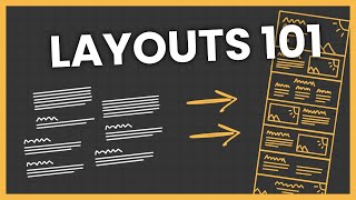
How to Control Responsive Column Layouts in Elementor-REVISITED!

HTML-код
- Опубликовано: 28 сен 2024
- Until this week, with Elementor you were stuck with the column layout in tablet view being the same as on desktop. In a previous video, I showed you how to control the column layouts in Elementor's tablet responsive mode using some custom CSS.
Thankfully, the latest version of Elementor has made all this soooo much easier and flexible and powerful.
Let’s have a quick look at what’s changed in Elementor 1.5, and how easily you can now control responsive column layouts for all screen sizes. Huzzah!


Thanks so much, I was losing my mind trying to figure this out and now it's so easy!
Nice! I was looking for this for so long time, thanks bro!
Thanks a million!! Now I can fix the tablet view without having to code.
Thanks a ton, brother! This neat little trick at 1:40 will cut hours off my future work!
Thank you so much for this tutorial, you made my day! Greetz from Vienna, Barb
Thank you so much. Wonderful advice - works well.
Many many but many thanks guy! Good explanation
2020. still helped alot. Thanks
You are amazing! Best Elementor tutorials!
Thank you.
What to do with nested columns? I try and prevent my nested columns from stacking, but it is simply ignored even though the columns in total are less than 100%
Brilliant! Thanks Dave.
Thank you, But the problem is the fonts are properly seen in desktop view, in Mobile view they are very skewed , How do we balance the font size
Thanks Dave for showing me this.
Nicely explained. I don't know code so I need dummy instructions. Bizarrely my tablet setting just won't allow me change column width no matter what % width I type in. So my tablet columns look horrendous for my 3 column setting...some narrow, some on new line, all different. Looks fab on mobile and desktop. Any ideas?
Thanks a ton. Saved my day.
Nice video Dave, kindly put some tutorial how to design "Blog page" using elementor page builder, when i use elementor in blog page instead of the post excerpt the whole post is shown, every thing is alright but i am stuck with the blog page
Do you have to create the side by side columns in desktop before you can have them in tablet? I cannot find how to build side by side columns in tablet mode
Thank you so much. That fixed my problem. I thought I'm screwed.
Glad to help.
hello! great tutorial. i have a question tho.
Im designing a website and Im watching it on a 25 inch screen with a resolution of 1920x1080.
My client is watching it on a 13 inch screen on a macbook pro. And he is watching a totally different result than me.
Is there a way to adjust the desktop view for different screens / resolutions? thanx in advance
Thanks a lot Dave. Helped me a lot.
I have a problem. when I switch to tablet mode and change stuff, the desktop mode is all messed up. Why? The desktop doesn't stay as the desktop, the tablet doesn't stay as the tablet and the mobile doesn't stay as the mobile. FML. >:(
what i was looking for. thanks :)
AMAZING!! Thank you SO MUCH!!
Thanks for the video
I have one problem I can't seem to figure out how to solve - maybe i'm overlooking something.
I have two columns placed as they should be side by side in a row on a computer screen. I call the column on left A and the one on the right B. Now when it's shown on a phone column A is on top of column B - how do I reverse that, so B is on top of A without changing how it looks on a computer screen?
I hope you understand the question..
Thanks in advance
Sorry for the delayed reply Henrik. I'm just back from a holiday. In the section settings > advanced, you can reverse the column order on mobile there.
Dave, are there any way to reverse them in tablet? I Can't solve it.
If you want to reverse in tablet, hang on for the release of Elementor 2.2 which is to be released next week. It has this as a new feature. :)
Perfect thanks Dave!
Hi there! This is a great turorial!
Mine has been driving me crazy cause no matter what I set differently for tablet mode, it doesn't change the layout at all!!!
I have a 3 column layout in desktop, so when viewed on tablet, the columns convert into 1 column layout, (one underneath the other). So I want to change them again to a 3 column layout because there is enough space, (3 big icons with an h5 title below them)
.
So I do a 33% for each column, but it doesn't change at all, nor in the preview window, nor when I see it via customizer and tablet view!
Any ideas, please?? I don't know what else I can try, it seems pretty straight forward..I even made a new installation, did a similar setting, (3 column layout), tried this method, but nothing again, so it can't be something that's wrong in the particular installation I'm working..!
Major frustration...!!
Same problem here. My guess is another setting in another tab must be different.
Thanks Dave, very helpful.
Hi great video, only problem I have is my elements with the text are different sizes from each other due to different amount of text in each element, any help would be great.
I love your work. Elementor has changed my life, it has given me financial freedom as a web designer. Don't know how to thank you enough Dave. Honestly super grateful, if you ever need digital marketing help please reach out!
That's really great to hear! Thank you Carlos. Your comment has made my day.
Hey! I am looking to work as a web designer as well, how much can I charge for an Elementor site? Any tips?
@@DaveFoy Hey Dave! I am looking to work as a web designer, how much can I charge for an Elementor based site? Any tips and/or suggestions?
This responsive feature is fantastic and simple! Thanks for the walk through!
By the way, have I understood you right, that you will come up with some more comprehensive paid videos soon? What will it cost to join that subscription?
Hey no worries Felix. It really is very very simple. :) Yes, I'm developing some paid stuff at the moment, which will allow me to go much deeper. I also want to cover a lot of the basics of WP, themes, page builders etc that newcomers really struggle with. Would you be up for giving me some early feedback?
Yes, that would be interesting to give some feedback.
Excellent. I'll be in touch Felix. Thank you.
Super! Looking forward to hear from you! :)
Love your stuff, Dave. My new fave WP info-stop! I have dumped another page builder for Elementor and GeneratePress. So easy to use!!!
Thank you!!! Perfect!
Hi dave, thanks for your work. I tried to do what you described but it doesn't work, tablet and mobile still accept just one column per row. Do you know what coud the be the cause and what i should i do?. Thank you very much
Hmm. Not sure! You'd be best asking Elementor support I think. Sorry!
Hello, I have a question: how can we adjust the column layout for the Default Gallery widget? I want to explain: now, by default, in mobile, Elementor puts all the picture in one, single column. If you have 40 images, you must to scroll like a crazy. What's the solution? Thank you. =)
I answer by myself after 2 years: buy Elementor PRO =)
Love love your tutorials...
Thank you thank you thank you! :)
How do I insert a shop page HTML code? I want the mobile version to have two or more rows and many column but on my mobile view i only get one row and one column
Not sure what you mean by 'shop page HTML code'?
Nice! Just what I needed, thanks.
No worries Olaf. Glad it helped.
@0:23 Do you have a hack for Background Fallback box images?
The image I placed there doesnt fill a mobile screen. [Edit section | Style | Background | Background Fallback]
Very nice, thanks
Thank you.
Hi, What about if you have 2 columns 50% width side by side on desktop, say image on the left, text on the right. How do you on mobile make the right column appear first? So the image in the left column would come below the text. I say this because I have a banner image above the 2 columns so banner image then image again then text looks a bit odd on mobile.
In the section, go to Advanced > Responsive and reverse columns.
Hey Dave, anyone know a way to make a column area clickable? Id like to create a huge square button instead of adding a button...any ideas? was thinking CSS HERO might have something quick for this? of maybe I just need to css it myself...hmmm
Making the whole column clickable isn't easy. You'd have to use javascript I think.
css-tricks.com/snippets/jquery/make-entire-div-clickable/
You *could* place an HTML widget before the bit you want to be clickable, containing the opening tag. And then another one after the bit, with the closing tag. But it actually isn't valid HTML cos of all the nesting with Elementor's code. Hard to explain without a solid example, but I've tested it.
Hey Dave! Thanks for the video. Do you know if there is a now a better work around for columns in columns? For example, if you have a section that is already split into 2 columns, you cannot currently further add another set of columns into it, which really is a bummer. I think right now BB allows us to do so, but I really love the speed and ease of Elementor. Hoping there's a workaround or that it will get implemented soon.
Hi Shae. :) If I create a 2 col section, and then drag the Columns widget into one of those columns, it adds 2 columns. Does that not work for you? I might have misunderstood what you're trying to do... let me know.
Seems I thought it could do columns within columns within columns. But it can only do two layers deep (so section of two columns, and into one of those columns, another set of columns can be added), was hoping it or BB or any other, may be able to do a layer further but it's not a deal breaker lol, I still love Elementor
Ah yes, that's all it can do. It can start getting v complicated in terms of responsive editing control with columns more than 2 levels deep I think. :)
Hi Mate, I'm struggle with something really simple, can you do a 3 column layout in the free version of elementor? Or is it only possible in pro? I can only get two column no matter what I try... Thank You!
No no, 3 column layouts are no problem. Just create a new section, select the 3 column option.
Or... if you already have a section, just right click one of the little column icons and select 'add column'. Add as many as you need.
Thanks for the quick reply. I managed to figure it out. Because I was using demo content I never notice the add section button at the bottom of the page. Easy when you know how, its the first time I'm using Elementor over Visual Composer so there's some getting used to it.
Ah yes. Definitely a learning curve with Elementor. Especially as they've gradually removed labels from the interface that made it easier to understand what everything does. Bit of a voyage of discovery now. :) Good luck.
Great thank you so much :)
You're welcome.
Thanks Dave!
Thank you! You saved me!
Brilliant, Thanks bro :)
If I change in any mode all modes change. I just optimised my site for tablet mode and then viewed it on my pc and it was all over the place :/
Changes in tablet mode should only affect tablet size or smaller. Hard to say more without seeing what's happening.
The same to me. Maybe it changed something in the system?! I use only the Basic Elementor could that be the reason?
very useful thank you
Thank you very much.
brilliant thank you!
Great thanks a lot
Thanks Raylin!
it helped me!
THANK YOUUUUU!!!
Thanks!
Good Staff
Muito Obrigado!!! :)
Thank u !
bless you!
Thank you. :)
thanks
wow
Nothing for smaller desktops!
You saved my time, again! Thank you!
THANKS! needed this particularly
Thanks a bunch for these tips! Helped me greatly.
Nice helped me to make 2 columb on mobile device. Thank u. really i was stucked on this
Really glad to help.
wow, thank you so much. Great tip!
Thanks very much
This video was extremely helpful for me!!! Thank you very much!!
not working as of june 2020
Thanks so much 🙏
very helpfull thanks
Thanks Dave, Very Useful :)
Thank you!
Thnakyou!!!!
Thank you so much!!! this was super helpful to me
fantastic. that was exactly what I needed. thank you so much.
Nice Video 👍🏻
Thank you
thanks
Thanks!
Thank you Dave for your very easy to follow explanations that finally are shedding some light on this whole mystery! I really appreciate your help! Great videos!
Glad it was helpful!
Unfortunately, if you have extra breakpoints enabled on Elementor, you can only break columns in mobile and tablet devices. I have an "extra tablet" breakpoint and it simply squizes things until it gets to tablet view.
Yeah just realized that and it was surprising. I have a laptop breakpoint and i don't want the desktop or the tablet setup for that. I can't think of anything other than adding extra sections, columns etc. and hiding them accordingly on each device. But it will probably affect the page speed a little bit plus it's extra work. Did you came up with any solutions to break the columns?
@@Stath1s_K Όχι 😉 I just accepted that on some devices, hopefully less used, will have a bit worse layout in some sections. There is an update though, that has the new "container" type, but I haven't tested this particular issue.
@@skoy21 Καλώς 😆 I'll probably end up doing the same, compromise the look a little bit. Haven't checked out the container either, i'll wait for the final release
You're star. As the saying goes, systems developers do not read manuals nor clicking on all buttons. Hmmmm... I am a web designer now...
You doing great work.
Thank you!
Hi there. Suppose I want to have a row of 3 33% width columns, and then underneath, another row of 2 33% columns (centered), to showcase 5 staff members. On desktop, no problem. On mobile, no problem (they all stack vertically 100% wide). On tablet, a problem! I want them to be 50% width, so I see 2 rows of 50%, and then the final row is a single block of 50%. The problem is that the middle row has an empty slot on the right. How do you fill this gap?
Have to say thanks. I learned something today.
You've just saved me SO much time and hair-pulling - thanks!!
I keep on having an issue with a EA "sortable gallery". For some reason I does not want to allow me to make it proper full-width. I've tried setting it when creating the page, switched templates just to see if it was related to my template (which is Salient), tried pretty much all other trouble-shooting but I cannot figure it out. Any help would be much appreciated (the URL is nildecker.com/full-width).
I had the multiple columns working on mobile after watched your tutorial. But now it's gone back to one big fat column on mobile - both tablet and phone view. I don't know why. I have followed your exact steps again. But I can't get it to go into 2 columns on mobile.what should i do now?
Thank you, Dave, for your help it worked for the Ipad view, however, the iPhone view just makes one of the columns disappear no matter what I try, any suggestions?
This is not working for me either, sounds an easy fix, spent too long on this now, could something be stopping the 2 columns from going side by side? I have removed shadowing in case that did it but no joy. Any ideas please help!!!!
Hello! Not Elementor related. Pls, Is there a particular plugin or a way to add a top level menu or links like phone number, email address or social media links on one's site as you mostly on an eCommerce site? So eager and curious to know how that's done. Thanks
Hi there! I love your videos. I am running into an issue and I thought maybe you would have an answer if it's no trouble. I am designing a website with Elementor on a widescreen mac and although I can also edit for tablet and mobile, when my website is viewed on a smaller computer, like a laptop, it appears like something in between full size and tablet... which doesn't look good at all. I'm going through and making sure I didn't use pixels instead of percentages, but that doesn't seem to be the issue. I hope I worded this well, I'm having difficulty explaining the issues I run into, but I hope that either you or someone on this feed could help me out or direct me to the answer.
Anyways, thanks for all the easy to follow videos!
x
Hi Ary - thanks for your kind words!
It's hard to know what might be the issue without seeing the page. Can you share a URL? Happy for you to send it to hello at designbuildweb dot co if you prefer to keep it private.
Changing column width % does nothing for me. I have 4 columns in desktop mode, and when i switch to tablet or mobile it defaults to stacking each column and making them full length. Not sure how to fix this
Thanks, this was really helpful and informative 👍
what if i want to change the order of the columns in mobile view? i tried reverse columns but it doesn't do anything, as they are 3 columns and not two. can you do a tutorial or explain what to do please? thank you in advance.
Thanks but it don"t answer / resolve this problem : why the result on the tablet is not the same as in elementor ? you can change the column in version tablette but it's not in real on tablet what you set :(
Very helpful! Thanks so much!
great...thanks a lot
No worries!
So simple yet needed this video to get me there. Thanks!
Thanks so simply explained!
Another great video, easy to follow :)
Thanks Christian!