Get my FREE cheat sheets for R programming and statistics (including transcripts of these lessons) here: www.learnmore365.com/courses/rprogramming-resource-library
Thank you for this Greg. Suppose that I wanted to do something similar to facet wrap but wanted to compare one type against all other i.e. will have two categories plotted in a single chart across all types
Thank you Greg. Any tips for breaking from tutorial loop. It feels easier following a tutorial and working it out in R than applying it to other data sets.
What ive been trying to do is use various resources to learn how to write a script for a particular type of data analysis, then next time i do it with a different data set I use that initial working script for reference
Great video. I've learnt so much over the past week. Having a little trouble wrapping my head (pun intended) around the facet_wrap function? What does it do?
Please do an analysis of variance ANOVA tests for three related data sets of different sizes, including numeric and categorical variables. Urgently need to understand for my research project!
Hi Greg. At 18.42 you said that list could be made into an object and popped in. Could you suggest how we could do this if we have a long list of categorical variables please.
Greg, I find the whiskers stuff a bit confusing since they are not always the same length on both sides. My understanding is that the whiskers extend up to 1.5 x IQR or up to the maximum (or minimum) value (if they are less than 1.5 x IQR). So if the highest value is at 1 x IQR then that is where the whisker terminates (IQR is interquartile range). I would love to hear your thoughts on this.
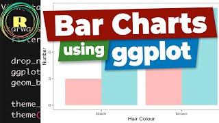
I noticed here you used drop_na(). What is the difference between this and na.omit() ? When should we use one over the other. There is also the line na.rm=TRUE which I have often seem. A confusing amount of codes to try and accomplish the same goal, and hoping you can help straighten these out. Thanks


Get my FREE cheat sheets for R programming and statistics (including transcripts of these lessons) here: www.learnmore365.com/courses/rprogramming-resource-library
Thank you so much! You explain everything so much better than my professor! Liked and subscribed! I will get through Biostats class thanks to you!
I love your tutorials. Thank you very much
thanks - glad you love them.. more to come
Thanks for the video, I was stuck with my data but now I can visualize it beautifully.
Glad it was helpful! Thank you :)
plz carry on your video makes me understand R because it is simple easy to understand the way you teach
Thank you for your time and excellent explanation.
Thank you for this Greg. Suppose that I wanted to do something similar to facet wrap but wanted to compare one type against all other i.e. will have two categories plotted in a single chart across all types
Thank you so much Dr. Greg, please keep up your excellent lecture.
Thank you so much, you have made R easy to understand
You're very welcome!
Thank you for all the great content! I reference it often when making my videos!
My pleasure! Thank you for your great feedback - much appreciated!
Thanks Dr Greg, this was super useful.
Excellent! Hope to see more!
Concise and informative! Big Thank you!
Thank you so much Dr. Greg
Most welcome! Thanks
Very nice explanation! Thank you!
You deserve much much much more views and likes, thanks for your hard work!
Glad you like them! Thank you
love these video, super clear and useful!
Thanks for these lectures
you are most welcome.
Thank you Greg. Any tips for breaking from tutorial loop. It feels easier following a tutorial and working it out in R than applying it to other data sets.
What ive been trying to do is use various resources to learn how to write a script for a particular type of data analysis, then next time i do it with a different data set I use that initial working script for reference
Great videos and very nice explanation.. Can u please prepare some videos on time series analysis using R..👍
Excellent tutorials, just starting with R and your tutorials are helping a lot. Can you please made an episode about violin plots? :)
Great suggestion! Thank you for your feedback, glad my videos helped! 😊
Nice tutorial. Thanks you sir
Greg, Please do a video on creating boxplot using three numeric variables (i.e., built in data, trees).
Great video! Thank you
Great video. I've learnt so much over the past week. Having a little trouble wrapping my head (pun intended) around the facet_wrap function? What does it do?
Please do an analysis of variance ANOVA tests for three related data sets of different sizes, including numeric and categorical variables. Urgently need to understand for my research project!
Great content! 👍 Thankyou!
I love your videos!!! I hope you will be doing a playlist on For loops with ggplot
thanks a lot for ur great work ,. don't you have any videos about interactive dashboards in R on ur channel ??
will make one (thanks for the suggestions)
Great video! What is the video annotation editing tool you used with the sound effects?
please trun the captions on for this video...
Excellent. thanks
Thank you very much for this, and your other videos. Can the code itself be downloaded so it can be run in parallel to the video?
Hi Greg. At 18.42 you said that list could be made into an object and popped in. Could you suggest how we could do this if we have a long list of categorical variables please.
Will create a video about this.
Greg, I find the whiskers stuff a bit confusing since they are not always the same length on both sides. My understanding is that the whiskers extend up to 1.5 x IQR or up to the maximum (or minimum) value (if they are less than 1.5 x IQR). So if the highest value is at 1 x IQR then that is where the whisker terminates (IQR is interquartile range). I would love to hear your thoughts on this.
i think whiskers terminate 1.5x IQR
How to combine box plots? I want to have three categorical variables and two numerical variables… pls let me know 😅
Nice video sir, do you know how to make box plot graphic with 2 box plot inside the graphics at once?
Hey, any simple command to remove pixels of outliers in box plot to only show mean and 1std dev box?
When I make plot color not changing. What is the problem with it?
You need a github repository!!!
More please
didn't see any number you have inserted
why don't make it more simple by taking a few data? PLZ
Die letzte war überhaupt nicht antifeministisch.
I noticed here you used drop_na(). What is the difference between this and na.omit() ? When should we use one over the other. There is also the line na.rm=TRUE which I have often seem. A confusing amount of codes to try and accomplish the same goal, and hoping you can help straighten these out.
Thanks
aes? drop_na/....