Это видео недоступно.
Сожалеем об этом.
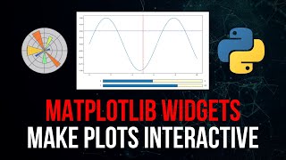
Interactive Python Plots With IPyWidgets

HTML-код
- Опубликовано: 6 авг 2024
- In this video, we learn how to create and use interactive Python plots in Jupyter Notebooks.
◾◾◾◾◾◾◾◾◾◾◾◾◾◾◾◾◾
📚 Programming Books & Merch 📚
🐍 The Python Bible Book: www.neuralnine.com/books/
💻 The Algorithm Bible Book: www.neuralnine.com/books/
👕 Programming Merch: www.neuralnine.com/shop
🌐 Social Media & Contact 🌐
📱 Website: www.neuralnine.com/
📷 Instagram: / neuralnine
🐦 Twitter: / neuralnine
🤵 LinkedIn: / neuralnine
📁 GitHub: github.com/NeuralNine
🎙 Discord: / discord
🎵 Outro Music From: www.bensound.com/


This was incredibly helpful! Thank you. The way you broke down functionality into separate examples really helped the explanation not be bogged down with detail all at once.
1:35 import packages
3:16 def plot_fct
3:42 ipywidget.interact
5:16 example 2
8:26 example 3
10:38 example 4
13:35 example 5
this was an amazing tutorial! Ive been trying to find an effective way to present my research progress to my advisor and this is definitely the way to go (I have like 1000 different plots and 100 different histograms that will definitely be better understood using this method!) thank you!
This was one of the most helpful matplotlib tutorials I've seen! Thank you very much for making this!
Nice visualizations! Thank You so much!
Thanks a tonn. That helps. Great mathematical skills as well
Great video, very helpful. Thanks!
Thank you very much, exactly what I needed!
Great tutorial, thanks!
Thank you very much for these amazing insights!!!
Thank you. Great video to learn Quatitative Methods.
You're awesome! Thank you ❤
Lots to do with that one again. Thanks a lot
Congrats for your video. I'm brazilian and I love so much your youtube videos.
bruh
what generates the pot_cos selection box? [10:05]
lets go...like up!
God i wished this worked. Your explanations are so straightforward with no 10 minutes to create a dataset to play with. Yeah, I’ve spent the last hour trying to find someone who can explain how to make interactive graphs in Colab.
Unfortunately, i run the code exactly as you provide, and Colab decides to create a new graph below the previous one with the new parameter, so i now have 5 graphs one after the other and no interactivity. Thus far very unimpressed with Colab, it seems to create random unpredictable results from one user to the next
In colab you should add plt.show() at the end so plots won't stack
When I display a widget or interact, I just see some text, such as IntSlider(value=0) or interactive(children=(IntSlider(value=0, description='x', max=1), Output()), _dom_classes=('widget-interact',)). What is wrong?
I am trying to use plotly instead of matplotlib. So I replaced plt.scatter(x=x, y=y) with px.scatter(x=x, y=y).show(). The Jpyter Notebook shows two image. The first image is the original image, and all update by clicking the slider shows on the second image. Why? Any help would be appreciated!
Great video! But I have a question, how do you export those graphics?
Thx.
Works for small plots, apart from that it lags has to do with the backend.
Can anyone break down the code where you used x_in and y_in to use the red dot in the curve and the indicating line of the dot as well? I know it's kinda silly but I'm quite new to this and couldn't understand that part.
This was cool but is there a way to export these interactive plots to, say, an HTML file so that other users do not have to go in and run the code for themselves? Like an interactive dashboard?
I was not able to run the ipywidget in spyder. It just shows the plot without the sliders for w.
Thank you so much bro, this kind of plots are sexxy
How to get output from interact?
For Visual studio it doesn´t work.
is it jupyter only?
Yup.
It should be available in Pycharm professional now, but I haven't tried it yet.
Oink, desmos trash, python op.
Btw, how's life going brother.....
wow. woow this is a best and most comfortable tool for this.
if I will keep my job I will donate you