Bootstrap 5 Crash Course Tutorial #7 - Grid Layout (part 1)

HTML-код
- Опубликовано: 7 окт 2024
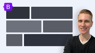
- Learn how to use the grid system in Bootstrap 5 - using containers, rows, columns and responsive classes too.
🐱👤 View this course in full now - without ads - on Net Ninja Pro:
netninja.dev/p...
🐱💻 Access the course files on GitHub:
github.com/iam...
🐱💻 HTML & CSS Crash Course:
• HTML & CSS Crash Cours...
🐱💻 Node.js Crash Course:
• Node JS Tutorial for B...
🐱💻 SASS Crash Course:
• SASS Tutorial #1 - Wha...
🐱💻 VS Code - code.visualstu...
🐱💻 Bootstrap 5 Docs - getbootstrap.c...
🐱💻 Social Links:
Facebook - / thenetninjauk
Twitter - / thenetninjauk
Instagram - / thenetninja


Whoaaaaaa You are just the best coding teacher and you put so much effort into teaching us and that to for free!!!!
I love you and your teaching!!
Thank you :)
Another excellent series. Thumbs up!
A series combining bootstrap 5 with react would be nice addition to your great channel.
could not agree more :)
Finally rocking my new badge 😎
Thank you for maintaining good and well explained content for so much time ♥️
Ah that's awesome, thank you so much for the support! :)
he likes watermelons !
@@michal2135 ;)
Great class. I really appreciated the short and direct videos. Easy to follow and gets right to the point.
Done thanks
Have to wrap component in container and then in row class divs to make use of grid
You specify how many columns each item can take out of 12. If assigned 6 columns then will take up half. You can tell each component to take up different column widths depending on the screen size. So you can assign a component both col 6 and col 12 md classes so that when the screen size goes to medium the component takes the entire width. Remember bootstrap breakpoints go from smallest to largest.
Thank you Shaun for your efforts. I've become a fan of your ways of teaching...
Thank you so much, Shaun, I really appreciated this video, all your tutorials I've been watching are very helpful but this one hits more cause it's when I really needed it, I've been working with this bootstrap 5 and its utility classes, but I never really understood its grid system responsiveness, and this video made everything clear, Thanks so much.
I think the grid just clicked. Well find out when I dive into the project tomorrow. Thank you for sharing your knowledge.
Omg I just realized that yesterday I centered columns by specifying offset on the first column instead of justify-content on a row. Gonna go fix it now before someone notices 😂
Thank you so much . i ve just started learning front-end and you ve helped me more than my trainer. You are awesome. Thx for sharing with us thi
Thank you so much. I tried reading the documentation but couldn’t understand. This really helps. Thanks again.
Sie sind 'tot' hervorragend 🎉..
Vielen Dank ❤
BRO YOU ARE THE BESTTT CODING TEACHER OUT THERE, LIKE THE WAY YOU TEACH AMAZING, I HAVE TO CREATE A WEBSITE AND I REALLY NEEDED BOOTSTRAP TO MAKE LOOK GOOD. MATE YOU EARNED A NEW SUBSCRIBER. FR YOU ARE THE BEST CODING TEACHER OUT THERE!!!!!!!!!!
thank you so much for the wonderful tutorial, now i can start my project with ease :))
You are welcome 😊 have fun!
Well explain and clear thank you so much 🙏🏼💪🏼
Glad it was helpful Ernesto! :)
really looks good grid system responsive.
you are better than my teachers at university :)
thank you so much ! I don't think you can explain it any better!
Two words - life saver 👌
Marvelous explanation, thank you.
You're very welcome! thanks for watching :)
Thank you bro for explaining very well
best explanation
that was absolutely awesome, thanks.
You are perfect bro . Thanks for this beautiful course😍
Thanks Hadi, hope it was helpful!
Thank you
thanks for your efforts it is really appreciated👍
Lifesaver, thank you.
thank you very much, very clean expains !
thank you!
You're welcome!
Saved to my library ❗
thank you man you are a great teacher :3 love ya
Thanks for watching James :)
Thanks! That required container at grid took me hours, and I couldn't find why is that weird behavior
Thank you so much 😊
You're welcome Brandy 😊
Thank you very much for this great tutorial
great explanation. thanks
wow great tutorial
amazing tut.. thanks bro
Helpful
Too much knowledge here
Hi--great content--thanks! Question: at 4:12 you mention that default behaviour is for column elements to occupy same amount of space in a row by dividing the 12 available columns equally, but then at 7:36, you seem to state that when no column specification is provided for a given screen size, the default behavior is for a column element to take up all 12 columns. Does this default behavior change from 'equal columns per element' to '12-columns per element' when you add responsive classes to the class definition? I didn't find reference to this in Bootstrap documentation.
ty
you the best
The problem is when we put a tag or something inside of column, align-items-center doesn't work, why?
You may be looking for this class:
d-flex justify-content-center (align horizontally)
d-flex align-content-center (align vertically)
The grid system on its own is already a win for me writing the CSS for grids and flexbox is a pain :-)
U should goo for big React-native advance tutorials with all it's APIs
amazing
nice!
Thank you very much ^_^
Welcome back ninjas
the original css grid is much better and straight without the hassle of adding these classes.
please do on java.
how did you manage to write (class= "col") to all div at the same time? I like that shortcut :)
hold alt while clicking on several spots..
do you put all lessons of this course on youtube?
yes that's what these videos are for
what if i use col-md-6 for the first 2 divs and then col-md-12 for the third div and i want the third div to be positioned in the center not in the left
Thank you, but i have a question, how did u write class="col" to all div at the same time ?
Alt+click. You can watch it and see at @3:30
Здравствуйте мои дорогие. Мне предлагают курс junior Python developer за 90 тысяч рублей. Обещают сделать из меня пайтон джун разработчиком за 420 часов учёбы и практики(всё вместе). Это реально? Или очередной лохотрон???
if you want people here to help you then you should probably write your question in English
@@codewithfarhad8594 I have a paid course that promises to make me a junior Python developer in 420 hours of learning (theory + practice). This is real or is it a scam???
First
are we really expected to remember all this?
That's why the documentation exist
You don't need to write div.xyz you can just write .xyz 👍