How to make a Bubble Chart in Google Sheets
HTML-код
- Опубликовано: 4 янв 2021
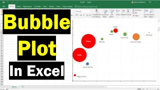
- This video will show how to create a Bubble Chart in Google Sheets. My example uses the Ontario Government's Covid-19 Data. Each city is plotted with the size of the bubbles being the weekly cases per 100k. Hopefully you find this video useful! #MDM4U1 #statistics


Hey man, thanks for the video. It was really helpful!
Have a nice one. (:
Very useful, thank you
Awesome! Glad it was helpful.
Mr. Rozon, do you know if there is a way to move the label of each bubble above rather than through?
Honestly not too sure about that. I kind of doubt you can move it. It's probably one of those things you can't change unfortunately.
@@pmrozon I think you can't move it, sometimes it defaultly labels the bubbles in some bizarre places. Go office!
@@martinbauchwitz9116 I agree!