Это видео недоступно.
Сожалеем об этом.
PB101: L11 - Responsive Development With Breakpoints & Media Queries (+ CSS Cascade & Specificity)

HTML-код
- Опубликовано: 10 май 2023
- We have some unfinished business with the Messagely landing page we created in a previous lesson. One part of that unfinished business deals with mobile responsiveness.
But before tackling responsiveness, we must discuss breakpoints, media queries, CSS cascade, and CSS specificity!
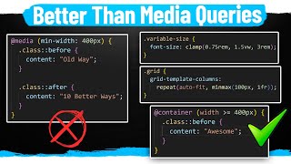
This lesson covers:
✔️ Max-width media queries
✔️ Min-width media queries
✔️ Orientation media queries
✔️ Variable support in media queries
✔️ Media Range Queries
✔️ Container Queries
✔️ CSS Cascade & Specificity
** MY TOOLS **
🔥 AutomaticCSS (ACSS) - automaticcss.com
🔥 Frames - getframes.io
See all my recommended tools here: geary.co/tools/
** INNER CIRCLE **
Step your design/dev game up, make more money, and get the full scoop on scaling your digital agency! When it comes to the Inner Circle, I don't hold back.
⭕ In-depth design & dev trainings
⭕ Business, sales, & marketing trainings
⭕ Agency resources & downloadables
⭕ Vibrant, quality community with zero toxicity
⭕ ...and much more!
Learn more and join here: geary.co/inner...
** SOCIAL **
👉 FB - / marketingkev
👉 LinkedIn - / kevingeary
** CHAPTERS **


I believe you are the best web design teacher right now in YT! Keep up the good work 🚀
Appreciate that!
@@Gearyco Do you launch the figma add-on for acss and frames next week? 😇 Cant wait. 🤩🤩
I don't believe, I KNOW he is 💪
From this lesson I extended my knowledge with landscape and portrait media query, thanks! 😁 Always something to pick up from your lessons, even for those more familiar with web development. 🙌
Interesting about staying desktop-first. I’m kind of on that mindset too but have noticed various resources online recommending going mobile-first instead. But maybe that’s more relevant to hand-coding as you said in the video instead of for those using page builders. I find it easier to think big to small, but maybe that’s just from lack of experience doing it mobile-first, hard to say. I may try a small project mobile-first one day and see how that goes.
Yea for hand coding mobile first is more efficient.
Thank you Kevin. Amazing tutorial.... 🤝
Great, thank you so much
I need to get a dual monitor setup. It's so hard to keep tabbing back and forth between RUclips, Notion, and now Codepen and Bricks! 😅 But worth it! 😉
Thank you, Kevin. 👍
Thanx Kevin, Awesome Lesson
Very interesting, thank you Kevin for clarifying these subjects !
Great Lesson!!!
Brilliant!
Beautiful.
Yeah, Elementor has earned it 😂...
Loved this part ))))
Great lesson! Thanks!
Good Lesson.
Great explanation. Thank you Kevin 👍
Thank you Kevin, awesome lessons!
One of my favorite hobbies too. lol.
Thanks!:)
Since the videos come in such short intervals, I have cancelled netflix and appleTV. Just a pity that there are no more chapters.
It may be bad practice but an !important inline styles should be mentioned.
MDN: Inline styles are styles defined using the style attributes. They can also be normal or important. Inline normal styles take precedence over all normal declarations, no matter the origin. Inline important styles take precedence over all other important author styles, no matter the layer, but important styles from user's or user-agent's style sheets and transitions override them.
I think I covered inline styles at one point in the course.
I feel confused between align main axis / align cross axis. ( I test and I try to align left but I don't know which one will work )
16:40 Technically, the correct naming format for IDs is somewhat camelcase. It should be id=”myBox” unless I’m wrong.
Hmm haven’t ever heard that
@@Gearyco Hmm. It looks like I’m wrong, according to a University of Washington CSE 154 - Unofficial Style Guide > Naming Conventions in HTML... D’oh... I learned it in college in 2014 during an introductory web design course. We used an Adobe Dreamweaver textbook... I’ve been using the method ever since. It’s easier for me to differentiate and debug... Whatever works and is consistent. Carry on, great teacher. 😊
How would be your aproach if on a 25" monitor website looks perfect but it doesnt look good on smaller screens like 1300px, would you create a custom breakpoint or?
Depends on what doesn’t look good
I’m knocking stuff over on my desk 😂
Things get exciting sometimes
At 37:10 why would you not add responsive design (swapping to one column on mobile) to your utility class? Wouldn't you want to possibly have all grid--2 classes behave in the same way on different break points? And why would you not use a BEM class for grid lay outs? I don't fully understand that quite yet 🙏🏻
No, that’s too opinionated for a utility class. You don’t want to force all two column grids to stack at a specific breakpoint. That would cause big problems.
@@Gearyco thank you!
Hey Kevin, great video has usual. Thanks for all of this kind sharing. Got wondering about this preference of yours of aligning left on mobile 🤔 I try to be consistent on alignment across all viewports, also it's easier to manage. Yet, while looking you're video I realized that by aligning the content at left, it creates more space on the right. It makes sense considering most of the times our finger is there swiping the screen to scroll. Is this one of the reasons or there are others?
It just looks cleaner imo.
What is creating the 3 little dots at the top of the page next to your breakpoint icons? It looks like when you click on that the popup with info about the breakpoints comes up. I don't see that on my screen. Thanks!
Bricks custom breakpoints. Turn on in settings.
Thank you!@@Gearyco
Is there a setting in code pen that lets you use the custom element tag of my-box or do you have to be a Pro member? I am using div at the moment to make things work but I've looked in settings and am not seeing it if there is. I actually think I really need to practice with specificity as I keep getting some problems with this on a site! Thank you.
No, just make sure you’re setting the display properly. Custom elements require you to set display to flex, block, grid, etc. there’s no default.
Playing with the box, like we all like to do 😂
A favorite activity.
The cwicly tailwind update fcked me up big time because of breakpoints and the changes to mobile first dev. What a mess, i should have known better
It doesn’t force you to use mobile first does it?
@@Gearyco Yes it does, TW is mobile first and once you change to the tailwind breakpoints your website is screwed
Well I was wrong again, they allow you to switch BP but besides they developed this breakpoints styles transfer tool, and it works great.
Honestly, this is BASIC, TOO basic. Anybody needing to learn this could watch the gazillion of videos on youtube OR read documentation, also every where!
I'd rather you go in detail about clamp functions and ACSS! That's more modern and gets rid of media breakpoints which we all know has run its course!
You’ll always need breakpoints for certain things. It has to be covered in a 101 course.
Before I just started building the website. Now I sit in front of the PC for 1h just thinking