How to Create Interactive Settings Menu in Excel | Ultimate Excel Dashboard Ep. 7
HTML-код
- Опубликовано: 12 янв 2025
- ✅ GET CODE here ► excelfind.com/...
📌 EXCEL VERSION: Microsoft Office 365 - Get it here ► geni.us/Office...
▬▬▬▬▬▬▬▬▬▬
🔥BIG NEWS ► Launch of excelfind.com 🔥
I just launched my new Excel Resource Website and kindly invite you to check it out.
I put a lot of work and research into it to provide you with the biggest possible value!
Main Website ► excelfind.com
Recommended Courses ► excelfind.com/...
Tutorials ► excelfind.com/...
Most Powerful Excel Add-ins ► excelfind.com/...
And even better, I integrated the most up-to-date databases about all relevant functions, formulas, and shortcuts. You can use our advanced filtering system to filter by Relevance, Category and even minimum required Microsoft Office Version. That means you can learn about all new functions in Microsoft Office 365 with only one click!
Excel Functions ► excelfind.com/...
Excel Shortcuts ► excelfind.com/...
If you like that website and want to help me grow, please consider to share it online and with everyone you know.
Thanks for your support!
▬▬▬▬▬▬▬▬▬▬
How to Create Interactive Settings Menu in Excel | Ultimate Excel Dashboard Ep. 7
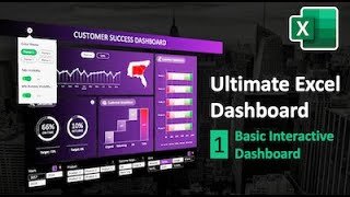
In this Excel Tutorial you will learn how to create custom collapsable and interactive settings menu in Excel that can be perfectly used to control the visual appearance and behaviour of a dashboard. The settings menu includes fully functional and custom radio buttons to control the theme color of the dashboard with only one click. On top, it includes modern-design toggle buttons that allow to control the visibility and availability of certain dashboard features.
******** FULL TUTORIAL SERIES PLAYLIST ********
[Ep. 1] Basic Dashboard ► • How to Create Impressi...
[Ep. 2] Background & Tile Design ► • How to Create Beautifu...
[Ep. 3] Modern Slicer Design ► • How to Create A Modern...
[Ep. 4] Auto-Refresh Pivot Charts ► • Auto-Refresh Pivot Tab...
[Ep. 5] Interactive Info Button ► • How to Create an Inter...
[Ep. 6] Interactive Dashboard Tabs ► • How to Create Interact...
[Ep. 7] Interactive Settings Menu ► You are here…
If you want to build this dashboard yourself, we recommend to upgrade your Excel Version to the latest one which is included in the Microsoft Office 365 Subscription. Find the link for current offers in the Microsoft Store below. ↓
▬▬▬▬▬▬▬▬▬▬
You want to become a master in Excel and learn all modern and relevant Excel techniques?
Then definitely have a look at the following links.
🚀 OUR EXCEL RESOURCE WEBSITE ► excelfind.com
💎 RECOMMENDED ONLINE EXCEL COURSES
GoSkills is our favourite & it’s not even close. Have a look ► bit.ly/30PWMnQ
📌 EXCEL VERSION IN THIS VIDEO
We use the latest version of Excel via the Microsoft Office 365 subscription. This allows us to have all the latest features like new chart types, a huge integrated icon library, improved functions, and much more!
If you want to upgrade your version as well, we recommend to get it from the
Office 365 (subscription based) ► geni.us/Office...
Office 2019 (standalone version) ► geni.us/Office...
▬▬▬▬▬▬▬▬▬▬
You want to show your support and help me grow?
Here is what you can do.
🚀 SHARE MY NEW EXCEL WEBSITE ► excelfind.com
☕ WANT TO MAKE MY DAY?
Buy me a Coffee ► bit.ly/2Oqg6Cu
🔥 MORE AWESOME EXCEL AND POWERPOINT CONTENT
Subscribe ► bit.ly/37bcvAB
Note: Some of the links in this description are affiliate links, meaning, at no additional cost to you, we will earn a commission if you click through and make a purchase. This supports the channel and allows us to continue to produce videos like this. Thank you for your support!
#interactive #excel #dashboard


![Responsive Sidebar Menu in Excel [Side Navigation Bar for Dashboards]](http://i.ytimg.com/vi/T6pRSAZXKpQ/mqdefault.jpg)


![Felix "Unfair" | [Stray Kids : SKZ-PLAYER]](http://i.ytimg.com/vi/Oswujxm2Ag0/mqdefault.jpg)


This is awesome! I have learned so much from you in this series. I appreciate how well you communicate and simplify your explanations. Thank you so much for putting out such great content.
This is so good! I learned a lot from the seven series. I programmed step by step and everything worked (after a few typos). I have now adjusted everything after my own data and everything works fine. keep doing The good work
This is so good! Thank you. Can’t wait to put them into use, especially the settings menu.
Check out my new website excelfind.com for the Free Version of the Dashboard 🚀
⬇ FULL TUTORIAL SERIES PLAYLIST
[Ep. 1] Basic Dashboard ► ruclips.net/video/cKkXtyjleX4/видео.html
[Ep. 2] Background & Tile Design ► ruclips.net/video/NfEqCdfl23k/видео.html
[Ep. 3] Modern Slicer Design ► ruclips.net/video/CbDTFfoePZY/видео.html
[Ep. 4] Auto-Refresh Pivot Charts ► ruclips.net/video/Xdq7SE-z-Aw/видео.html
[Ep. 5] Interactive Info Button ► ruclips.net/video/RZW-vQRr0nY/видео.html
[Ep. 6] Interactive Dashboard Tabs ► ruclips.net/video/2qN5jUiJWMY/видео.html
[Ep. 7] Interactive Settings Menu ► ruclips.net/video/fCFGqj4QcJU/видео.html
Impressive work :)
You demonstrated how we neglect the power of Excel and there so much we can do in it.
Thanks for sharing it with us.
This is so breathtaking. I have to say the part is the cherry on top a cake.
Thanks for these wonderful tutorials!
All of this helps me tremendously when designing our reservation system.
Thank you!
You are very welcome. Glad it was helpful! 😊 would love to see your final result.
👏👏👏
This whole series was extremely helpful and very well done.
Thank you!
Glad you enjoyed it!
6 Views, 14 likes..! You have crashed RUclips my friend! Much awaited video post! 🤗
Just pure perfection !!!!! The best, you are simply the best!!!!!!
Thank you so much 😊 Really appreciate it!
Dude, this series is AWESOME! I learned so much and even created a dashboard for my organization to track authentication to my companies Domain Controllers. The Boss Loved It!!! We were quickly able to visualize which DC's were getting the most authentication traffic, and this gave us very clear ideas on where to add authentication traffic weight values to our domain in AD Sights and Services, where to load balance, etc.
One thing I've been wondering: With as many excel slicers as is required for these complex dashboards - is there a way to clear all filters without having to click on each slicer filter icon? Just a quality of life question.
Thanks for sharing these amazing tutorials!
The ultimate Excel channel 😍🤩😍🤩😍 my
Glad you think so!
I have learned so so much in this series. Great skills!
Very good tutorial. Thanks for your work!
Really Ultimate. Loved it. Thank you so much for sharing your knowledge. 😍😍😍💕
You are an amazing inspiration for thousand of us. Really apareciate your work. Quick Q, can I replicate this un Office 2013?
Than was like watching a top rated movie! Awesome!
Thanks, mate 😊 appreciate it
Very good tutorials thanks 🙏
This is awesome, thanks for sharing.
My pleasure!
I watched and did of this topics tutorials and they are simply amazing the way you describe every single step in detail!!!
I also have mac and it was very difficult for me to set and work in excel in the mac version, it feels it is not the same but you have made me change that view. Can you make a video of the main differences between Mac and Windows versions?
This series was absolutely perfect, thank you. These are perfect in my line of work and already created my own. What would the macro code be if I had 2 information icons? I've been trying for days and still can't get to the right code.
Ok you have inspired me to make my own dashboard. BUT i ve stumbled upon a big issue. After I m done with my pivot charts, if I use my slicers the charts get messed. I'm talking about messed legends, messed custom design. You put all the work in formatting the visuals , only to get messed in 2 clicks. How do you cope with that?
Thank you so much. Amazing content.
Glad you enjoyed it!
BRAVO, BRAVO Thanks for All
I really like these Channel. 💪🔝
How did you made the Intro, is this also with PowerPoint?
Thank you so much! :)
Hello! Your work is absolutely great, thank you.
Can you please help to find the way to protect this dashboard from editing? If i want to take it to users as analytic tool with right to using slicers only.
Hello all series of making excel dashboard is really nice and useful ,
As it u conveyed the master data in table format and then create all pivots nd dashboard , after doing all these , if I add few rows in that master data , will they reflects result in dashboard ??
Awaiting for your reply , thanks .
Incredible video like all the previous ones, and to ask if there is any download link of the board with all these functions already loaded
Thank you Mr excel God
It's my pleasure, Manjunath 😊
Great Dashboard. How can i do this with multiple tabs. I fave 10 tabs with the same type of information but tabs are different names
Is it possible to make these custom components reusable? Maybe save/export them as a dll or addin or etc?
Hi, thansk a lot for the video. i got one trouble. When i click toggle, the gourp of shapes where its placed is moving also. How can i stop it please?
From where can I get this excel file which u are presenting in the video..
Hi Bilal.
At the moment, the advanced dashboard with all the extra features (like the settings menu) is not available. I might make it available on my website in the future (for a small fee) if there is enough interest.
When i put the vba code in for the settings button it says “Object doesn’t support this property or method” but then changes to white or transparent, but the settings box doesnt open/close.
Greetings friends .... when I execute Sub Change_Tabs_Visibility (), I get a system error & H80070057 (-2147024809). They can help me to correct it. Thanks
Why are my toggle buttons distorted with every click?
Hi Gaurav,
what exactly do you mean by distorted? What exactly happens when you click on them?
@@theofficelab I did a similar toggle button recently, every time the button is clicked, the group's (BG shape and the circle) deforms a little. Aspect ratio gets distorted.
@Gaurav sikka That's bad, I am sorry. I honestly never experienced such a bug with my toggle buttons.
Did you change the horizontal position of the circle via the 'left' property in the VBA script? Or did you do it in a different way?
@@theofficelab I will check and confirm. I am eager to do something similar from your video in the reports that I do. Awesome stuff!
Great tutorial! I've managed to replicate the entire dashboard and plan to share on my portfolio with credit being awarded to Office Lab of course.
I wanted to enquire how to make the info button visibility scalable as the example only caters for one info button. The code I'm referring to is the below:
Sub Change_Info_Visibility()
With ActiveSheet
If .Shapes(“Toggle_Circle_Info”).Fill.ForeColor.RGB = RGB(255, 255, 255) Then
‘Visibility Info Elements
With .Shapes(“Info_Button_Deliveries”)
.Visible = True
.Fill.ForeColor.RGB = RGB(255, 255, 255)
End With
.Shapes(“Info_Box_Deliveries”).Visible = False
‘Toggle Button Status
Call Change_Toggle_Button_Status(.Shapes(“Toggle_Circle_Info”),
.Shapes(“Toggle_Background_Info”),
.Shapes(“Toggle_Textbox_Info”),
True)
Else
‘Visibility Info Elements
.Shapes(“Info_Button_Deliveries”).Visible = False
.Shapes(“Info_Box_Deliveries”).Visible = False
‘Toggle Button Status
Call Change_Toggle_Button_Status(.Shapes(“Toggle_Circle_Info”),
.Shapes(“Toggle_Background_Info”),
.Shapes(“Toggle_Textbox_Info”),
False)
End If
End With
End Sub