DAX for Power BI - Creating a Custom Timeline Matrix
HTML-код
- Опубликовано: 14 окт 2024
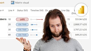
- In this Power BI tutorial, we learn how to create a custom timeline using the Matrix visual. We will specifically be visualizing our employee retention in the months following their start date. We'll even take it one step further and visualize employee churn by cohort!
To enroll in my introductory or advanced Power BI courses:
training.bieli...
Blog Post/PBIX Download:
bielite.com/bl...
Elite Power BI Consulting:
bielite.com/
Data Insights Tools:
www.impktful.com/
Connect with me on Twitter!
/ powerbielite


Nice one Parker. I like how you built on methods through few videos in a row with useful tips and instruction. Becoming a must see when your videos pop up in my timeline.
Howdy Dan! I appreciate you watching the videos :)
Funny thing about CF used here with Color scale where min custom = 0 gives white and max custom = 1 gives blue is that when you decide to return 2 or whatever more than 0 in the IsCurrentEmployee measure it also gives blue anyway. The more strict option is to format by rules when value is 0 or 1 - had to figure that out when added a superior category to the matrix on top (lets say department in this case) to count items each EoM in parallel when the category is collapsed : )
Inspiring idea!
Thats an amazing Gantt chart . Thanks for sharing this Parker ! Learning always something new and implementing as well in my report . Last time you explained the Cohort Analysis which i implemented in the report and stakeholders were really happy to see that :)
Awesome to hear, Abhishek! Great profile pic btw :)
@@BIElite HAHAHAHA , THANKS !!
Looks good! Only thing I'd like to know, is how you'd deal with employees that worked several periods, but with pauses in between.
For example: Karen worked from 1/20 - 3/20 and also from 8/20 - 10/20. How would you make this show up in the visual?
Very nice Gantt chart. I will certainly use it in my work.
One idea: if you use SUM of those 1's instead of MAX, I believe you may be able to highlight the longest working employees.
Nice idea! I'll likely do that moving forward :)
Brilliant! Thanks for this very useful video.
Very insightful matrix. Do you know if we can change the series to days instead of months in order to take insights for shorter period of time? (day by day)
How can we create this visual of we have multiple dates (different tollgates) between start and end date. ?
For eg: data set consists of
Project Name, phase 1 end date , phase 2 end date, phase 3 end date, finally project end date.
This is very helpful. Is there a way I can make the columns by year? Tried adding a column and wrap eomonth with year, changed the condition but couldn't make it work.
If column intervals are every 30 min , can you please share the query for it
Thanks, very nice.
No problem!
good day, is there a way to show 3 months in columns along with another 6 weeks columns and 6 days columns in the same table?
Thank you !!
No problem Bilel!
@@BIElite I'm from Paris Merci !!!
Can you share rhe documents please ?
Check the description for the link to download the PBIX.
can you please share me the data
Ваще норм, Ruth тихо стоит в сторонке.
Can do that better in Excel
If column intervals are every 30 min , can you please share the query for it