Aaron was able to cover and explain what took and ENTIRE semester of university photo arts degree class in 15 minutes... Only on Phlearn. Another whack out of the park !
Aaron... The color theory tutorial was well done and very enjoyable. Not only with this tutorial but all preceding tutorials, I have learned a plethora of knowledge from you. Thank You so very much!
Your tutorials are more comprehensive, and they go into more detailed in a more concise way than college curriculum. This is phenomenal, I would take a ton of pride in what you're doing for it's even better than what universities are offering. You have a gift, and it's a very awesome one :)
you guys at phlearn are awesome. from the video editing and presenting to the tutoring, its just great. everything is so transparent and easy. thank you aaron for making it so much fun. subscribed.
Love you and your videos, Aaron! Always very clear and informative... Certainly one of my favourite RUclips channels. Thank you for sharing so much knowledge with us!
I love your videos! I saw you working with that graphic tablet and so i bought a wacom intous pen...and i love it :) Thank you for making these videos! I learned so much from you
Sir this video is amazing - i am totally blown away.. website phrom adobe - color range selection and the color theory.. TYWM!!!! I have so much to learn - but you are making it Phantasic Phun! TYWM!
Also if you didn't want to take a screenshot, Adobe CC subscribers can log into Adobe Color, make a theme, and save it. Then in PS CC 2014 you can go to Window > Extensions > Adobe Color Themes and a mini form of the color website will appear. You may then go to "My Themes" to sample your colors from the website. You can actually even create a theme from the window without the need to go to the website. Great tutorial!
#AaronNace - all I can say is WOW! I thought I was becoming a decent photographer but I had no idea about color theory. I have been watching you for about two to three years and feel this tip is one of the most helpful any photographer has shared. And I have learned a lot from everyone who has posted on RUclips. Thank you!
Hi - thanks Aaron another great tutorial. I found you can get to the colour wheel by going to - Window/extensions/color themes from inside photoshop - saves going onto the website and copying screenshots.
Very cool! My Photoshop skills have grown immensely over the past 2 months because of Phlearn. :) I was wondering, could you guys do an episode on inverted high pass? Things like: -When it's ok to use it and when it will destroy the look of an image. -How much blur is good and when you're just overdoing it and expecting too much. I've searched, but I haven't found anything from you all. It seems like a good compliment to frequency separation when both are used correctly, and along the same lines of "overuse will kill your image" when overdone. haha I've only used this method a couple of times, and I'm pretty sure I've gone way too far each time. :p Thanks so much, and keep up the great tutorials! :)
This is the most helpful PS tutorial I've seen this year!! Thank you so much for posting such a great, straight to the point and interesting video. Greetings from Romania! :)
Awesome channel. Aaron is a great teacher. Makes it easy to stay engaged. I did the pro 101 and 201 tutorial. It was great learning. Feel so much more comfortable with photoshop. I am just eating up all RUclips videos now ;)
Hello Aaron, There are many way of teaching but there are few simple ones to oneself… I have learned in life that you have to be in sync with the person teaching you in order for it to make sense and stick in your brain. I have had AMAZING teachers according to a lot of people but when it came to me I had a hard time learning from them. Not because I was not capable but because like I said we were not in sync and learning did not flow. I seldom times come across people like you where this happens and without much explanation and technical details it all makes sense to me. Don’t get me wrong, I am a computer science major and consider myself a very smart person but when it comes to learning it takes a person like you to get the message across. I have watched the BIG guy’s videos which I won’t say their names because it is not fair to them, and never did learn as much as I did with yours. Keep up the good work and please know that there are people like me sitting at home appreciating the time and effort you put into this. Thank you for making my life a bit more fun than it already is. Manny
Thank you very much! Thanks to your lesson now I can safely make color correction to the style of modern films. I think many people have seen what kind of vibrant color in modern films. Thanks again!
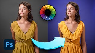
Great tutorial, I love learning about color theory. One thing to note is that I'm sure that most people spotted that the model on the right in the stock photo was modified to be thinner... just look at the wavy bricks. I see this all the time in Facebook photos, if you do this make sure not to warp the background behind you!
Aaron, nice tutorial as always! I would just like to suggest that people should be using Solid Colors instead of filled layers so that you can always have more control over what you're doing with layer masks... And also, it makes a huge difference when it comes to changing the colors. Keep up these incredible videos :)
Easily the best tutorial channel on RUclips you have helped me through every step of my graphics design career. Thank you. Also what is that drawing board that you use and where can I get one?
Good stuff, as always! Aaron, I'm sure you already know this, but when working with the eyedropper in Select Color Range, you can just hold the shift key when you want to add more colors, or alt / option to remove colors, rather than going over and clicking on those separate eyedropper tools. It's a nice little shortcut that might be worth mentioning to others when you're working with those tools. :)
thank you ''Phlearn Photoshop & Photography Tutorials'' your videos are vary useful in editing my images. thanks a lot, and keep uploading different and unique tutorials.
This is so cool, because it works on a lot of things, not just photography. For instance they use it a lot on comic books, the hulk is green and it's complementary is purple, which is on his pants (also the riddler's costume from batman has that color scheme, and the joker kinda does, with his green hair and purple suit) And just watching this I looked up and saw a superman toy that I have, and realized that his suit is made of the exact scheme of red-blue-yellow that was used on this episode :)
Love your videos. Maybe this has been mentioned before but if not, if you have the latest cc2014 the color wheel is included in the program under windows < extensions. This way you don't have to copy the image into your design. You can also then save your color themes.
Thanks again phlearn! I've recently started changing colours in my photography to make an image look better and been wondering what the "complimentary colours" are and thanks to this tutorial I can now do that! I feel it looked a little flat still, would u have added a bit of "dodge and burn" to stuff like the skateboard and maybe texture layers to the brick? Either way this has been a great video and really helpful! Liked it so much its my first comment on a post to youtube. :P
Hi Aaron! thanks for this great video! I'd have an idea for another tutorial: all blending modes explained. There are a load of blending modes but i know only the meaning of 3/4 of them and usually just test to see how it looks,but have no clue what they actually mean and do... Thanks!
I know that Aaron and the rest of the Phlearn crew know this, and I also know that when Aaron does his tutorials, he doesn't do as nice of a job as he would if he were doing it professionally because he's simply tying to get the concept of the tutorial across. But this is for all the people who are knew to photo shop. I noticed that in the image Aaron was editing, that there were some really dark blue spots on the shorts of the girl on the right after he added the blue in with the color range thing and it ended up looking a bit unnatural. This can easily be fixed by making yet another layer, and using the color range thing to specifically choose the darker (in this case unnaturally looking dark blue) spots and choosing a lighter blue color, then change the blending mode to color and all that good stuff he did in the video. Hope this helps, good luck guys!
I know you recently did a video on body touch ups, but you should do more on how to avoid effecting the background too, like on the image in the video, with the brick bending next to the woman (At least I think that's what its from)
how can it be a coincidence, few days ago I watch your video about complimentary color, which you create last year. This one How To Use Complimentary Colors In Photoshop - Enhance Your Photo ; and began interesting with color, I even search that cool stuff you got - that color wheel. While searching I also found that adobe kuler you mention in this video and this video really help me to understand how color works and how we should apply in photoshop. Really thanks Aaron...... :) And one more thing, can you maybe share how to calculate/predict perspective for composite photo ? Yes I know that you already made it, which I also have, red lady in that passage. But, how we calculate if it really difficult angle ? like some one way above or way down. or maybe someone fly, or maybe when we join some small object with very big object. how we predict the perspective point to make seamless composite photo ?
hi Phlearn! i'm from the Philippines and i would like to purchase some of your Pro Tutorials but it scares me to use my credit card online. My question, is there any other way to purchase your Pro Tutorials? maybe in some bookstores? i really love your work and i'm dying to watch each and every Pro Tutorials that you have. Thanks in advance! (sorry for my bad english, it's just my second language. hehe)
No she didn't have a tummy tuck in Photoshop......you can actually buy bricks like that....they're called 'warp blocks'. Beyonce is a big fan......she has them all over her house!
Hello ***** !!! Where is the contest video? I am so eager to see the awesome winning entries! Thank you for always making me look forward to your videos!
Surprised there isn't a way to import the color pallet into photoshop like you can with illustrator. Photo looked great either way. One question I do have is have you had any issues with adobe products and Yosemite? Also how is chrome? I heard chrome was taking up lots of ram and cpu because Apple changed something and now in activity monitor chrome has many items that are red (not working) and slowing down the whole system.


![COLOMBIA vs. CHILE [4-0] | RESUMEN | ELIMINATORIAS SUDAMERICANAS | FECHA 10](http://i.ytimg.com/vi/TDjN4W3yy1k/mqdefault.jpg)


Aaron was able to cover and explain what took and ENTIRE semester of university photo arts degree class in 15 minutes...
Only on Phlearn.
Another whack out of the park !
For the millionth time - best channel on RUclips.
Aaron... The color theory tutorial was well done and very enjoyable. Not only with this tutorial but all preceding tutorials, I have learned a plethora of knowledge from you.
Thank You so very much!
You don't stop being an inspiration for all of us, Aaron! Thanks for this.
***** You are more than welcome!
I'm partially color blind but watching Aaron talk about and display colors so intuitively really helps me understand them better
Great tutorial. I'm in college for photography and i'm doing an assignment with analogous colour right now! Thanks Aaron!
Another fantastic tutorial, didn't even know this was a thing! Awesome, can't wait to use it!!
Your tutorials are more comprehensive, and they go into more detailed in a more concise way than college curriculum. This is phenomenal, I would take a ton of pride in what you're doing for it's even better than what universities are offering. You have a gift, and it's a very awesome one :)
you guys at phlearn are awesome. from the video editing and presenting to the tutoring, its just great. everything is so transparent and easy. thank you aaron for making it so much fun. subscribed.
Aaron, super job! You explained yourself perfectly well with the right touch of enthusiasm. Thanks for making these tutorials, they help tons!!
Just brilliant Aaron, I've seen a lot of tutorials on You Tube, this is one of the best.
Best tutorial i have ever seen for color grading in photoshop
Love you and your videos, Aaron! Always very clear and informative... Certainly one of my favourite RUclips channels. Thank you for sharing so much knowledge with us!
I love your videos!
I saw you working with that graphic tablet
and so i bought a wacom intous pen...and i love it :)
Thank you for making these videos!
I learned so much from you
Such a great Tutorial! I can't wait to try these. thank you!
Phlearn your videos are so amazing and so helpful. This was just what I was looking for to adjust the colors of my poster. Thank you so much!
Sir this video is amazing - i am totally blown away.. website phrom adobe - color range selection and the color theory.. TYWM!!!!
I have so much to learn - but you are making it Phantasic Phun! TYWM!
Also if you didn't want to take a screenshot, Adobe CC subscribers can log into Adobe Color, make a theme, and save it. Then in PS CC 2014 you can go to Window > Extensions > Adobe Color Themes and a mini form of the color website will appear. You may then go to "My Themes" to sample your colors from the website. You can actually even create a theme from the window without the need to go to the website.
Great tutorial!
Great stuff Aaron. By the way, your pen tool episode opened up a whole new world of selection in PS for me. Thank You!!
you are always perfect thanks!! hope to see more videos teaching photography (like ideas for photoshooting portraits or couples..)
with all love!!
#AaronNace - all I can say is WOW! I thought I was becoming a decent photographer but I had no idea about color theory. I have been watching you for about two to three years and feel this tip is one of the most helpful any photographer has shared. And I have learned a lot from everyone who has posted on RUclips.
Thank you!
Hi - thanks Aaron another great tutorial. I found you can get to the colour wheel by going to - Window/extensions/color themes from inside photoshop - saves going onto the website and copying screenshots.
Very cool! My Photoshop skills have grown immensely over the past 2 months because of Phlearn. :) I was wondering, could you guys do an episode on inverted high pass?
Things like:
-When it's ok to use it and when it will destroy the look of an image.
-How much blur is good and when you're just overdoing it and expecting too much.
I've searched, but I haven't found anything from you all. It seems like a good compliment to frequency separation when both are used correctly, and along the same lines of "overuse will kill your image" when overdone. haha I've only used this method a couple of times, and I'm pretty sure I've gone way too far each time. :p
Thanks so much, and keep up the great tutorials! :)
This is the most helpful PS tutorial I've seen this year!! Thank you so much for posting such a great, straight to the point and interesting video. Greetings from Romania! :)
Awesome channel. Aaron is a great teacher. Makes it easy to stay engaged. I did the pro 101 and 201 tutorial. It was great learning. Feel so much more comfortable with photoshop. I am just eating up all RUclips videos now ;)
Hello Aaron,
There are many way of teaching but there are few simple ones to oneself… I have learned in life that you have to be in sync with the person teaching you in order for it to make sense and stick in your brain. I have had AMAZING teachers according to a lot of people but when it came to me I had a hard time learning from them. Not because I was not capable but because like I said we were not in sync and learning did not flow. I seldom times come across people like you where this happens and without much explanation and technical details it all makes sense to me. Don’t get me wrong, I am a computer science major and consider myself a very smart person but when it comes to learning it takes a person like you to get the message across. I have watched the BIG guy’s videos which I won’t say their names because it is not fair to them, and never did learn as much as I did with yours. Keep up the good work and please know that there are people like me sitting at home appreciating the time and effort you put into this. Thank you for making my life a bit more fun than it already is.
Manny
Gosh, so useful! I'm going to give this a go today. Thanks, Aaron!
That was very useful. Thank you, all the Phlearn staff!
Thank you very much! Thanks to your lesson now I can safely make color correction to the style of modern films. I think many people have seen what kind of vibrant color in modern films. Thanks again!
Great tutorial, I love learning about color theory. One thing to note is that I'm sure that most people spotted that the model on the right in the stock photo was modified to be thinner... just look at the wavy bricks. I see this all the time in Facebook photos, if you do this make sure not to warp the background behind you!
Aaron, nice tutorial as always! I would just like to suggest that people should be using Solid Colors instead of filled layers so that you can always have more control over what you're doing with layer masks... And also, it makes a huge difference when it comes to changing the colors. Keep up these incredible videos :)
Easily the best tutorial channel on RUclips you have helped me through every step of my graphics design career. Thank you. Also what is that drawing board that you use and where can I get one?
Great tutorial again Aaron - thank u soooo much!!
Great video and just what I was looking for! Thanks!
Excellent! I have learned a lot from you. Thank you Aaron Nace
Don't stop here on the colour theory Aaron, keep making them ;)
Good stuff, as always!
Aaron, I'm sure you already know this, but when working with the eyedropper in Select Color Range, you can just hold the shift key when you want to add more colors, or alt / option to remove colors, rather than going over and clicking on those separate eyedropper tools. It's a nice little shortcut that might be worth mentioning to others when you're working with those tools. :)
Thank you very much.... You always have something new to teach.
i like this tutorial...am going to
work better with colors now. thanks bro.
It reminds me of the lessons I learned in college undergraduate visual communication
Very useful, thanks Aaron! BTW, did someone go nuts with the Liquify tool and forgot to fix the wall?
Could you do an tutorials on restoration and colorization of old black and white photos?
thank you ''Phlearn Photoshop & Photography Tutorials'' your videos are vary useful in editing my images. thanks a lot, and keep uploading different and unique tutorials.
Thats great episode!!! Can you make any episode how to create various types of text styles in PhotoShop?
Nice tutorial. We really enjoy it. Keep it up
This is so cool, because it works on a lot of things, not just photography. For instance they use it a lot on comic books, the hulk is green and it's complementary is purple, which is on his pants (also the riddler's costume from batman has that color scheme, and the joker kinda does, with his green hair and purple suit)
And just watching this I looked up and saw a superman toy that I have, and realized that his suit is made of the exact scheme of red-blue-yellow that was used on this episode :)
Interesting one. I really enjoy the episodes where you talk about color theory, light theory and that kind of stuff :D
Love your videos. Maybe this has been mentioned before but if not, if you have the latest cc2014 the color wheel is included in the program under windows < extensions. This way you don't have to copy the image into your design. You can also then save your color themes.
Thanks Aaron and Phlearn team for the nice tutorial
the stock photo seems .... liquified
Thanks again phlearn! I've recently started changing colours in my photography to make an image look better and been wondering what the "complimentary colours" are and thanks to this tutorial I can now do that! I feel it looked a little flat still, would u have added a bit of "dodge and burn" to stuff like the skateboard and maybe texture layers to the brick? Either way this has been a great video and really helpful! Liked it so much its my first comment on a post to youtube. :P
Never thought of colors like that.. .. thanks Aaron :)
Nicely explained. Thank you, love every single one of your videos! :)
Thanks for sharing that information, Does always colour wheel works?
Awesome video!! But am i the one seeing the bended brick?? ✌️✌️
Hello Aaron.
Amazing video, congrats
Hi Aaron! thanks for this great video! I'd have an idea for another tutorial: all blending modes explained. There are a load of blending modes but i know only the meaning of 3/4 of them and usually just test to see how it looks,but have no clue what they actually mean and do... Thanks!
just found this channel, you guys rock!!
Great video guys as per usual.. Would you guys do a video on car photography and editing as I struggle sometimes and need pointers
Thanks
Learning a lot from your Tutorials :)
you are amazing in this field thumbs up
I know that Aaron and the rest of the Phlearn crew know this, and I also know that when Aaron does his tutorials, he doesn't do as nice of a job as he would if he were doing it professionally because he's simply tying to get the concept of the tutorial across. But this is for all the people who are knew to photo shop. I noticed that in the image Aaron was editing, that there were some really dark blue spots on the shorts of the girl on the right after he added the blue in with the color range thing and it ended up looking a bit unnatural. This can easily be fixed by making yet another layer, and using the color range thing to specifically choose the darker (in this case unnaturally looking dark blue) spots and choosing a lighter blue color, then change the blending mode to color and all that good stuff he did in the video. Hope this helps, good luck guys!
Hii, i was wondering if all your tutorials would work in photoshop elements aswell? Also great tutorial :)
Amazing video. Very useful! Thank you! :)
I know you recently did a video on body touch ups, but you should do more on how to avoid effecting the background too, like on the image in the video, with the brick bending next to the woman (At least I think that's what its from)
You just make an extra layer off the part you want to edit and then change that so you just affect one layer.
Jacob in the liquify tool there's a freeze brush option to avoid that
This is very useful! Thanks so much Aaron!
Your video is always educational and fun to watch, Aaron~ Loving it!
Best tutorial on color theory...
Using a color wheel... Omg thanks can't believe i never thought to try this...
Great tutorial! Thanks!
With your tutorial Photoshop is more simple to use.
Thx !
OMG thank you so much bro..15 years of head ache just sorted
Camera looks sharper, did you switch up?
Very interesting!
how can it be a coincidence, few days ago I watch your video about complimentary color, which you create last year. This one How To Use Complimentary Colors In Photoshop - Enhance Your Photo ; and began interesting with color, I even search that cool stuff you got - that color wheel. While searching I also found that adobe kuler you mention in this video and this video really help me to understand how color works and how we should apply in photoshop. Really thanks Aaron...... :)
And one more thing, can you maybe share how to calculate/predict perspective for composite photo ?
Yes I know that you already made it, which I also have, red lady in that passage. But, how we calculate if it really difficult angle ?
like some one way above or way down. or maybe someone fly, or maybe when we join some small object with very big object.
how we predict the perspective point to make seamless composite photo ?
Very well explained, Thanks :)
Hi :) This is a really nice tutorial. Just asking though. ..... Would the colors still work together if I made the yellow a little darker though?
In Photoshop CS 13.0 you can add Kuler directly in photoshop :) and it's so much easier to use.
hi Phlearn! i'm from the Philippines and i would like to purchase some of your Pro Tutorials but it scares me to use my credit card online. My question, is there any other way to purchase your Pro Tutorials? maybe in some bookstores? i really love your work and i'm dying to watch each and every Pro Tutorials that you have. Thanks in advance! (sorry for my bad english, it's just my second language. hehe)
Odd how the tiles in the background are bent near her stomach. Looks like the liquify tool.
Great episode btw!
Great video! Thank you!
I like how the model on our right had her mid section liquifyed, the bricks make it obvious. (Yes I know he didn't do that) Great tut regardless :)
Very useful... Worth to watch....Thanks...:)
It's kind of funny that you can see whoever took the pic gave the girl in the blue jacket a quick tummy tuck. You can see it in the bricks :)
Yes, if this person had watched some more Phlearn tutorials the bricks wouldn't been bend like that. Lol :-)
No she didn't have a tummy tuck in Photoshop......you can actually buy bricks like that....they're called 'warp blocks'. Beyonce is a big fan......she has them all over her house!
***** I know it wasn't yours. Im 100% sure you wouldn't make a mistake like that mr perfectionist :)
Hello ***** !!! Where is the contest video? I am so eager to see the awesome winning entries! Thank you for always making me look forward to your videos!
collor theory is much more then using collors, and i think that that particular leson is wrong, love your other staff!
Aaron you're the best
thank you so much its very help!!!
Pretty cool. But I think the Monochrome colors are more complimentary.
The Complimentary, and Triad, looks more contrasting.....
Awesome tutorial man :)
amazing work thank you
Can you make a tutorial on how to turn a colorful photo into a neutral toned photos? They look great in neutral toned apartments
Very informative video!
Super Awesome Tutorial! Ha ha the curved Bricks in the Stock Photo. :D
Surprised there isn't a way to import the color pallet into photoshop like you can with illustrator. Photo looked great either way.
One question I do have is have you had any issues with adobe products and Yosemite? Also how is chrome? I heard chrome was taking up lots of ram and cpu because Apple changed something and now in activity monitor chrome has many items that are red (not working) and slowing down the whole system.
Excellent thanks 🙏🏼
This is amazing! fatastic! Phlearn help me every time
great tutorial! thanks
*****
I think u should post uniqe text tutorials in photoshop
Awesome as usually...
Great tutorial! But did anyone else notice the bad liquifying that was on the stock image?
thanks for the tuto
I just love you, man. Thank you!