Can You Make a RESPONSIVE HEADER in Figma? - Design a Website ep.31 -

HTML-код
- Опубликовано: 2 июл 2023
- Visit my STORE: bit.ly/mavi-design-store
Explore Mavi Design COURSES : bit.ly/mavi-design-courses
Get FIGMA for FREE: bit.ly/get-started-with-figma
Take FULL advantage of ALL FIGMA's features: bit.ly/figma-professional-plan
FREE FIGMA COURSE / SERIES: Design a Website in Figma: • FREE Figma Web Design ...
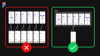
In today’s episode of designing a website in Figma, we’re going to be taking advantage of Figma’s free features to try and create a responsive header component for our website project. It goes from a full header menu to a mobile (logo + hamburger menu icon only) layout.
--------
© 2023 Mavi Design  Хобби
Хобби


BROOOOO. This is so underrated! You are super talented. Continue to push the boundaries, man.
Great thinking! This is the kind of tutorials that help us think, not just copy, thanks mate!
Bro you are a genius, keep up the great work, love your channel!
man! id what to say! all your tuts are so on point! thank you so much!
Great video! Thank you! Can you make the next part of this video ? (the overlay that you mentionned at the end of the video)
Your trick idea is awesome! I have done it according to your idea!
totally amazing!
What a lovely tutorial! Thanks a lot. After several days of research this seems to be the only way to make a fully responsive menu on figma. Would it be possible to have a figma share link to see how it works head on? I'd love to see all the different variables and conditions
"This is all I've talked about, that's the GOAT, the GOAT!" thank you Mavi for the tutorial!
thank you so much i loved it 😍
This tutorial was really helpful. Also, I want to know which screen recorder you are using and how are your keystrokes are displayed on the screen when you type?
Insightful video! Can you please explain how made the Navigation bar Auto-layout "Vertical layout" ? A bit confused on how you achieved that.
Nice trick. Thanks. Before this, I thought we must switch to framer to make it responsive.
Thank you for this
Thank you so much ❤
This is awesome
Thank you for the video it was really helpful. Other than following your guidance, what does one need to do to be able to do things like this themselves, I feel one needs a creative mind as well as the technical skills, would that be correct?
You are great.
you are the best!
Oh my god ! thx u so mutch
thank you very very much!!!!
You can use that when someone using mobile to view your design like in prototype panel? Or not.
super bro, really nice.👍
You're an angel bro
Nah, bro, you're the real deal. wow
Hi, I really apreciate this video. I´m goona apply ir RN. However, I have a couple of questions: Is it ok and undertandable for developers this kind of component? , and Does it break any design good practices?
6:03 🤣🤣🤣🤣🤣"things that push content down"
bro this video is undoubtedly helpful but for someone beginner like me it's really hard to understand the method by following this video. can you please make another fresh video on it ? It will be really helpful brother. Please make a video by more detail explanation. I don't understand the part of adding layout grid by variance
didn't really understand this tuto...
So it's just a hack. This is pointless and a waste of time. Just code it. Much faster.
well, "just coding it" may not be an option for someone who wants to create a Figma prototype. Besides, a coded responsive header is of no use when you're working with Figma
thnaks a lot man. I've learned so much with your videos! Unfortunately I'm not an expert and some how I can't figure it out why the Mobile Header doesn' get pushed down. Other than that everythign works fine