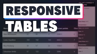
TailwindCSS responsive tables on mobile screens

HTML-код
- Опубликовано: 7 июн 2024
- In this video we'll see what solutions we have when it comes to making tailwindcss responsive tables look good on mobile devices.
Code snippets: tallpad.com/series/tailwindcs...  Наука
Наука


in a real case we would have dynamic table data, so instead of styling each tr individuality you can use more in the doc, thanks for the video 🙌
Yup! Forgot there is a tailwind variant for almost everything 🤣. I might do a video on those just to catch up
@@cdruc 😅 btw i came from react .. but tailwind used in jsx part so i can follow .. thanks for the video 🙌
Your content is the best 👏👏👏👏. You deserve a million likes and subscribers 👏👏👏👏
Thanks .. I was using table wrong in.. its so much helpful.
Dude, I was really lost using tables with Django and Tailwind, this saved me, so thaaanks,
Glad you find it helpful! 👊
This is crazy great! Thank you so much!! 👏
Loving the videos on tailwind... Not into PHP (sorry) but your CSS, JS, etc. stuff is great - thank you!
If it wasn't for Laravel, I probably wouldn't be into php as well, so that's ok 😂
Glad you enjoy the others!
This is sick... I love it...thanks
I'm lucky to found gems video. Awesome toturial. And thank's
Outstanding! Best of its kind 😃
Awesome video! I hope you can make a tutorial for the pagination as well
Great video!
very good video - even understandable for me as a backend / database guy :)
Glad you find it useful!
Nice job !
Very very good!!!
now this is awesome
Very helpfull tutorial and well explained it helps me alot, you have earn 1 more sub
Really nice, should definitely add some sticky headers then it will be golden
Реально красиво получилось. Спасибо
good stuff bro
this is so underrated
Awesome bro, i like it ❤
Great! Thank you!
Also I discovered your website - a lot of useful information, I'll start using it tomorrow.
Thanks! I hope you’ll find it helpful 👊
great video, I was able to use the idea in my project. Datatables and mobiles are not visually compatible at all.
for option number 2. in production are you going to render the data at the same time as the table or you will make a trigger if it hits a specific media query?
Correct! Here: ruclips.net/video/S4MhQ6peq8A/видео.html
On line 5 I'm hiding the table on screens less than 768px in width using hidden md:block, and on line 59 I'm showing the grid&cards but only until I reach 768px - from here on the table will be visible.
Clean clean
nice
How can i prevent my table from stretching? because now horizontal scrollbar appeared, PLEASE HELP ME 🙏🙏🙏🙏
damn i cant explain how mucn i have learn in such a s small time
code please
I think they could be accessibility issues if you use a grid div instead of a the table element. The first approach is the best, imo
I’m still trying to understand what advantage tail wind has for developers who already know CSS. It would be even cleaner to write CSS inside dedicated file and not have to clutter the HTML.
In Software development, we want to get money as fast as we possibly can unless you have other goals, and how do we achieve that? By being productive and saving time. That's where Tailwind comes in.
I agree with @NekoJinFel. This looks like someone puked up CSS classes all over the page. This is worse than old school Div-itis.
How to deal with table in mobile devices?
Hide it.
Awesome content though.